Anatomy of a High-Converting Website: A Masterclass in Structure and Design

In web design, it's very easy to get lost in colors, animations, and "vibe." But experienced designers know that a website is driven to success by two invisible forces: Structure and Clarity.
Whether you're building a site for a local bakery, a portfolio site, or a tech SaaS, the rules of engagement remain the same: a site that looks good but confuses the user is a failed project.
Based on leading industry research, we've compiled the ultimate guide to the must-have pages you need and secrets to a homepage that actually converts and how to execute it all in minutes using CodeDesign.ai.
Part 1: The Blueprint (The 6 Pages That Build Trust)
A website is more than a digital business card; it's an ecosystem. While you may be tempted to put everything into one long scroll, breaking your site into these six distinct pages improves SEO and offers a logical flow for your visitors.
1. The Homepage: "Grand Central Station"
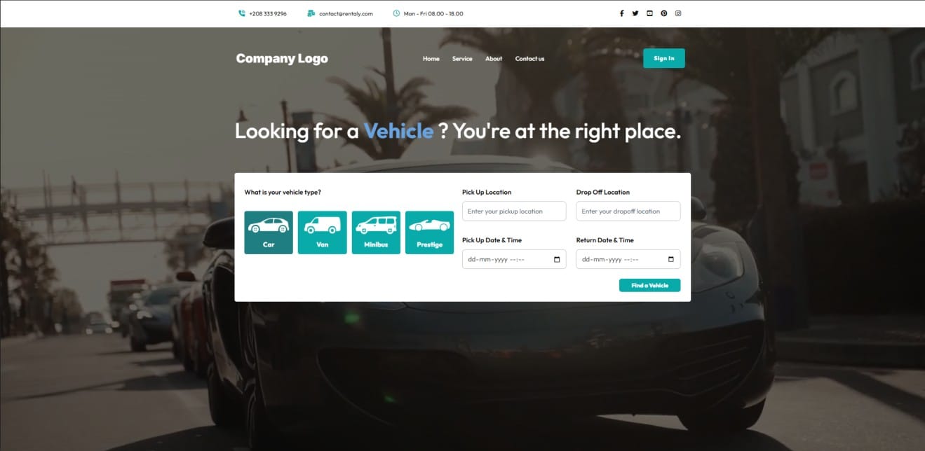
Think of your homepage as the lobby of a high end hotel. Its primary job isn't necessarily to close the deal immediately, but to direct traffic efficiently to where it needs to go.
- Strategy: It needs to answer the questions "Who are you?" and "What do you do?" instantly.
- Risk: A cluttered or vague page will lead to a "bounce".
- CodeDesign Fix: Use AI to generate a clear hero section that segments your audience immediately; for example, two distinct buttons, "For Freelancers" versus "For Agencies".
2. Products or Services: The Solution Center
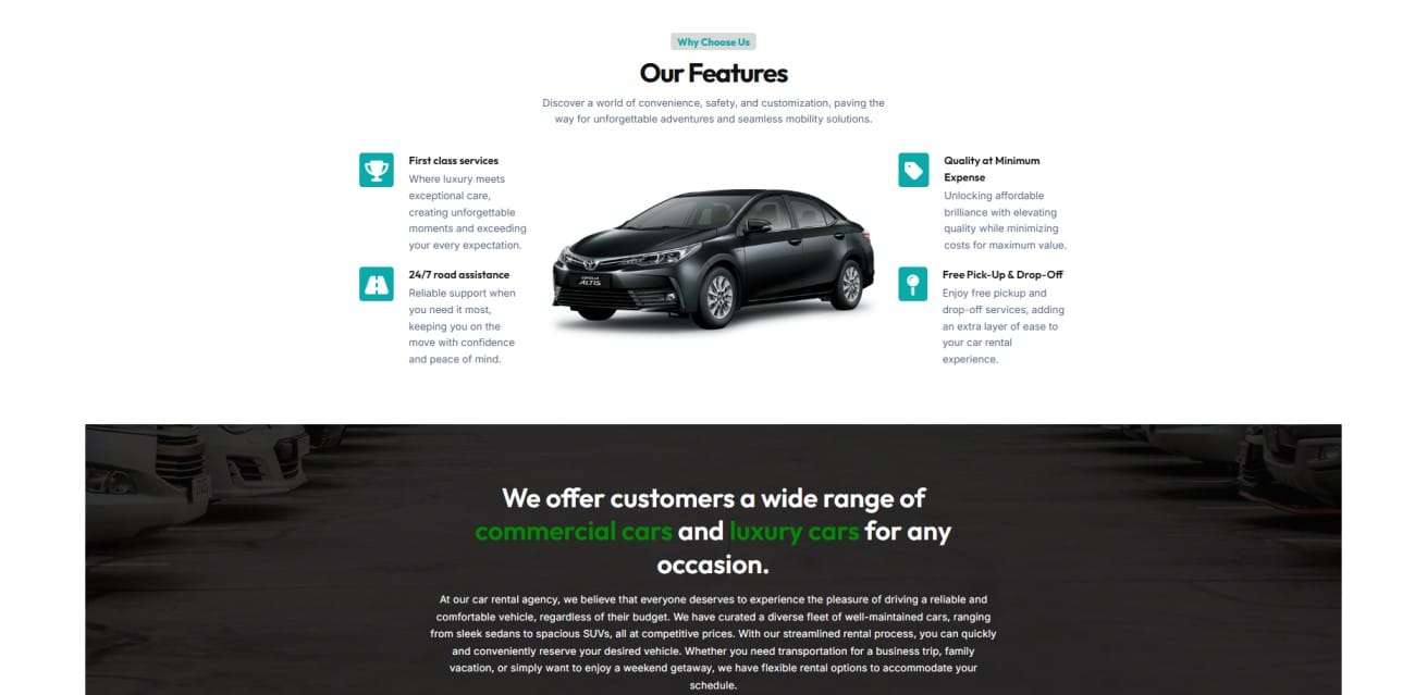
This is where the user decides if you can actually solve their problem. Just a simple bulleted list will not be enough here.
- Focus on Benefits: Instead of saying, "We use 4K cameras", say "Capture every detail with crystal clear video ".
- Process Visualization: So many service businesses fail because clients don't understand how the work gets done. Use this page to visualize the roadmap; for example, "Step 1: Consultation," "Step 2: Strategy," "Step 3: Execution". A visual timeline removes anxiety.
3. About Us: The Differentiator
In a world of automation, people crave contact with humans. This is often the second most visited page on a site; users want to know who is behind the curtain.
- The Strategy: Give them more than a dry company history. This is your page to share your values and your team.
- The Narrative: Explain why you started this business. A compelling origin story builds emotional capital that no product page can build.
4. Contact Page: The Open Door
If a user is searching for this page, they're a "hot lead." Don't make them jump through hoops.
- Reduce Friction: Offer multiple ways to connect. Some people hate phone calls; others hate contact forms. Provide an email, a phone number, and a simple form.
- Trust Signal: Even for a digital only business, listing a physical mailing address lends an air of legitimacy that anonymous websites do not have.
5. Privacy Policy: The Assurance
Data privacy is a hot-button issue. This page is legally required in many regions (such as the EU and California) if you collect any data at all even just IP addresses via analytics.
- Strategy: Transparency builds trust. Clearly state what you collect and, more importantly, that you will not sell their data to third parties.
6. Terms and Conditions: The Safety Net
While the Privacy Policy protects the user, the T&Cs protect you.
- Strategy: This is the rules of engagement page. It covers the very important aspects of refunds, cancellations, and copyright. This acts like a reference point if ever a dispute arises, saving you from possible legal headaches.
Part 2: Deep Dive into the Homepage: 8 Elements of a Winner
Your homepage has to work harder than any other page. It needs to capture attention, build interest, and drive action all within seconds. Here is the breakdown of the 8 non negotiable elements.
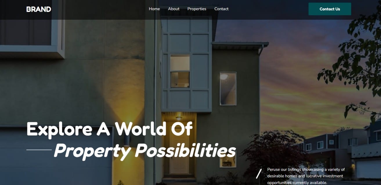
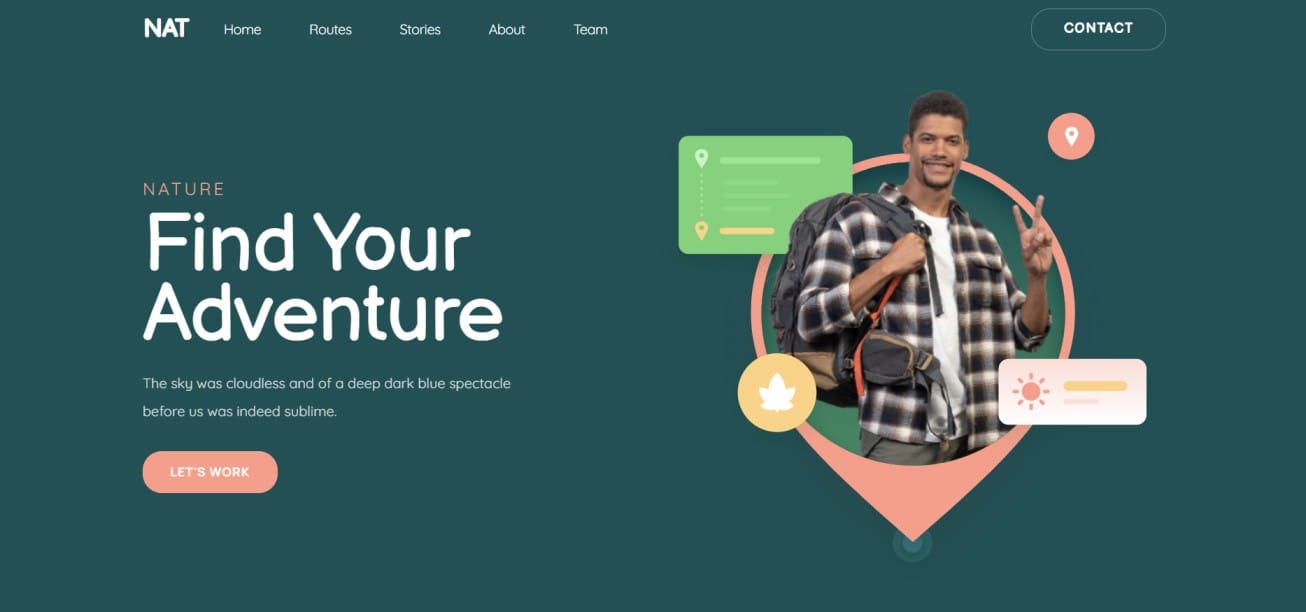
1. An Engaging Headline
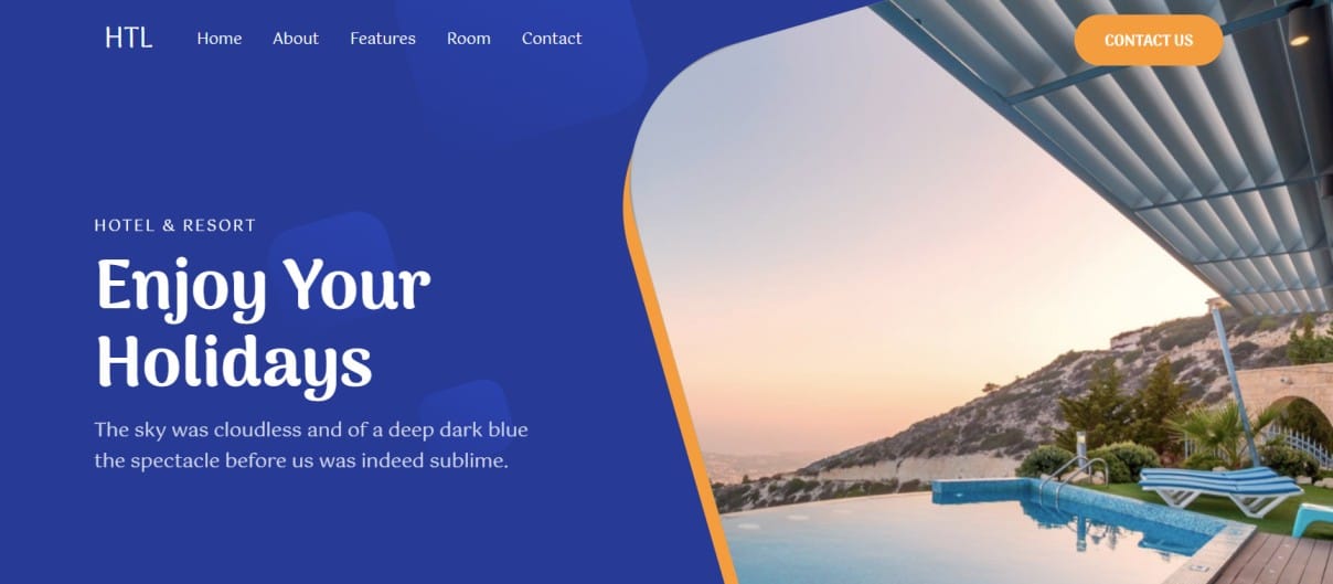
This is the first text a visitor reads. It needs to be the largest on-screen text.
- The "Grunt" Test: If a caveman looked at your headline for 5 seconds, would they know what you sell? Shun abstract metaphors such as "Unleash the Power" and instead opt for clarity: "Accounting Software for Small Business".
2. An Informational Subheadline
If the headline grabs them, the subheadline hooks them.
- The Detail: Use this space to address the user's pain point or explain the specific outcome. If the Headline is the "What", the Subheadline is the "How".
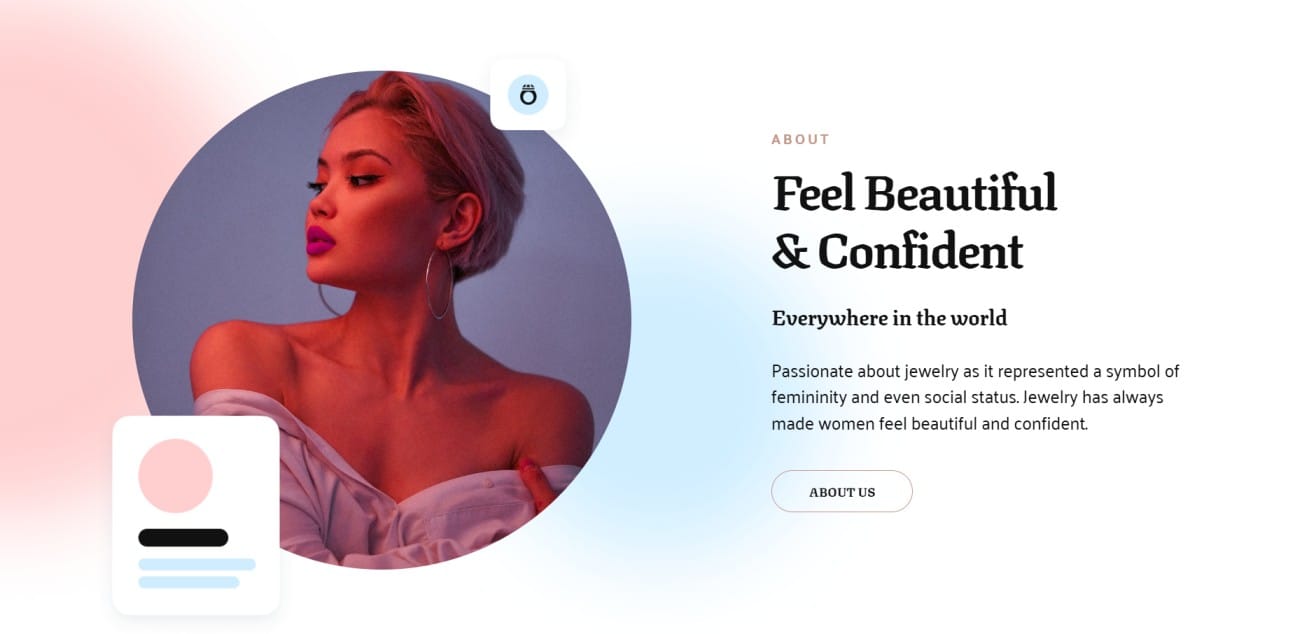
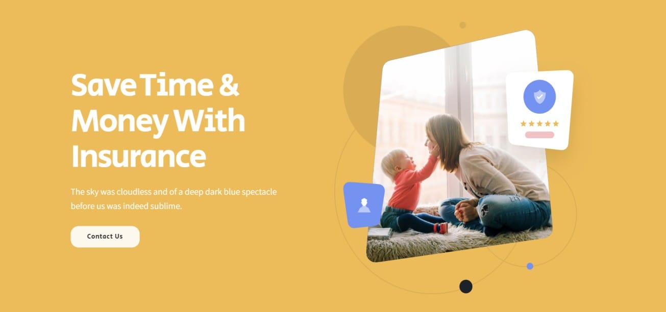
3. Visuals That Vibe
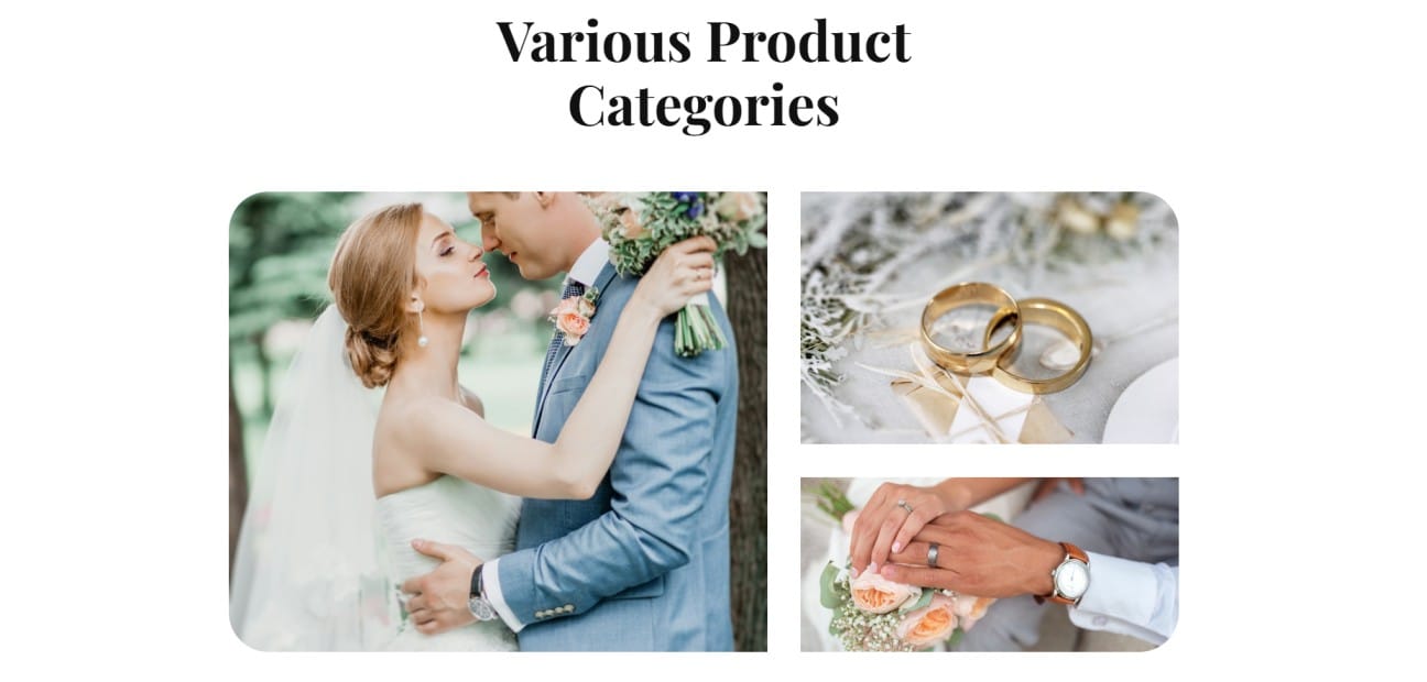
People process images 60,000 times faster than text.
- The Strategy: Use authentic imagery. If you sell physical products, show them in use. If you sell software, show the interface.
- Pro Tip: Humans are wired to look at faces. Photos of people looking toward your CTA button can actually direct the user's eye movement toward the click.
4. Intuitive Navigation
Don't make your users think. Navigation should be predictable.
- Sticky Nav: The menu will be sticky to the top as users scroll down the website page. This reduces the effort involved in moving to any other page.
- Limit Choices: Cognitive load is real. Limit your main menu to 5 – 7 items max.
5. Appealing Calls to Action (CTAs)
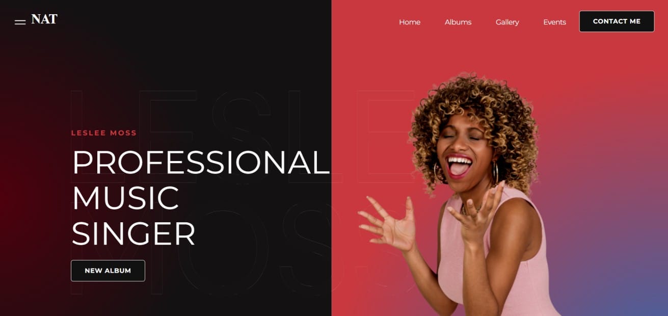
A CTA, or call-to-action, is a button that tells the user what to do next.
- Color & Contrast: The button color should be highly contrasting to the background.
- Text: Instead of "Submit", use low-friction, high-reward text such as "Get Started Free" or "See Pricing".
6. Memorable Copy
Your design draws them in, but your words make them stay.
- Scannability: Nobody reads giant walls of text. Break your copy into small paragraphs, use bullet points, and bold key phrases. CodeDesign's AI writer has been expressly trained to create text optimized for scannability.
7. Social Proof
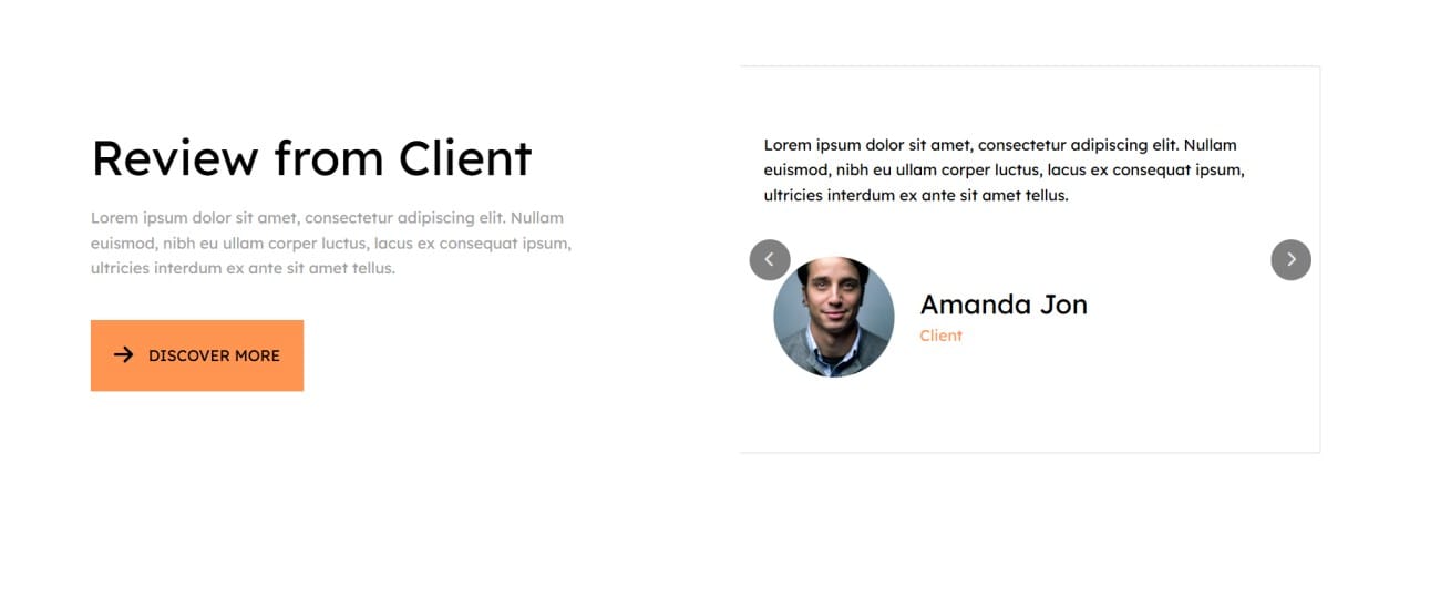
Users are herd animals we follow the crowd.
- The Bandwagon Effect: Showcase client logos, 5star review badges, or user testimonials high up on the page; just below the hero section is a prime spot. This answers the subconscious question: "Does this actually work?"
8. The "Cut-Off" Effect
This is a subtle but powerful design trick.
- Technique: The "fold" that occurs at the bottom of the screen should have content slightly cut off.
- The Result: Seeing the top half of an image or a headline peeking up from the bottom tells the user's brain: "There is more down there." It forces them to scroll, engaging them deeper into your content.
The CodeDesign Advantage
Understanding the theory behind these points is one thing, but it's in the application where magic really happens. You used to have to wireframe those sections for hours on end or code them from scratch.
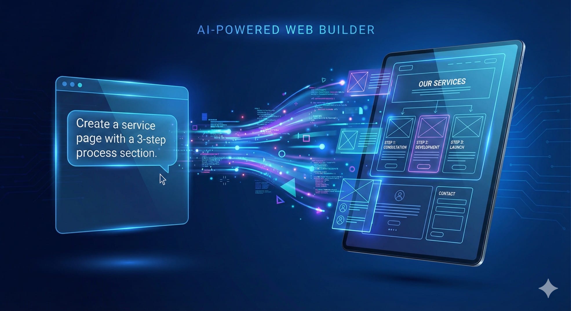
CodeDesign.ai frees you from having to build these pages manually. All you have to do is ask for them.
- Need a Services page? Prompt the AI with, "Create a service page with a 3-step process section and a pricing table."
- Need a better Hero section? Ask the AI: "Regenerate the header with a punchy headline, a subheadline about saving time, and a high-contrast CTA button."
Plan your website with a purpose, and then have AI do the heavy lifting.
Ready to build your perfect site? Start creating with CodeDesign.ai today.
- What is your brand name?
- What kind of business you are in?
- What kind of products or services you offer?