The Click-to-Page Gap: Why Great Ads Still Die on Bad Landing Pages
Guest Contributor: Emily Ahearn
People rarely blame the landing page first.
They blame the ad. The audience. The offer. The budget. Sometimes all four before lunch.
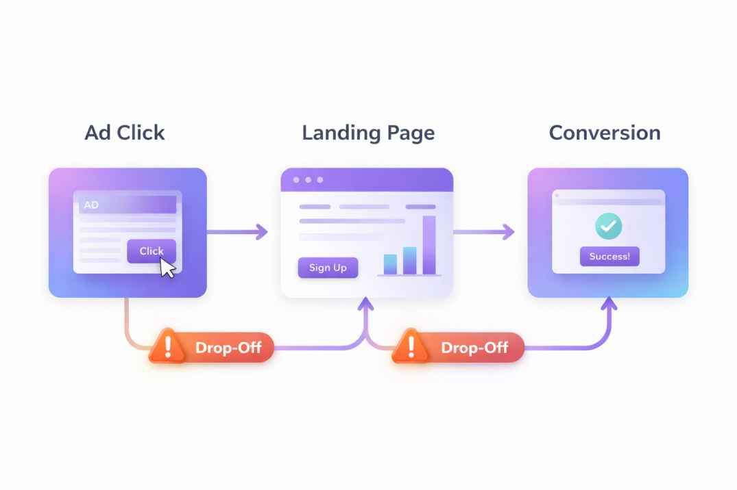
But a lot of paid campaigns fail for a simpler reason: the click made one promise, and the page made a different one. Not wildly different, either. Just different enough to make a visitor pause, hesitate, and leave.
That’s the click-to-page gap. And it eats conversions faster than most teams realize, especially when the ad is good enough to attract the right person but the page is too slow, too vague, too busy, or pointed at the wrong next step.
The ad got the click. The page has to finish the job.
A strong ad does one thing well: it creates intent. It gives someone a reason to care right now. Your landing page has to catch that momentum without making the visitor reorient themselves.
Google makes this pretty plain in its guidance on landing page experience: relevance, usefulness, ease of navigation, and whether the page matches what the ad led the user to expect all affect how that visit performs. That sounds obvious, but it’s where good campaigns quietly break down.
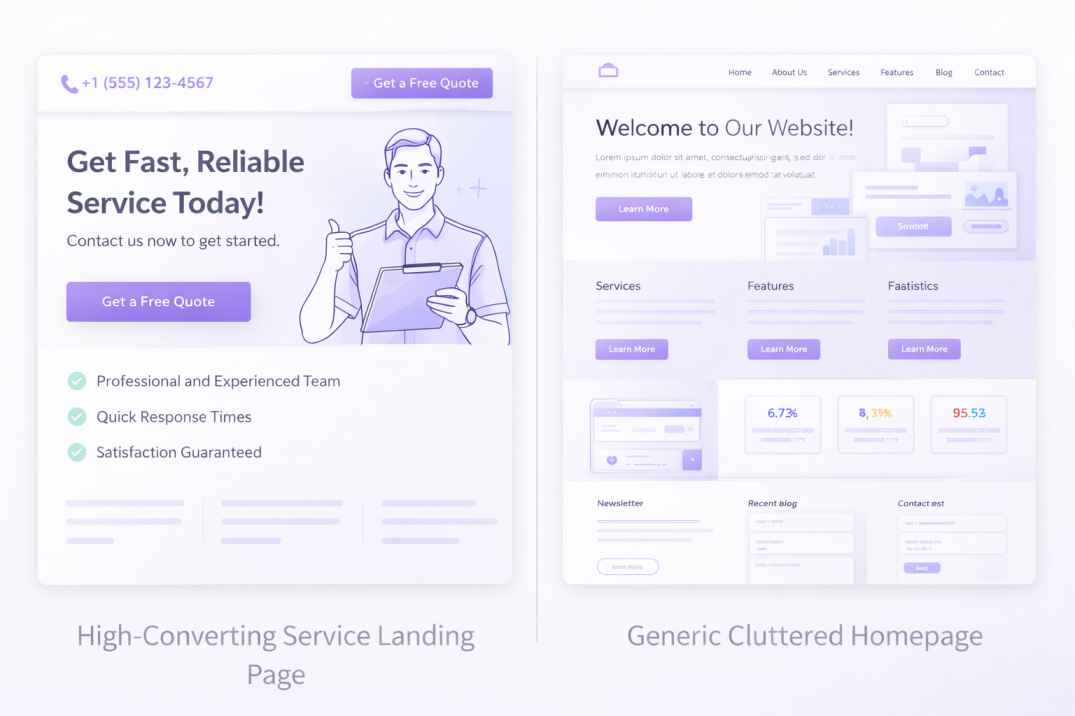
Take a basic example. An ad promises “book a free roofing estimate in 24 hours.” The click lands on a general homepage with five menu items, a brand video, a services grid, and one buried contact form below the fold. The visitor isn’t confused because the business is wrong for them. The visitor is confused because the page is asking them to think again.
That’s also why teams running traffic from a digital ad platform can see decent click-through rates but weak conversion rates. The problem isn’t always traffic quality. Sometimes the page is treating warm intent like a cold browse.
If the ad is specific, the page needs to be specific. If the ad is urgent, the page needs to move fast. If the ad is for one offer, the page can’t behave like a tour of the whole company.
Message match is where conversions start to recover.
Message match means the visitor sees the same idea continue from ad to page, with no mental reset in between. Same pain point. Same offer. Same audience. Same tone. Not copy-pasted word for word, but clearly connected.
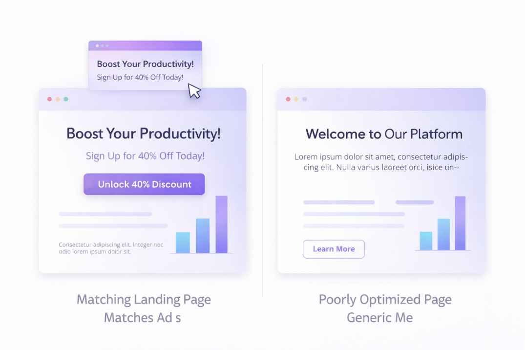
This is where a lot of teams drift. They’ll write a sharp ad about one result, then send the click to a page written around the company’s broader story. That might work for branded traffic. It usually doesn’t work for campaign traffic.
Good message match looks like this:
- Ad: “Get a quote for same-day office cleaning.”
- Headline: “Same-day office cleaning for small teams.”
- Subhead: “Get pricing in minutes and confirm today’s availability.”
- CTA: “Check today’s slots.”
Bad message match looks like this:
- Ad: “Same-day office cleaning.”
- Headline: “Welcome to BrightSpace Facilities”
- Subhead: “We deliver tailored facility solutions for modern businesses.”
- CTA: “Learn more.”
The second version isn’t wrong. It’s just too broad for the moment. Your visitor clicked on a task, not a brand seminar.
That’s why the structure of the page matters as much as the copy. A focused campaign page should usually answer five things in the first screen: what this is, who it’s for, what happens next, why it’s credible, and where to click. CodeDesign’s own guidance on the hero section lines up with that reality. The first visible section has to carry the pitch fast, before curiosity turns into friction.
A useful gut check is this: if someone hides your logo and reads only the headline, subhead, CTA, and proof bar, can they still tell what action the page wants from them? If not, the click-to-page gap is probably still there.
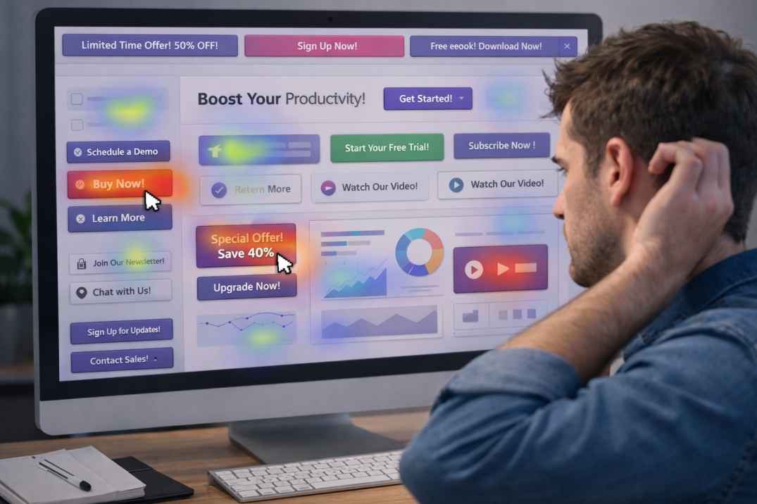
Most landing pages don’t fail because they’re ugly. They fail because they add work.
Visitors from ads arrive with limited patience. Every extra decision costs you. Every competing CTA splits attention. Every vague phrase forces interpretation.

According to Think with Google, when page load time goes from one second to 10 seconds, the probability of a mobile visitor bouncing increases 123%. That stat gets quoted a lot because it keeps being true in practice. Slow pages don’t just annoy people. They break the momentum that the ad paid to create.
Speed is one form of friction. Others hurt just as much:
- A headline that names the brand but not the offer
- A form asking for 8 fields when 3 would do
- Navigation that invites people to wander off
- A CTA that changes language three times on one page
- Social proof that is generic instead of tied to the offer
- Mobile layouts where the first button sits too low
Picture a dental clinic running ads for “emergency same-day appointments.” A good page shows the emergency service first, puts the phone number and booking CTA high, confirms hours, lists insurance basics, and shows one or two trust signals. A weaker page opens with a smiling team photo, explains the clinic philosophy, lists every service equally, and makes the urgent patient scroll.
One page respects the reason for the click. The other page asks for patience that ad traffic rarely gives.
That’s also why many campaign pages need less content, not more. In HubSpot’s landing page guidance, one recurring point is to keep the goal focused and remove elements that don’t support the next action. For paid traffic, clarity usually beats completeness.
If you need a practical build standard, start with this short checklist:
- One campaign, one audience, one core CTA
- Headline mirrors the ad’s promise in plain language
- Proof appears before the first major scroll
- Form length matches purchase urgency
- The mobile version shows the main action immediately
That’s not fancy advice. It’s just the part teams skip when they’re rushing to get the campaign live.
A page should change when the traffic source changes.
This is where the click-to-page gap gets more subtle.
A lot of teams use one decent landing page for every channel. Paid social, display, search, email, retargeting. Same page, same proof, same CTA, same order. That saves time, but it ignores intent.
Someone clicking a search ad for “buy accounting software for freelancers” is often closer to action than someone who clicked a curiosity-driven display ad. The first visitor may need pricing clarity and feature fit. The second may need a tighter explanation and stronger credibility before taking the next step.
So the better question isn’t “Is this a good page?” It’s “Is this the right page for this click?”
That’s where conversion funnel analysis becomes useful beyond reporting. If paid social users bounce after the hero, while search users reach the form but abandon at field six, those are different problems. One page might need stronger relevance at the top. The other might need less form friction.
A simple workflow works well here:
- Build one control page for the offer
- Duplicate it by traffic intent, not just by campaign name
- Change headline, subhead, proof order, and CTA emphasis
- Track scroll depth, CTA clicks, and form starts
- Cut anything that doesn’t improve the completion rate
For example, a SaaS team selling scheduling software might use three variants of the same page. Search traffic gets pricing clarity and integration logos high on the page. Social traffic gets a pain-led headline and a quick explainer block. Retargeting traffic gets customer proof and a stronger demo CTA in the first section.
Same product. Different click temperature.
CodeDesign is well-suited to that kind of fast iteration because the point isn’t rebuilding from zero every time. It’s using a focused structure, then adjusting blocks, proof, and hierarchy inside an AI landing page generator so the page matches the campaign instead of fighting it.
Fix the gap with smaller edits than you think.
When conversion rates are weak, teams often jump straight to a redesign. New visuals. New copy system. New brand pass. Sometimes that helps. Often, it delays the more useful fix.
The first move should be diagnosing where the intent drops.
If the click-through rate is healthy but the bounce rate spikes fast, look at message match and load speed. If people scroll but don’t click, your CTA or proof may be weak. If they start the form and quit, you’re probably asking too much too soon.
Here’s a practical sequence you can use this week:
- Compare the ad headline to the landing-page headline side by side
- Rewrite the first screen so a stranger can identify the offer in five seconds
- Remove one competing CTA and one nonessential section
- Shorten the form by two fields
- Add one concrete proof point near the top, like “2-hour response time” or “used by 430 local businesses.”
- Check the mobile version before touching anything else
A real example: an ad offers “free 15-minute legal consult for landlords.” The page currently says “Trusted legal support for property matters,” with a long intro and a contact form asking for full case details. A tighter version says “Free 15-minute landlord consult,” adds “Speak with a property attorney today,” shows “4.8/5 from 300+ clients,” and swaps the long form for name, email, phone, and issue type. Same business. Different outcome.
The point is not to make the page louder. It’s to make it easier.
Wrap-up takeaway
Good paid traffic is expensive enough. You shouldn’t also make it do interpretive work after the click.
A landing page doesn’t need to be perfect to convert. It needs to feel like the next logical step from the ad someone just chose to click. When that handoff is clean, performance gets easier to improve because you’re working on real friction, not guessing. When it’s messy, even a strong campaign can look weaker than it is. Put your ad beside your page today, read it like a first-time visitor, and fix the first place where the story breaks.