
Create Before and After Sliders: A Complete 2026 Guide

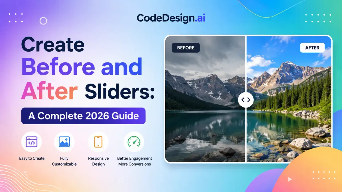
You're probably in one of two situations right now. You have a transformation worth showing, but a static gallery feels flat. Or you've seen before and after sliders on Shopify stores, agency sites, dental pages, renovation portfolios, and product launches, and you want to add one without getting trapped in a bloated plugin or a brittle custom build.
That's the challenge with before and after sliders. The visual idea is simple. The implementation choices are not. A no-code widget gets you live fast, a CSS build keeps things lean, and a JavaScript library gives you the polish most production sites require. Each route works. Each also breaks in predictable ways if you choose it for the wrong reason.
I've built these with page builders, hand-rolled CSS, and JavaScript widgets stitched into custom themes. The best method depends less on trend and more on what you need to control: speed of launch, editor friendliness, accessibility, performance, or long-term maintenance.
Table of Contents
- Why Before and After Sliders Are a Conversion Powerhouse
- The No-Code Method with CodeDesign.ai
- The Hand-Coded Approach with Pure CSS
- The Hand-Coded Approach with a JavaScript Library
- Slider Best Practices for Maximum Impact
- Beyond Visuals Accessibility and SEO Considerations
Why Before and After Sliders Are a Conversion Powerhouse
If you need to prove a change, few UI patterns are as direct as a slider. A side-by-side image asks the visitor to compare two frames manually. A slider removes that work. They drag once, see the difference instantly, and make the judgment themselves.
That moment matters because it shifts the page from claim to evidence. A skincare brand can show texture change. A contractor can show the exact line where an outdated kitchen becomes a finished remodel. A fitness coach can present progress without making the user scan two separate images and guess what changed.
Control creates trust
The best before and after sliders feel persuasive because the user is in control. They decide how much to reveal, how fast to move, and where to pause. That interaction usually holds attention longer than a fixed image pair, and it feels less like marketing copy and more like inspection.
That behavior lines up with ecommerce data. A 2026 visuals roundup notes that 58% of online shoppers are more likely to purchase from a site with high-quality, interactive visuals, and case studies indicate these comparison tools can increase add-to-cart rates by up to 35% when they showcase clear transformations, according to this 2026 ecommerce visuals report.
Practical rule: Use a slider when the difference is visual, immediate, and easy to verify. Don't use it when the change needs explanation more than demonstration.
A slider also solves a common persuasion problem. Businesses often have real results but weak presentation. The work is good. The proof is buried in separate photos, messy captions, or a gallery the visitor won't click through. A slider compresses that proof into one focused interaction.
It works best when paired with conversion intent
This isn't just a design flourish. It's a conversion device when it supports a buying decision. The strongest use cases tend to sit close to the moment of action: product feature sections, service pages, treatment pages, consultation landers, and case-study blocks near inquiry forms.
If you're reviewing your broader page structure, these 2025 ecommerce conversion strategies are a useful companion read because they frame interactive proof in the context of offer clarity, page flow, and friction reduction.
Here's where teams usually get it wrong:
- Weak transformation: The “before” and “after” look too similar, so the interaction feels pointless.
- Bad placement: The slider sits too low on the page, after the visitor has already bounced.
- No supporting context: There's no caption, label, or benefit statement, so users don't know what they're supposed to notice.
Before and after sliders convert when they reduce doubt fast. If the change is obvious and relevant, they do that better than a gallery almost every time.
The No-Code Method with CodeDesign.ai
For most founders, marketers, and client work where speed matters, no-code is the easiest way to get a polished slider live. You don't need to set up wrappers, clipping logic, or drag events by hand. You place the component, load your images, adjust the divider, and publish.

The advantage isn't just convenience. It's consistency. A visual builder reduces the small implementation mistakes that often show up in rushed hand-built sliders, especially spacing issues, mobile misalignment, and awkward handle placement.
How the setup usually goes
Start by dropping the before and after slider element into the section where proof belongs. Don't hide it deep in a gallery page unless your visitors are already highly motivated. It tends to work better near a product explanation, service promise, or testimonial block.
Then load two images that tell the same story from the same framing. Even in no-code tools, image choice does most of the work. If the “before” is shot wider, darker, or from a different angle, the widget can't save it.
A basic setup flow usually looks like this:
- Add the component: Place it in a content block with enough width to make the interaction obvious.
- Upload both images: Keep them visually aligned before you start styling anything else.
- Set the default divider position: Midpoint is safe. A slight offset can work when one side should be revealed first.
- Turn on labels if available: “Before” and “After” remove hesitation.
- Preview on mobile: The interaction has to feel touch-friendly, not tiny or fiddly.
If you want the flexibility to work visually and still keep export options open, the AI HTML website builder for code export is the kind of workflow that makes sense for teams that don't want to choose between no-code speed and developer handoff.
What to tweak before you publish
Most no-code sliders are usable out of the box, but “usable” isn't the same as “production ready.” There are a handful of settings worth touching every time.
- Handle visibility: Make the divider handle easy to spot. If it blends into the image, users won't know the module is interactive.
- Section spacing: Give the slider breathing room. Cramped edges make the component feel accidental.
- Captioning: A one-line explanation helps users understand what changed without forcing a long paragraph.
- Crop behavior: Check how the images behave across breakpoints. Portrait images often need a different container strategy than wide renovation shots.
No-code also has trade-offs, and it's better to be honest about them.
| Consideration | No-code result |
|---|---|
| Launch speed | Excellent |
| Custom behavior | Limited to available settings |
| Editor handoff | Easy for non-technical teams |
| Maintenance | Usually simple |
| Accessibility depth | Varies by widget |
| Styling precision | Good, but not unlimited |
A quick build is ideal when the page owner needs to update content without a developer. It's less ideal when you need custom keyboard interactions, unusual layouts, or a slider behavior that the builder doesn't expose.
Later, if you need deeper control, this walkthrough gives a useful visual reference for what the interaction looks like in practice:
The no-code path wins when your priority is shipping fast and keeping content edits simple. That's often the right call.
The Hand-Coded Approach with Pure CSS
The CSS-only route is attractive for one reason. It's lean. No dependency, no initialization script, no plugin updates, no library payload. If you're building a small landing page or an internal marketing component and you want a slider with minimal overhead, this approach is worth knowing.

It's also a good exercise because it forces you to understand the core mechanics. One image sits as the base layer. The second image sits above it. You reveal or hide part of that top layer based on a range input.
A minimal build that works
Here's a simple pattern using HTML, CSS variables, and a native range input:
<div class="ba-slider" style="--pos: 50%;">
  <img src="before.jpg" alt="Kitchen before renovation" class="ba-img">
  <div class="ba-overlay">
    <img src="after.jpg" alt="Kitchen after renovation" class="ba-img">
  </div>
  <input
    class="ba-range"
    type="range"
    min="0"
    max="100"
    value="50"
    aria-label="Compare before and after image"
    oninput="this.parentNode.style.setProperty('--pos', this.value + '%')"
  >
  <span class="ba-label ba-label-before">Before</span>
  <span class="ba-label ba-label-after">After</span>
</div>
.ba-slider {
  position: relative;
  max-width: 900px;
  width: 100%;
  overflow: hidden;
  border-radius: 16px;
  --pos: 50%;
}

.ba-img {
  display: block;
  width: 100%;
  height: auto;
}

.ba-overlay {
  position: absolute;
  inset: 0;
  width: var(--pos);
  overflow: hidden;
}

.ba-overlay .ba-img {
  width: 100%;
  height: 100%;
  object-fit: cover;
}

.ba-range {
  position: absolute;
  inset: 0;
  width: 100%;
  height: 100%;
  appearance: none;
  background: transparent;
  cursor: ew-resize;
}

.ba-range::-webkit-slider-thumb {
  appearance: none;
  width: 4px;
  height: 100vh;
  background: #fff;
  border: none;
  box-shadow: 0 0 0 9999px transparent;
}

.ba-label {
  position: absolute;
  top: 16px;
  padding: 6px 10px;
  font: 600 14px/1 sans-serif;
  background: rgba(0,0,0,.6);
  color: #fff;
  border-radius: 999px;
}

.ba-label-before { left: 16px; }
.ba-label-after { right: 16px; }
This version is compact and easy to drop into a page. The range input controls a CSS custom property, and the overlay width follows that value.
Keep the layout simple. The more decorative layers you add around a CSS-only slider, the more likely you are to spend your time fighting stacking, pointer behavior, and mobile quirks.
If you're styling the surrounding section and need a quick refresher on spacing discipline, this guide on the difference between margin and padding is worth revisiting. Sliders often look broken when the actual issue is container spacing, not interaction logic.
Where CSS-only starts to show strain
This method works, but it has boundaries.
- Interaction polish: Native range controls aren't always pleasant to style consistently across browsers.
- Touch behavior: You can support touch indirectly, but it won't feel as refined as a purpose-built script.
- Advanced accessibility: You can get partway there, but richer announcements and custom semantics usually need more than CSS.
- Feature growth: If the client later wants animations, alternate orientations, lazy behavior, or synced captions, the “small” component gets bigger quickly.
CSS-only is strongest when you need a lightweight module and can live with a basic interaction model. It's weakest when the slider is a hero element that has to feel premium under every condition.
The Hand-Coded Approach with a JavaScript Library
When the slider has to work across devices, survive client edits, and feel smooth without a lot of custom engineering, a JavaScript library is usually the practical choice. You're not reinventing drag handling, touch support, state sync, or divider behavior from scratch. You're configuring a solved problem.
This is one reason libraries and embeddable widgets became common so quickly. The broad rise of sliders as a standard web element began around 2015 to 2018, and by 2023, 200+ major website platforms officially supported embedding them. By 2025, downloads for dedicated slider apps and plugins had exceeded 1 million, according to this interactive content trends reference.
Why libraries became the default for many teams
A good library earns its place when the component needs to do more than just reveal one image over another. It helps when you need cleaner drag motion, better swipe behavior, orientation options, or a setup your team can reuse across multiple pages.
You also reduce maintenance risk. A custom slider built in a hurry often works for the original launch and then becomes awkward when someone swaps assets, changes the container ratio, or updates the surrounding layout.
A library approach is a better fit when:
- The slider is prominent: Hero sections, product spotlights, and treatment pages need polish.
- Mobile matters: Visitors should be able to swipe naturally.
- You need repeatability: Agencies and in-house teams benefit from a standard implementation.
- The design may evolve: Labels, handles, transitions, and orientation settings are easier to adjust.
A practical implementation pattern
The exact syntax depends on the library, but the implementation pattern is usually straightforward. You include the library assets, add a wrapper with two images, and initialize the component.
A generic structure looks like this:
<link rel="stylesheet" href="library.css">

<div class="comparison-slider">
  <img src="before.jpg" alt="Office before redesign">
  <img src="after.jpg" alt="Office after redesign">
</div>

<script src="library.js"></script>
<script>
  initComparisonSlider('.comparison-slider', {
    defaultOffsetPct: 0.5,
    orientation: 'horizontal',
    showLabels: true
  });
</script>
That's intentionally simple, but it reflects a common approach to using these tools. The value isn't the three lines of setup. The value is everything the library is already handling beneath them.
A library is the middle ground most production sites need. You keep control of markup and styling, but you stop spending time solving drag physics and edge cases.
There are still trade-offs.
| Factor | JS library outcome |
|---|---|
| Setup complexity | Moderate |
| UX polish | Strong |
| Dependency footprint | Higher than CSS-only |
| Customization | Usually strong |
| Cross-device behavior | Typically better |
| Long-term reuse | Strong for teams |
If I'm building for a client who wants the slider to feel dependable, editable, and hard to break, this is often the route I choose. Not because it's trendy. Because it reduces the number of small things I have to own forever.
Slider Best Practices for Maximum Impact
A slider can be technically correct and still perform poorly. Most failures come from bad image prep, the wrong implementation method, or a UI that hides the interaction instead of clarifying it.

The first decision is method. Don't pick based on what looks impressive in a tutorial. Pick based on who maintains the page and how important the component is to conversion.
Which method should you choose
Here's a simple decision framework:
| Method | Best for | Main upside | Main drawback |
|---|---|---|---|
| No-code | Founders, marketers, quick launches | Fastest path to publish | Limited deep control |
| Pure CSS | Developers optimizing for simplicity | Very lightweight | Fewer advanced interaction options |
| JS library | Production sites and reusable systems | Better polish and robustness | Added dependency |
If the slider is one supporting proof element on a landing page, no-code is often enough. If you're building a small bespoke site and want to keep the stack minimal, CSS-only can be smart. If the slider is central to the page and needs to survive real-world usage, a JavaScript library is usually the safer long-term bet.
Image prep decides whether the slider feels real
Technical fidelity matters more than people think. Both images need identical dimensions and matched framing. According to the implementation guidance summarized in this Shopify slider setup reference, misalignment causes a “drift” effect that reduces perceived transformation quality by over 40%, and high-converting sliders increase engagement time by 25 to 35% only when image resolution and color profiles stay consistent.
That means the production checklist starts before you touch the widget:
- Match the frame: Same camera angle, same crop, same subject position.
- Normalize the color: If one image is warmer or flatter for accidental reasons, users may read it as manipulation.
- Keep dimensions identical: Don't rely on the browser to fix mismatches for you.
- Choose orientation on purpose: Portrait-heavy content often benefits from a vertical treatment, while wide spaces usually read better horizontally.
A few details also improve usability:
- Show labels clearly. People shouldn't have to infer which side is which.
- Make the handle obvious. Hidden handles reduce interaction.
- Avoid clutter around the component. Too much nearby text competes with the reveal.
- Compress images carefully. Large files can make the component feel sluggish before the user even touches it.
The slider should reveal the transformation, not create one. If the effect looks dramatic because the photos are inconsistent, users notice.
The strongest before and after sliders feel almost boring in setup. Clean framing, clear labels, obvious controls, and no visual tricks. That restraint is usually what makes them convincing.
Beyond Visuals Accessibility and SEO Considerations
Most slider tutorials stop at the visual result. That's where problems start. A component can look polished in a design review and still fail keyboard users, screen readers, and mobile search performance.

The issue isn't theoretical. A 2025 industry audit found that 43% of global sites fail basic accessibility audits, and interactive images such as sliders can see a 28% drop in mobile SEO rankings if they aren't coded with ARIA live regions or semantic overlays and fail WCAG 2.1 touch and keyboard standards, according to this accessibility and SEO audit summary.
Why most sliders fail outside the design review
Many sliders rely entirely on pointer dragging. That creates immediate friction for anyone navigating by keyboard or assistive technology. If the handle can't receive focus, the comparison is effectively inaccessible.
SEO issues tend to show up in a different way. Teams sometimes load the entire module late, hide meaningful context inside non-semantic wrappers, or treat the comparison state as purely visual with no crawlable supporting text. Search engines don't need to “use” the slider, but they do need a page that remains understandable without it.
Common failure points include:
- No keyboard path: Users can't tab to the control or adjust it.
- Weak alt text: The images exist, but the transformation isn't described meaningfully.
- Missing semantic context: The component sits in anonymous divs with no useful surrounding copy.
- Performance drag: Large unoptimized images hurt page speed.
Fixes that actually help
The good news is that most slider issues are fixable with disciplined implementation.
Start with the control itself. If you're using a custom handle, make sure it can receive keyboard focus and has an accessible label. If you're using a range input under the hood, keep that benefit instead of replacing it with a mouse-only element.
Then support the component with real page structure:
- Use descriptive alt text: Explain what changed, not just what the image contains.
- Add visible labels: “Before” and “After” help everyone, not just assistive tech users.
- Provide nearby explanatory copy: A short caption gives both users and search engines context.
- Keep the DOM meaningful: Semantic wrappers and readable text around the slider matter.
If you're working on a broader optimization pass, this guide to website builder SEO is a useful reference point for keeping interactive elements from undermining search visibility.
A beautiful slider that blocks keyboard use or drags down mobile performance isn't finished. It's unfinished with better styling.
If you want the fastest path from idea to live page, CodeDesign.ai is worth a look. It gives you an AI-assisted workflow, visual editing, hosting, and exportable code in one place, which is useful when you want a before and after slider live quickly without giving up control later.