Best SaaS Landing Pages: Inspire & Convert in 2026
What separates a SaaS landing page you save from one you can build on?
The gap is usually strategy. A founder lands on a polished page, notices the gradients, the product mockup, and the headline, then credits the result to visual taste. In practice, strong pages convert because they do a few hard things well at the same time. They clarify the product fast, show how it works, reduce risk, and point visitors to one next step without friction.
That is the lens for this guide.
Instead of treating landing page galleries as swipe files, this article breaks down the conversion logic behind them. The core case study is a real CodeDesign.ai template library, because static screenshots only get you halfway. Teams also need to see how a page structure turns into something publishable, testable, and tied to trial signups. If you want to move from inspiration to implementation, an AI landing page generator for SaaS teams is a more useful reference point than another gallery full of pretty homepages.
Across the examples ahead, pay attention to repeatable patterns. Strong SaaS pages usually make the product visible early, teach the user with a short walkthrough or use-case section, add proof from customers or review platforms, and keep the primary CTA close to product access instead of pushing people through extra clicks. Those choices are not decorative. They reduce hesitation.
CodeDesign.ai adds a practical layer to that study process. Its template library includes SaaS website patterns, and its workflow supports animated, performance-focused builds with generative UI and agentic steps. That makes it useful both as inspiration and as an execution environment, which is a different job than a gallery alone can do.
Table of Contents
- 1. 1. CodeDesign.ai Inspiration Meets Execution
- 1. 1. CodeDesign.ai Inspiration Meets Execution
- 3. 3. SaaS Landing Page The Pure SaaS Gallery
- 3. 3. SaaS Landing Page The Pure SaaS Gallery
- 4. 4. Landingfolio From Inspiration to Code
- 6. 6. Lapa Ninja Daily Dose of Design Trends
- 6. 6. Lapa Ninja Daily Dose of Design Trends
- 7. 7. Saaspo The Quick-Filter SaaS Directory
- Top 7 SaaS Landing Page Galleries, Quick Comparison
- Your Blueprint for a Winning SaaS Landing Page
1. 1. CodeDesign.ai Inspiration Meets Execution
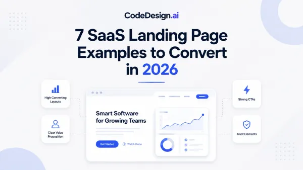
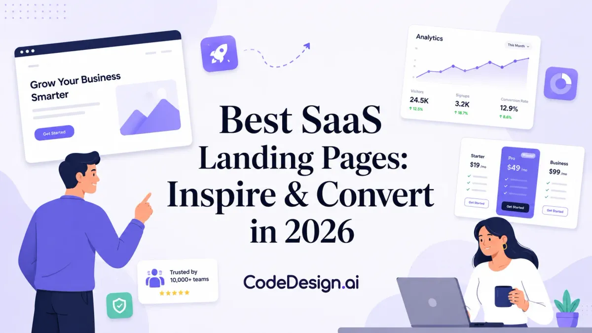
CodeDesign.ai SaaS website templates
Want a reference point that shows both what a strong SaaS landing page looks like and how to ship one without starting from a blank canvas?
CodeDesign.ai earns the top spot for that reason. It gives teams a live template library to study, then an execution workflow to adapt, test, and publish. That combination is more useful than a screenshot gallery if the goal is pipeline, not moodboarding.
The practical edge is page production with context. You can review a structure built for SaaS offers, then customize it for your pricing model, product story, and signup flow. Page volume has a measurable effect on performance, so adapting proven layouts instead of rebuilding from zero is a real operating advantage. Analysts at Digital Applied found that companies with more landing pages often see materially stronger conversion results in aggregate, especially as they build pages for distinct audiences and offers in their landing page statistics roundup.
I like this setup for one simple reason. It shortens the distance between inspiration and an actual test.
If a team wants to move faster, the AI landing page generator for SaaS campaigns makes that workflow even more practical by turning a rough page idea into something editable instead of forcing a full redesign from scratch.
Why this template library converts
The stronger SaaS templates in CodeDesign.ai follow patterns that usually hold up under testing.
- Product interface appears early: Good SaaS pages let visitors see the UI before they commit to reading dense copy. That reduces ambiguity fast.
- Use-case education is built into the page: Short walkthroughs, feature flows, or role-based sections help the visitor connect the product to an actual job to be done.
- Proof sits near decision points: Testimonials, ratings, client logos, and outcome-focused proof work better when they appear close to the CTA, pricing, or feature claims they support.
- The CTA stays tied to product access: Trial, demo, or signup buttons are easier to act on when the page keeps them visible and specific.
- The structure supports iteration: Templates built in reusable sections are easier to adapt for vertical pages, feature pages, or campaign variants.
That last point gets missed. Founders often judge a page by how polished it looks on day one. Marketers usually care more about how fast the team can spin up version two, three, and four once paid traffic starts exposing weak points.
What I'd copy from these pages first
I would not copy the styling first. I would copy the sequencing.
Start with the above-the-fold product view, then check how the page answers the next three visitor questions in order: what it does, who it helps, and why it is safer or easier to try than alternatives. After that, study how the template handles proof and CTA repetition without making the page feel mechanical.
That is the true value of this case study. CodeDesign.ai is useful because it shows landing page strategy in a form you can put into production.
1. 1. CodeDesign.ai Inspiration Meets Execution
CodeDesign.ai SaaS website templates
If you want one place to study and launch, this is the strongest starting point in the list. CodeDesign.ai isn't only a gallery. It's an execution layer with a large vault of SaaS templates, plus AI-assisted generation, editing, and iteration.
The practical advantage is speed with context. You can inspect a layout pattern that already fits SaaS buying behavior, then adapt it instead of rebuilding from zero. That matters because page volume still has a measurable effect on performance. Businesses with 10 to 15 landing pages can increase overall conversion by 55%, and those with more than 40 landing pages can boost conversions by over 500%, according to Digital Applied's landing page statistics roundup.
Why this template library converts
The highest-converting SaaS templates in CodeDesign.ai's own library share a persuasion stack that's familiar to anyone who has optimized trial flows.
- Product showcase first: Strong pages show the actual interface early instead of hiding it behind abstract copy.
- Sample tutorials included: Short tutorial-style sections help visitors picture first use, not just end benefits.
- High-trust proof: Reviews and validation from sources like G2 or Trustpilot reduce skepticism quickly.
- Single destination CTA: The strongest CTA path moves users into the product dashboard, not into a maze of options.
One more practical edge is testing. The platform already supports multiple homepage variants, and AI increasingly handles the layout experimentation layer for engagement and conversion. If you're comparing the best SaaS landing pages, that's the key distinction. Most galleries stop at inspiration. CodeDesign.ai closes the gap between swipe file and live page through its AI landing page generator.
Practical rule: If the hero can't show the product, the next section should. SaaS buyers don't trust mystery.
What I'd copy from these pages first
CodeDesign.ai also stands out because the templates don't force a single visual style. You can build more polished product-led pages, more editorial pages, or more animated SaaS front ends. The vibe coding companion is especially useful if you want animated and performance-oriented SaaS pages generated first, then refined through generative UI and agentic workflows.
The vertical that surprised me most from this ecosystem is Metawaves on CodeDesign. It's a good reminder that some SaaS niches respond better to bolder visual identity than many conservative B2B marketers expect.
3. 3. SaaS Landing Page The Pure SaaS Gallery
What do you need from a gallery when you are building a SaaS homepage? Usually not more visual noise. You need references that stay inside the constraints of SaaS buying.
That focus is more important than many teams assume. SaaS pages have to explain product value, show enough interface detail to feel real, reduce perceived risk, and push a visitor toward one clear next step. Browsing ecommerce or portfolio inspiration can distort those decisions fast.
Why a SaaS-only gallery is useful
SaaS Landing Page earns its spot because it filters out irrelevant patterns before they distract you. The examples stay close to the problems SaaS teams face: product screenshots, proof design, pricing presentation, onboarding friction, and trial or demo CTAs.
I use galleries like this earlier in the process than section libraries. They are better for judging page posture. You can assess whether a page feels product-led, sales-led, or category-creating within a few seconds. That helps founders avoid a common mistake: copying a beautiful layout that does not match their sales motion.
There is also a practical speed advantage. A focused gallery shortens the gap between inspiration and direction. If a team is deciding between a homepage built around UI, customer proof, or outcome-driven messaging, five strong SaaS references usually beat fifty mixed-industry ones.
What to study here
Look for recurring choices, not just attractive pages.
Pay attention to how these sites handle the first screen, how quickly they introduce the product, and whether the CTA matches the offer. On stronger examples, the story usually stays tight from hero to proof to action. On weaker ones, the design is polished but the path to signup feels vague or delayed.
This is also a good gallery to pair with live execution. After you identify a direction, you can translate it into a working layout with CodeDesign.ai SaaS website templates instead of stopping at screenshots.
Best use case
Use SaaS Landing Page when you are still shaping the overall page concept and need category-specific calibration. It is less useful for diagnosing one broken block. It is better for answering higher-level questions such as: Should the hero lead with UI or outcome? How much copy does this product type need before the CTA? How aggressively should pricing show up on the homepage?
That makes it a strong complement to the CodeDesign.ai case study in this article. CodeDesign shows how a high-converting template turns strategy into an actual page. SaaS Landing Page widens the reference set, so you can pressure-test your direction against other SaaS patterns before you build.
3. 3. SaaS Landing Page The Pure SaaS Gallery

A lot of inspiration sites lose value because you spend half your session filtering out irrelevant industries. This one doesn't. It stays tightly focused on SaaS.
That matters more than people think. The best SaaS landing pages solve a distinct communication problem. They have to explain software, establish trust fast, and move visitors toward a trial, demo, or signup. Looking at fashion stores or portfolio sites usually muddies your judgment.
Why focus matters
This gallery is useful because it reduces false inspiration. You're not accidentally borrowing patterns that look polished but don't fit SaaS buying behavior. You stay inside the world of product UI, proof layers, onboarding cues, pricing structure, and signup friction.
It also helps benchmark ambition. Unbounce reports that the average SaaS landing page conversion rate is 3.8%, below the all-industry median of 6.6%, while optimization can push a page to 11.6% to enter the top 25% of SaaS pages, according to its landing page conversion benchmark guide. That gap is exactly why curation matters. SaaS pages need more discipline than many categories.
How to use it without copying noise
I'd use this gallery to build a pattern board around one job only. For example, collect only pricing intros, only hero sections for dev tools, or only signup-first pages for PLG products. The moment you start collecting random “cool” pages, the exercise gets less useful.
If you want to move from pure reference into build mode quickly, CodeDesign's broader template collection is the natural next step. Browse narrow for ideas here, then switch to editable templates when you're ready to ship.
4. 4. Landingfolio From Inspiration to Code
>Landingfolio
Landingfolio is useful when the conversation has already moved past “what looks good?” and into “what can we implement this week?” It sits between gallery and component library, which makes it more operational than many inspiration sites.
Designers can reference patterns. Developers can grab component direction. Marketing teams can stop debating screenshots in Figma and start aligning on page sections that can ship.
Where it fits in a real workflow
This is the kind of resource I'd use in a handoff-heavy team. Someone on design collects examples, someone on growth rewrites the message, and someone on dev or no-code assembly turns the pattern into a page. Landingfolio supports that flow better than galleries built only for browsing.
It's also a strong reminder that media still matters when the product needs explanation. Including a video on a SaaS landing page can increase conversion rates by 86%, according to Powered by Search on B2B SaaS landing page stats. When a component library makes it easier to drop a demo section into the page without redesigning everything, that's not cosmetic. It's conversion work.
Trade-off to watch
The downside is obvious. Component-rich libraries can push teams toward assembly-line sameness. You can end up with a page that is structurally sound but forgettable if nobody sharpens the value proposition.
Good components don't rescue vague positioning. They only make vagueness look more polished.
Use Landingfolio when your bottleneck is implementation speed, not strategic clarity.
6. 6. Lapa Ninja Daily Dose of Design Trends

How do you spot a design trend early enough to use it well, instead of copying it after every other SaaS page already looks the same?
Lapa Ninja is useful for that job. It gives founders, marketers, and designers a fast read on where landing page aesthetics are heading, especially around typography, UI framing, color restraint, motion, and product imagery. In an article focused on strategy, that matters because visual trends still shape how a message gets received.
I would not use Lapa Ninja to build a page from scratch. I would use it after the core conversion logic is already set. The CodeDesign.ai case study earlier in this piece is the right model for that sequence. Start with structure, offer, and section order. Then use a gallery like Lapa Ninja to pressure-test whether the page feels current enough to earn attention.
What it does well
Lapa Ninja helps teams update taste without resetting their strategy. That is valuable during redesigns, rebrands, or category shifts where the positioning is still sound but the presentation feels a version behind.
You can scan for patterns such as cleaner hero composition, sharper headline spacing, more product-led visuals, or lighter use of decorative illustration. Those are not small cosmetic choices. They affect perceived clarity, trust, and how quickly a visitor understands what kind of product they are looking at.
The trade-off to manage
Fresh design can drift into expensive design.
A trend that depends on heavy animation, oversized media, or layered visual effects often creates friction in the places that matter most. Load time slips. Mobile readability gets worse. Important copy loses contrast against the art direction. Pages loading in under a second tend to convert better, so trend-chasing only works when performance stays intact.
That is the filter I use. If a visual treatment improves comprehension, keep it. If it mainly signals that the team has seen the latest startup sites, cut it.
What not to imitate blindly
Do not copy the attention device if it weakens the sales argument. A dramatic hero can still fail if the product shot is unclear, the headline says nothing specific, or the CTA gets buried under visual styling.
Lapa Ninja works best as a trend monitor, not a blueprint. Save references for reusable presentation ideas. Then bring them back to a grounded landing page system with clear hierarchy, strong copy, and fast execution. That is how inspiration stays useful instead of turning into decoration.
6. 6. Lapa Ninja Daily Dose of Design Trends

Lapa Ninja is where I'd look for freshness. Not strategy first. Freshness first. That makes it valuable, as long as you know what job it serves.
If your current page feels visually dated, this kind of hand-picked gallery helps you spot what modern teams are doing with motion, spacing, typography, illustration, and product presentation. It's especially useful during redesigns when a brand wants to look current without throwing away its message.
What it's best for
Lapa Ninja is great for identifying emerging visual cues before they become overused. That might be lighter interface framing, stronger product-first heroes, more editorial typography, or more restrained animation.
Speed still has to anchor your choices. Digital Applied reports that pages loading in 1 second achieve 3x higher conversion rates compared to slower pages, in its landing page conversion data roundup. So if a visual trend requires heavy assets, complicated effects, or decorative motion with no persuasive role, I'd treat it as suspect.
What not to imitate blindly
Don't copy the part that gets attention if it weakens comprehension. I see this a lot with highly stylized hero sections. They look expensive and say almost nothing.
A SaaS page should still answer basic buyer questions quickly:
- What is the product: Name the category or job clearly.
- Who is it for: Signal the user or team type early.
- Why switch now: Show a concrete benefit or workflow improvement.
- What happens next: Make the CTA feel low-friction and obvious.
Lapa Ninja gives you style references. You still have to do the selling.
7. 7. Saaspo The Quick-Filter SaaS Directory

Saaspo earns its place because it's fast. You can move through examples quickly, filter by page type, and get relevant references without a lot of friction.
That speed matters when you're not only studying homepages. Many SaaS teams need examples for pricing pages, signup pages, feature pages, or subpages that support a longer decision path. Saaspo makes that narrower search easier than broader galleries do.
Why teams keep this one open
This is a good resource for teams that already know what page type they're building. If the task is “find five clean pricing page patterns” or “show me signup flows that don't feel heavy,” Saaspo gets you there quickly.
It also pairs well with testing work. Waypoint notes that only 17% of marketers use A/B testing for landing pages in its benchmark article on landing page conversion rates. That means many still leave easy learning on the table. A fast-filter directory helps you generate better variant ideas instead of testing random button colors.
The best test ideas usually come from studying page structure, not tweaking surface details.
A useful reminder about page paths
Saaspo is a good reminder that “best SaaS landing pages” shouldn't only mean homepage inspiration. In practice, conversion paths often depend on the handoff between page types. A signup page may need less storytelling and more reassurance. A pricing page may need tighter plan framing and stronger objection handling. A feature page may need more UI proof.
That's where this directory is practical. It keeps the reference set tied to SaaS behavior, not generic web design taste.
Top 7 SaaS Landing Page Galleries, Quick Comparison
| Item | Implementation Complexity (🔄) | Resource Requirements (⚡) | Expected Outcomes (⭐📊) | Ideal Use Cases (💡) | Key Advantages |
|---|---|---|---|---|---|
| 1. CodeDesign.ai: Inspiration Meets Execution | Moderate, AI-guided build reduces manual work | Moderate, subscription + some learning curve | ⭐⭐⭐⭐⭐, conversion-focused templates; automated A/B testing 📊 | Build and iterate full SaaS sites quickly; launch high-converting pages | Live, battle-tested templates; generative UI; agentic workflows |
| 2. SaaS Pages: The Block-by-Block Deconstruction | Low, research-centric, no build required | Low, mainly time to analyze examples | ⭐⭐⭐, improved component decisions; clearer patterns 📊 | Component-level research (pricing, CTAs, testimonials) | Granular blocks; side-by-side comparisons of specific sections |
| 3. SaaS Landing Page: The Pure SaaS Gallery | Low, browse and filter to find examples | Low, quick filtering, no tooling needed | ⭐⭐⭐, broad inspiration; trend awareness 📊 | Early-stage inspiration; tech-specific examples (Framer/Webflow/React) | Large curated SaaS-only collection; strong filtering |
| 4. Landingfolio: From Inspiration to Code | Low–Moderate, uses ready components for faster implementation | Moderate, assets for Tailwind/Webflow/Figma; some dev work | ⭐⭐⭐⭐, accelerates build time; consistent UI impact 📊 | Teams using Tailwind/Webflow/Figma who need actionable components | Pre-built components and templates; direct handoff to design/dev |
| 5. Land-book: The Deep Sectional Archive | Low to Moderate, browsing is easy; deep searches take time | Moderate to High, Pro features recommended for advanced use | ⭐⭐⭐⭐, excellent for niche/historical research; precise matches 📊 | Agencies/freelancers with specific or unusual design queries | Massive archive; advanced filters and Boards for curated swipe files |
| 6. Lapa Ninja: Daily Dose of Design Trends | Very Low, visual browsing only | Low, quick daily visits | ⭐⭐, strong visual inspiration; limited tactical depth 📊 | Trend scouting and visual ideation at project start | Hand-picked, up-to-date examples; fast visual browsing |
| 7. Saaspo: The Quick-Filter SaaS Directory | Very Low, straightforward tagging and filtering | Low, minimal time to gather examples | ⭐⭐⭐, fast assembly of relevant comps for review 📊 | Rapid stakeholder reviews, quick comps for briefs | Simple tagging/filtering; SaaS-focused and efficient to use |
Your Blueprint for a Winning SaaS Landing Page
What separates a SaaS landing page that gets bookmarked from one that gets trials, demos, and qualified signups?
The answer is usually structure, not style. Strong pages reduce risk in the sequence buyers feel it. They clarify the promise, show the product early, answer the next obvious objection, and ask for action at the right moments.
That is the lens for using the galleries in this article. They are useful for collecting ideas, but the true job is pattern selection. A page does not improve because it borrows a hero layout from one site and a testimonial block from another. It improves when each section earns the next scroll. That is why the CodeDesign.ai case study matters in this piece. It shows how a high-converting SaaS template can move from inspiration into execution without losing the conversion logic behind the design.
As noted earlier, SaaS conversion benchmarks leave plenty of room between average performance and strong performance. That gap usually comes from dozens of small choices. Sharper headlines. Earlier product visibility. Better proof placement. Faster paths into the trial or demo flow. Cleaner testing discipline.
A few principles hold up across live optimization work:
- Lead with the job, not the adjective. Clear outcomes outperform vague claims about being powerful, modern, or intelligent.
- Show the interface before attention drops. Buyers want evidence that the product is real and understandable.
- Place proof where doubt appears. Testimonials, logos, and usage signals work best beside pricing, forms, and feature claims.
- Keep CTA intent consistent. “Start free” and “Book a demo” can coexist, but each section should make the next step obvious.
- Cut friction before adding persuasion. If the form, onboarding step, or CTA path is clumsy, stronger copy will not save it.
- Test page variants with a real hypothesis. CodeDesign.ai supports multiple homepage variants, which is useful when the team is testing a specific change in message, proof, or page flow rather than making random edits.
Founders often over-invest in visual novelty and under-invest in message order. I see the opposite pay off more often. A familiar layout with sharp positioning and disciplined proof usually beats a beautiful page that hides the product, delays specifics, or asks for too much trust too early.
If you are building a swipe file, the galleries above help you collect patterns fast. If you are trying to ship a working page, CodeDesign.ai is practical because the templates already reflect common SaaS conversion structures, and the platform shortens the path from draft to variant to published page.
For more outside inspiration on what strong pages look like in practice, this collection of high converting landing page examples is also worth reviewing.
CodeDesign.ai is the fastest option here if you want more than inspiration. You can start from SaaS-focused templates, generate new sections with agentic AI, refine copy, publish quickly, and keep control through visual editing or code export. If you're serious about building one of the best SaaS landing pages instead of just bookmarking them, try CodeDesign.ai.