7 Cool Restaurant Websites to Inspire You in 2026
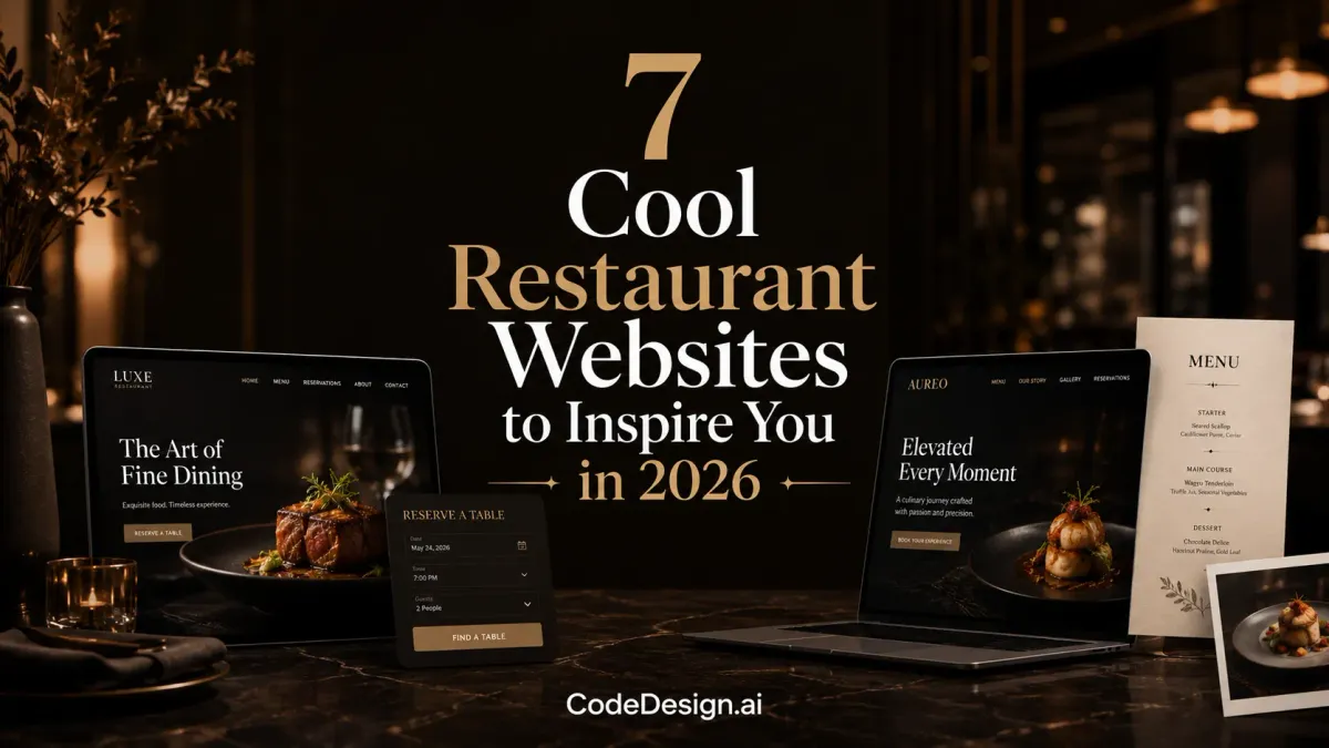
Your restaurant site is no longer just a digital brochure. Diners check menus on their phones, compare photos, and decide whether to book, order, or keep scrolling before they ever walk in the door. That's why the best cool restaurant websites don't just look polished, they help people make fast decisions on mobile, which is exactly where modern traffic lives, as the category scale in Semrush's April 2026 restaurant rankings makes clear with doordash.com at 97.09 million monthly visits and 77.85% mobile share, plus mcdonalds.com at 30.7 million visits with 86.27% from mobile devices (Semrush global restaurants rankings). If you're planning your own upgrade, a practical starting point is to compare what strong sites do well, then build those same mechanics with a flexible system such as CodeDesign.ai and, if you want a browser-side performance boost, review the guide to the Speculation Rules API.
Table of Contents
- 1. Alinea
- 2. Eleven Madison Park
- 3. Canlis
- 4. Dishoom
- 5. BÆST
- 6. SMOKESTAK
- 7. sweetgreen
- 7 Cool Restaurant Websites Compared
- Bring Your Vision to Life with CodeDesign.ai
1. Alinea
Alinea's website is a strong lesson in restraint. The page gives you a single-minded path toward booking, then uses high-impact photography and compact content blocks to frame the restaurant as an occasion, not a casual stop. That kind of design works because the site doesn't compete with itself, the visuals carry the brand, and the action path stays obvious.
The homepage also handles multiple experiences without feeling cluttered. Kitchen Table, Gallery, and Salon are presented as distinct options, so a visitor can understand the difference quickly and move toward the right reservation path. That's especially valuable for high-intent diners, because the site is doing two jobs at once, signaling scarcity and reducing friction.
You can see the same discipline in the booking flow through Tock. Instead of burying the reservation behind layers of storytelling, Alinea makes the choice visible and immediate, which is exactly what a fine-dining brand should do when demand is high and time is limited. The trade-off is real, though, and it's deliberate, sparse navigation can reduce casual browsing, but it also keeps the experience focused on conversion.
Practical rule: If your restaurant sells an experience, not just a meal, the homepage should act like a concierge desk, not a magazine spread.
For small operators, the takeaway isn't to mimic the luxury budget. It's to copy the structure, one primary CTA, clear experience labels, and imagery that communicates the promise before a guest reads a single paragraph. A beginner-friendly build process can help you do that without extra complexity, which is why website design for beginners matters when you're setting up the core page system.

2. Eleven Madison Park
Eleven Madison Park leans into atmosphere with an editorial feel that matches its fine-dining positioning. The site uses a large scrolling gallery, farm imagery, and concise story panels to reinforce sourcing, produce, and the restaurant's point of view. That combination matters because the visitor isn't just browsing a menu, they're being asked to trust a philosophy.
The booking path stays practical. Reservations route through Resy, and the essentials are pushed into the footer so address, phone, and newsletter capture don't get lost in the visual storytelling. This is a smart pattern for hospitality brands, because the site can feel cinematic without turning navigation into a scavenger hunt.
The downside is also easy to spot. Heavy galleries can feel slower on weaker connections, and the site doesn't lean hard into menu specifics or pricing on-page. That's a brand choice, but it won't fit every restaurant. If your guests need decision support before they visit, you'll want more explicit menu structure than this site provides.
What small restaurants can borrow
Use the storytelling, not the bloat. Pair a strong hero image with a short, confident explanation of what makes your food and sourcing different, then keep the essential actions close. A lightweight home page can still feel premium if the copy is precise and the booking button is easy to find.
- Lead with one visual story: Show produce, plating, or the dining room, then connect it to your brand position.
- Keep contact details visible: Put address and phone in the footer and in the header where possible.
- Avoid hiding reservations: If guests need to book, don't make them search for the button.
If you're building this kind of layout from scratch, website builder SEO becomes part of the design process, not an afterthought.

3. Canlis
Canlis feels warm before it feels formal, which is a difficult balance to pull off online. The copy reads like a host talking to a guest, while the photography and architecture-forward visuals still signal a refined dining experience. That mix gives the site a more human tone than many luxury restaurant sites, and it helps the brand feel welcoming instead of guarded.
The practical details are just as important. The homepage surfaces press, design pedigree, FAQs, and location information, then routes reservations to Tock. That's a strong model for restaurants that want credibility without making guests dig through multiple pages for basic answers.
Many restaurant websites overemphasize ambiance while neglecting practical planning information. Canlis takes the opposite approach in the right areas. The "Before your visit" content anticipates the types of questions diners have, which reduces uncertainty and makes deciding to visit feel more straightforward.
Guests rarely need more adjectives. They need hours, directions, and a sense that the restaurant has thought through the visit.
The trade-off is screen space. Content-heavy blocks can feel long on smaller devices, especially if a visitor is trying to find a quick answer. That's the price of giving more context, but it works when the brand promise depends on anticipation and occasion.
For owners thinking about the economics of a custom build, cost to build a website is worth comparing against the time savings of a template-driven workflow. A site like Canlis works because the structure is disciplined, not because it is overcomplicated.
4. Dishoom
Dishoom reads like a living brand book. The site uses layered typography, archival photography, and narrative copy to evoke Bombay cafés while still keeping modern actions visible, including menus, reservations, and the online store. That's a rare balance, because many restaurant sites either lean into brand theater or lean into utility, and Dishoom manages both.
The multi-venue structure is a major strength. As a restaurant group grows, navigation has to scale without becoming messy, and Dishoom's layout handles that well. Visitors can explore locations without losing the thread of the brand, which is exactly what a multi-site restaurant needs when it wants both consistency and local relevance.
The editorial richness has one cost, though. Rich content can demand more scrolling on mobile, and some visitors will want a more direct CTA above the fold. For a brand with strong recognition, that trade-off is acceptable, but a lesser-known restaurant may need faster action cues to prevent drop-off.

What makes it work
The site gives each major action a clear information scent. Menus, bookings, and the store don't fight for attention, they sit inside a strong narrative frame that makes the brand memorable. That's a good lesson for restaurant owners who think “cool” has to mean visually busy. Often it means coherent, with the content arranged so people know exactly where to go next.
If you're trying to replicate that kind of structure fast, AI restaurant website templates can give you a credible starting point without forcing you to hand-build every section.
5. BÆST
BÆST is the opposite of a sprawling fine-dining homepage, and that's exactly why it works. The site puts hours, address, and menu access up front, so a visitor can get the basics without working through layers of brand storytelling. For a neighborhood restaurant, that clarity is often more valuable than a long homepage narrative.
The copy is short and specific, and it highlights in-house dairy and charcuterie in a way that supports the craft story without overwhelming the page. That gives the restaurant a distinct identity while still helping guests answer the practical question, “What should I expect when I walk in?” That's the test for a local site, not whether the site is flashy.
BÆST also uses proof points like gift card and inspection report links, which signal credibility. Those details matter because trust doesn't come only from photography. It also comes from showing that the restaurant is organized, transparent, and serious about operations.
Why this layout helps nearby diners
The site is easy to parse on mobile, and that's the main advantage. People looking for a neighborhood spot often want a quick decision, not an extended brand tour. A compact layout respects that behavior and keeps the path open to visiting.
The limitation is obvious. A simple design can feel plain to people who expect motion, rich galleries, or more visual drama. Still, that trade-off is useful for restaurants whose competitive edge is speed, clarity, and product quality rather than spectacle.
For small restaurant owners, BÆST is a strong reminder that “cool” can mean clean, credible, and fast to use. If your menu, opening hours, and location are easy to find, you've already solved a big part of the web problem.
6. SMOKESTAK
SMOKESTAK's site matches the brand's live-fire energy with a gritty, high-contrast look. The visual identity is cohesive across the homepage and booking pages, and that consistency helps the restaurant feel authentic rather than styled for style's sake. For a smokehouse or barbecue concept, that alignment matters because the website should echo the dining room, not fight it.
The utility is straightforward. Hours, email, phone, and booking instructions are easy to locate, and the booking path stays practical. That's a strong fit for a restaurant where guests want quick answers and a direct route to making plans.
The site does keep things lean, though, and that can leave some users wanting menu or nutrition details sooner. It also doesn't aim for lots of delight moments or playful motion. For some brands, that's fine, but if your audience expects richer discovery, you may need to add more content while keeping the tone intact.
The best utilitarian restaurant sites still feel intentional. They don't just remove clutter, they remove doubt.
That's the lesson here. A restaurant site doesn't need to entertain every visitor, but it does need to support the most common actions without hesitation. If someone wants to book, contact, or find you, those paths should be obvious and consistent.
If you're building around that kind of lean structure, templates for food websites can save time while still leaving room for brand detail.

7. sweetgreen
sweetgreen feels less like a brochure and more like a digital product. The site uses a component-based layout to surface menu modules, nutrition cues, ordering CTAs, and separate pathways for catering and workplace programs. That structure makes sense for a multi-location brand, because the website has to serve customers, office buyers, and campaign traffic without becoming messy.
The ordering flow is especially important. A clear Order now path turns the site into a functional sales channel, while the nutrition and ingredient content supports faster decision-making. That combination is what many small restaurants miss, they either tell the brand story or help the purchase, but not both with equal clarity.
The layout scales well across seasons and campaigns too. That matters because a flexible content system lets the brand swap promotions without redesigning the whole site. The trade-off is that brand-first storytelling takes a back seat to utility, and some product cards can feel heavy on slower mobile connections.
How to apply this to a smaller restaurant
You don't need sweetgreen's scale to borrow the structure. Put the menu, nutrition notes, and order CTA in predictable places. Keep the page modular so you can update seasonal dishes, catering offers, or lunch specials without rebuilding the whole site.
- Make order entry obvious: Don't hide the main ordering path in secondary navigation.
- Group content by task: Menu, nutrition, catering, and locations should each have a clear home.
- Design for updates: Use reusable sections so new campaigns don't break the layout.
If your restaurant wants a similar system without custom development overhead, CodeDesign.ai gives you a practical way to build and revise those sections with AI-assisted editing.
7 Cool Restaurant Websites Compared
| Site | 🔄 Implementation complexity | ⚡ Resource & performance | 📊 Expected outcomes | 💡 Ideal use cases | ⭐ Key advantages |
|---|---|---|---|---|---|
| Alinea | Moderate, ultra‑lean structure with polished visuals | High, large, high‑quality photography needs optimization | High bookings and premium brand perception | Three‑Michelin‑star / reservation‑first experiences | Streamlined conversion path; luxurious imagery |
| Eleven Madison Park | Moderate‑High, editorial galleries and storytelling panels | High, heavy galleries can slow weak networks | Strong brand storytelling and engagement | Heritage fine‑dining emphasizing provenance | Cinematic visuals with clear essentials (contact/booking) |
| Canlis | Moderate, content‑rich homepage with practical sections | Medium, mix of press, photography, and CMS content | Informed guests and straightforward reservations | Hospitality brands balancing story + guest needs | Balanced heritage storytelling with practical FAQs |
| Dishoom | Moderate, narrative sections + multi‑venue navigation | Medium‑High, rich content across locations | Distinctive brand voice driving actions (menus/reservations) | Multi‑location, brand‑led restaurants scaling identity | Editorial brand book feel with actionable CTAs |
| BÆST | Low, compact, clarity‑first layout | Low, minimal imagery and fast to load | Quick decision making; high trust signals | Neighborhood restaurants prioritizing speed/clarity | Immediate access to essentials and proof points |
| SMOKESTAK | Low, lean UX with utilitarian flows | Medium, strong typography/imagery but efficient | Authentic tone with fast paths to action | Concept restaurants with gritty, focused brands | Fast, utilitarian booking paths aligned with brand |
| sweetgreen | High, componentized layout and ordering flows | High, ordering integrations, nutrition data, scale | Scalable online orders and campaign consistency | Multi‑location chains, catering and B2B programs | Optimized for conversion, composable and scalable design |
Bring Your Vision to Life with CodeDesign.ai
You don't need a Michelin-star budget to build a site that feels polished and converts well. The pattern across these cool restaurant websites is simple, the best ones make the menu easy to find, keep booking or ordering visible, and use visuals to support a clear decision. They're stylish, but they're also operational, which is why they work on mobile and why they keep serving the business long after launch.
That same approach is achievable for a small restaurant or solo operator with the right workflow. CodeDesign.ai lets you generate, edit, host, and export a professional site, then refine it with prompts or a visual editor as your menu, hours, and offers change. It also fits the restaurant use case well because it supports responsive templates, SEO-friendly publishing, and fast iteration without locking you into a single build path.
If you're comparing options, think in terms of outcomes, not just aesthetics. You want a site that looks current, loads quickly, supports reservations or ordering, and makes it easy for diners to decide. The restaurants above succeed because they reduce friction and make the next step obvious, and that's the same standard you should use when you build your own online presence.
If you want to turn these ideas into a real restaurant website, start with CodeDesign.ai. You can build a fast, responsive site, shape the menu and reservation flow around your business, and keep ownership of the final result. That makes it easier to launch something that feels premium without turning every update into a technical project.