
Brand Style Guide for Visual Communication: A Step-by-Step Guide

Most brands don't lose recognition due to poor design. They lose the battle because potential clients can’t distinguish them from competitors. Businesses with poor brand consistency often have mismatched logos across platforms, shifting tone between channels, and no shared reference point for anyone producing content.
Establishing a solid identity can increase your revenue by up to 33%. And the best thing about it is that you can do it on a budget. Solid visual communication starts with a brand style guide shared with every stakeholder. It will take a few days or even hours to put together and save you a lot of time and money that otherwise would be wasted in endless edits.
Today, you'll find out what a brand style guide should look like and how to build one.
What Is a Brand Style Guide?
It’s the rulebook for how your company looks and sounds. You must share a brand guide with everyone who has even the smallest impact on it: from the in-house team and freelancers to external vendors like merchandise producers.
A basic branding guide covers the essentials: logo, colors, fonts, and tone of voice. It's enough to keep you recognizable without overcomplicating the process. A full branding system documents everything from the company’s vision and audience positioning to channel-specific rules and technical specs for every asset type.
You will see the difference as you grow. It’s easy to catch a mistake made by one person. But what to do if you need ten copywriters and five designers to keep your business moving?
Shared branding style guides keep everyone working with the same references. Also, it helps you ensure that the audience instantly recognizes you, even from a split-second banner.
Key Components of an Effective Digital Brand Style Guide
Brand consistency starts with striking a balance between staying true to your essence and distinguishing yourself from the crowd. Follow these recommendations to build a strong identity.
Logo Usage Rules
It’s the most recognized visual element, and the easiest one to get wrong. There are dozens of people outside of your core team who work with it. A solid brand guide covers every variation, spacing rules, and incorrect usage examples.
Color Palette and Typography
Most brands don't realize their colors look different in print or on the merch until it's too late. And instead of a pink and violet logo, they get something closer to peach and grey.
We know that you don’t want that to happen to you. And it’s a totally preventable situation, since all you need to do is specify primary and secondary shades in common formats: HEX and RGB for digital, CMYK for print, Pantone for physical media.
Primary colors are the 2-5 colors people associate with your business. Think about McDonald's — you don't just imagine "red and yellow," you picture specific shades. Find your fundamental shades, so people recognize your company in a moment.

Source: Color Hex Codes
Secondary and functional colors handle UI elements, CTAs, and additional visuals.
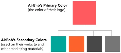
Source: Branding Compass
Typography follows the same guidelines. A freelance designer who doesn't know your preferred font or spacing will just find the closest match.
Now imagine that 15 freelancers do the same, and each of them chooses a different option while saying something like “I thought your font was a Comic Sans, not the Lexend”. So, it’s better to determine 3-5 key fonts and fallback generic options.
Imagery and Visual Assets
Even when basics are in place, mismatched photos and illustrations can damage your visual branding. That’s why you need to provide composition guidelines for all visual assets, moodboards for photos and videos, and a defined illustration style. Without these, assets from different creators start pulling in different directions — even when the colors and fonts are right.
Tone and Messaging
Tone of voice is where a lot of brands drop the ball. Yet, it’s just as important as visuals. Even experienced copywriters need a reference for your specific personality and vocabulary. Otherwise, they write well, just not like you.
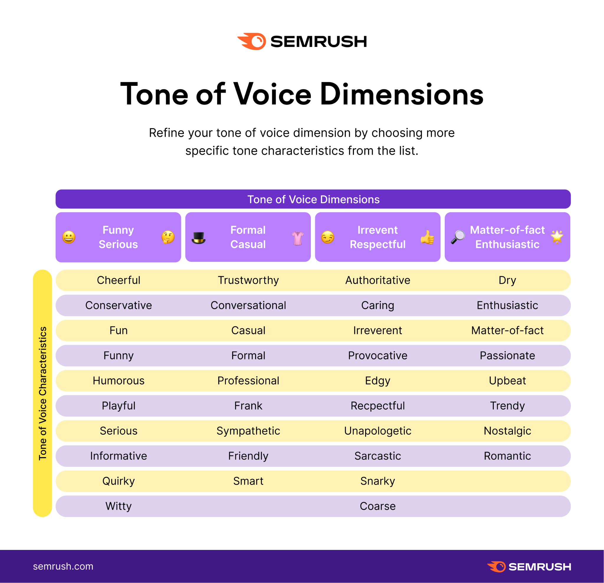
Source: Semrush
File Formats and Accessibility
Most teams distribute their brand guide in PDF documents, and for good reason. A PDF opens on any device without special software. So your vendor with a phone on Android sees the same thing as your designer on a Mac. And if you need an extra layer of control, you can protect PDFs with a password, watermark, or DRM protection.
How to Create a Brand Style Guide: Step-by-Step Instruction
The process of creating a brand guide sounds more complicated than it is. Once you understand your core identity, you’ll easily write the documentation.
Step 1. Audit Existing Brand Assets
Pull together every branded asset your team currently uses, from logos and fonts to templates for socials. Then, audit for inconsistencies like weirdly shaped logos or interchangeable fonts. Everything you find here is exactly what your brand guide will fix.
Step 2. Define Core Elements
As mentioned, every brand should have a logo, specified color palettes, and typography. Define every logo variation and when to use each. Set the typographic hierarchy for headline fonts, body fonts, and fallbacks for non-brand environments.
These elements form the backbone of your visual branding. Everything else builds on top of them.
Step 3. Document Visual and Content Rules
When you have core visuals, set guidelines for specific situations to ensure brand consistency. Define content rules in the smallest details. Murphy's Law applies here: if a guideline can be misinterpreted, it definitely will be.
Provide real examples for your moodboards. If you don’t have any, just find a reference from your competitors to temporarily “fill the hole”. Once you get your original samples, update the instructions.
Step 4. Organize and Format the Guide
Now, structure the branding guide based on the “inverted pyramid” approach. Start with the most crucial for your identity and gradually go into details.

Source: Indeed
Then, save it in a PDF format. It’s a golden standard of brand books since it requires no special software, and looks the same on every device. Whether you're onboarding a new hire or briefing an external vendor, everyone gets the same document.
Managing and Updating Your Brand Guide with PDF Tools
As your brand evolves, so does your handbook. You need to regularly update it to ensure that every stakeholder follows the same rules. If you send it as a Word doc or JPEG image, formatting and colors will shift depending on the software.
The brand guide in PDF prevents any inconsistencies. It won’t change the structure or colors overnight. What you send is exactly what everyone sees. When different teams maintain separate sections, merging PDFs into one master document keeps everything consolidated. It’s better to connect different ready-made pages, as it reduces the risk of formatting errors.
Compress the PDF before sending. Anything over 10MB may cause problems with email limits and slow connections. And before it goes out, protect the PDF: a password or watermark keeps the file from being edited or redistributed without your knowledge.
For such a task, it’s better to use a specialized online PDF editor like PDF House, Adobe Acrobat, or iLovePDF. Unlike general design software, specialized tools merge and protect sections without touching the formatting.
Best Practices for Maintaining Brand Consistency at Scale
Guidelines are only as effective as the habits built around them. Follow these practices to ensure clear and consistent visual branding.
Centralize Access to the Guide
A handbook pinned in Slack is just another random document. You need to make a guideline easily accessible to any stakeholder. Thus, choose one easily accessible location and share that link with everyone who needs it. You may place it in Notion’s database, Google Drive, or even on your site.
Regularly Update the Document
If you changed your logo and brand colors, archive the old guide immediately. It’s just a historical document. To prevent working with outdated instructions, schedule regular reviews every few months and after every major change.
Assign one person responsible for updates. Typically, it’s someone from the marketing department, as they know how to ensure brand consistency. This employee collects changes, merging them into the master file, and pushing the new version to everyone.
Train Teams and Stakeholders
Remember that most people skim documents, even if they tell you that they thoroughly read the document. If you want to be sure that they actually understand the guide, run regular training sessions and tests.
Spend your time onboarding new hires and briefing vendors. When they understand what's at stake, they're more likely to treat the guide as a real reference.
Use Templates for Recurring Content
Every piece of content your team produces more than once should have a template. Yes, even if it’s Instagram Stories or ad banners. That way, you’ll always know that the creative team will do what you expected from them. Also, templates eliminate the blank canvas problem that slows down designers and writers.
Ensure alignment across marketing, design, and product teams
You are hiring only the best people from the industry. And naturally, they’ll have their own opinions on how to make your content better. While you must give them the room to interpret, check that they stick to a branding style guide.
Conclusion
The first step to becoming a successful brand is to become easily recognizable. And you don’t even need to spend a fortune on that. Firstly, build a digital brand style guide so every stakeholder will know how your content should look and feel.
Save it as a PDF document, as it opens on any device with no distortions. JPEG can be a victim of lossy compression that shifts colors. A Word document can change the whole layout if a user even clicks on a picture. Meanwhile, PDF always stays the same, being protected from accidental edits.