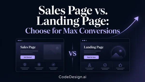
How to Improve Conversion Rates: 2026 Guide

You've put real effort into your site. The traffic is arriving. Maybe ads are running, content is ranking, or referrals are finally picking up. But the numbers that matter, sales, demo requests, booked calls, form fills, still feel flat.
Most owners react the same way. They tweak the hero headline, swap a button color, shorten a sentence, add a testimonial, then hope something sticks. Sometimes a small change helps. More often, it burns time because the page wasn't the main problem in the first place.
A lot of advice on how to improve conversion rates starts too late in the process. It assumes the visitor was a good fit, understood the offer, trusted the page, and only needed a better CTA. In practice, newer optimization guidance puts more weight on diagnosing upstream problems like poor audience targeting or message mismatch before redesigning the page itself, as noted in Time to Reply's guide on increasing conversion rate.
That distinction matters when you're working with limited budget, limited traffic, and no appetite for endless experiments.
Table of Contents
- Stop Guessing Why Visitors Leave
- Find the Leaks by Auditing Your Conversion Funnel
- Prioritize Fixes for the Biggest Impact
- Design Experiments That Give Clear Answers
- Targeted Optimizations That Move the Needle
- From Test to Triumph Analyzing and Scaling Your Wins
Stop Guessing Why Visitors Leave
Small businesses usually don't have a traffic problem first. They have a clarity problem, a trust problem, or a fit problem. If the wrong people land on the right page, conversion stays weak. If the right people land on a page that doesn't match the promise in the ad, conversion stays weak. If the page is solid but the form feels invasive, conversion still stays weak.
That's why random tweaking is such a poor use of time. It treats all conversion problems as design problems.
A better starting point is diagnosis. Look at the whole path a visitor takes, from click to conversion, and ask three blunt questions:
- Was the traffic qualified: Did the visitor likely want this exact offer, or did your targeting cast too wide a net?
- Did the message match: Does the landing page continue the same promise, audience, and intent from the ad, email, or search result?
- Was there friction at the point of action: Did the user hit confusion, doubt, or extra work right before converting?
Practical rule: If you can't explain why people are dropping off, you're not ready to test button colors.
Outside checklists can still help, as long as you use them as prompts instead of prescriptions. A good example is this roundup of actionable conversion tactics that can help you spot common friction points once you know where to look.
Direct visitor feedback is also useful when your analytics can't explain hesitation. If you need a lightweight way to gather objections, questions, or purchase blockers, a tool like CodeDesign's customer feedback generator can help you structure prompts for surveys, forms, or post-visit follow-ups.
Diagnose before you redesign
Founders often jump straight to visual changes because those are visible and easy to discuss. The harder work is checking whether the page is solving the right problem at all.
Use this lens before touching the layout:
| Question | If the answer is no | What to inspect |
|---|---|---|
| Does the traffic have clear intent? | The page may be fine | Ad targeting, keywords, audience filters |
| Does the page match the click promise? | You may have message dissonance | Ad copy, headline, hero section |
| Is the next step obvious and low-friction? | You may have UX resistance | Form length, CTA wording, navigation clutter |
When owners learn how to improve conversion rates, this is the shift that saves the most time. Don't start with tactics. Start with the reason the tactic would matter.
Find the Leaks by Auditing Your Conversion Funnel
A conversion funnel audit gives structure to the mess. Instead of asking, “Why isn't this site converting?” ask, “At which step are we losing people, and what evidence do we have?”
Established CRO frameworks recommend working in sequence, starting with heuristic analysis, then qualitative research, quantitative analysis, hypothesis creation, and A/B testing, so teams fix the biggest leaks instead of optimizing isolated elements by intuition, as explained in Invesp's conversion framework.

Start with the numbers
First, map the path you want visitors to take. For a lead-gen business, that might be landing page, service page, form start, form submit, thank-you page. For SaaS, it might be homepage, pricing, signup, onboarding start.
Then inspect the data step by step.
Focus on a short list of metrics:
- Goal completions: Which pages or sessions lead to the action you care about.
- Drop-off points: Where people stop moving forward in the funnel.
- Exit behavior: Which page ends the session most often when a user was otherwise progressing.
- Segment differences: Whether mobile, paid traffic, branded search, or returning users behave differently.
You don't need an enterprise setup to do this. Google Analytics, Search Console, ad platform reports, and basic form tracking are enough to start.
What matters is the sequence. If a large share of users land on a page and never move to the next step, that page deserves attention. If lots of users click through but abandon the form, the issue probably sits inside the form, not the landing page.
Don't ask which page looks weak. Ask which step loses the most qualified intent.
If you want a broader reference for organizing your audit into a repeatable workflow, The AI CMO has a useful complete CRO playbook that complements this process well.
For teams building or restructuring flows, CodeDesign's AI sales and marketing funnel builder is one practical option for laying out pages, paths, and conversion steps without stitching multiple tools together.
Then look at real behavior
Quantitative data tells you where the leak is. Qualitative review tells you why it exists.
Session recordings, heatmaps, on-page feedback, and support conversations are the fastest ways to spot friction. Watch what users do on the pages with the largest drop-off. Don't watch randomly. Filter for the exact step where intent breaks.
Here's what usually shows up:
- Hesitation loops: Cursor movement, repeated scrolling, and pauses near the CTA.
- Dead clicks: Users click text, icons, or images that aren't interactive.
- Navigation escapes: People leave a high-intent page to hunt for pricing, proof, or FAQs.
- Form anxiety: Repeated edits, field abandonment, and visible error loops.
- Mobile struggle: Mis-taps, zooming, keyboard issues, and hard-to-complete inputs.
What to record in your audit notes
Avoid vague observations like “users seem confused.” Write down patterns you can test.
Use notes like these instead:
- Users scroll back up before clicking the CTA. They may need reassurance or missing information near the action point.
- Visitors leave the form when they hit phone number or company size. Those fields may feel too demanding for the offer.
- Mobile users stall on checkout after seeing a promo field. The field may be distracting from completion.
- Ad traffic lands on a page that doesn't repeat the same offer language. Message mismatch may be weakening trust immediately.
That's how you audit a funnel without guessing. You identify the step, observe the friction, and write a testable reason for the drop-off.
Prioritize Fixes for the Biggest Impact
A decent audit usually produces too many ideas. That's good. It means you're finally seeing the site clearly. It also creates a new problem. You can't fix everything this month.
Teams often drift back into opinion. Sales wants more trust signals. Design wants a cleaner hero. Someone insists the button color feels weak. Instead of debating, score the opportunities.
The reason this matters is simple. The average website converts about 2.35% of visitors, meaning roughly 97.65% don't convert on the first visit, according to Keywords Everywhere's CRO statistics roundup. When that much traffic doesn't convert, small friction fixes matter. But only if you choose the right ones first.

Use PIE instead of gut feel
PIE stands for Potential, Importance, Ease. It's simple enough for a founder, freelancer, or small team to use in a spreadsheet.
- Potential asks how much upside a fix might have. A broken checkout step has more potential than rewriting a footer line.
- Importance asks how valuable the traffic is on that page. Your pricing page matters more than a low-intent blog post.
- Ease asks how hard the change is to implement. Editing copy is easier than rebuilding a multi-step application flow.
Score each item with plain language if you prefer. High, medium, low works fine. The point isn't mathematical precision. The point is consistency.
The best first test usually isn't the cleverest idea. It's the fix sitting on a high-intent page with obvious friction and low implementation cost.
A simple example
Say your audit shows three issues:
| Opportunity | Potential | Importance | Ease | Priority |
|---|---|---|---|---|
| Remove non-essential fields from demo form | High | High | High | Do first |
| Rewrite homepage hero copy | Medium | Medium | High | Do later |
| Redesign full pricing page layout | High | High | Low | Plan carefully |
Why does the form change win? Because it sits near the conversion event, affects qualified users directly, and usually doesn't require major design or engineering time.
This also helps you avoid a common waste pattern. Teams often pick the most visible project, not the most valuable one. A full redesign feels productive. A field-removal test feels small. Yet the small fix often teaches more and ships faster.
What usually deserves priority
If you're stuck between options, these categories usually deserve early attention:
- Broken or confusing paths: Forms that fail, unclear buttons, missing next steps.
- High-intent pages: Pricing, checkout, demo request, quote request, contact pages.
- Mobile friction: Input pain, cluttered layouts, hidden reassurance.
- Message mismatch: Paid traffic landing on generic pages that don't continue the original promise.
Learning how to improve conversion rates is mostly about sequencing. You rarely need more ideas. You need a better order of operations.
Design Experiments That Give Clear Answers
Once you know what to test, don't jump straight into changing five things at once. If the result improves, you won't know why. If it drops, you won't know what caused the damage.
A useful experiment starts with a hypothesis, not a hunch.
Write a hypothesis that can fail
A weak testing idea sounds like this: “Let's make the page cleaner.”
A strong hypothesis sounds like this: changing the CTA copy from a vague next step to a more explicit action should improve sign-ups because visitors will understand the commitment more clearly.
The difference is accountability. A real hypothesis names the change, the expected effect, and the reason behind it.
Use this pattern:
- Change: What single thing are you modifying?
- Audience or page: Where is this happening?
- Expected outcome: What behavior should change?
- Reason: Why do you think this friction exists?
For example:
- Better: Reducing the number of required form fields on the demo request page should increase submissions because users currently abandon when the form asks for information too early.
- Worse: Make the form nicer and see what happens.
Keep the test clean
CRO guidance is very clear on a few points. Test one variable at a time, and let the test run long enough to reach statistical significance before calling a winner, as emphasized in the earlier Invesp framework reference.
That matters because small businesses often sabotage their own tests in predictable ways:
- They stop early: A few good days doesn't mean the variant has won.
- They bundle changes: New headline, new image, new form, new CTA. Now the result is impossible to interpret.
- They choose the wrong success metric: More clicks can still mean worse lead quality.
- They test low-traffic pages: You can wait a long time for a usable answer.
If the page doesn't get enough traffic, run a stronger qualitative review and ship the highest-confidence fix. Not every decision needs a formal experiment.
What to measure besides the headline metric
Your primary metric should stay simple. Form submits, purchases, booked calls, free trial starts. But don't ignore downstream quality.
Check whether the change also affects:
- Lead quality: Are the leads still worth following up?
- Sales progression: Do submissions become real opportunities?
- User behavior: Are people spending less time because they're finding answers faster, or because they're bouncing?
- Segment performance: Did desktop improve while mobile got worse?
Many first-time teams get burned when they celebrate a surface-level win that hurts the business later.
A clean test should leave you with a sentence you can trust: “This change improved the action we care about, for the right users, without damaging quality.” If you can't say that, keep digging.
Targeted Optimizations That Move the Needle
Once the diagnosis is done, the tactical work gets much easier. You're no longer looking for generic best practices. You're fixing a specific point of friction for a specific audience at a specific step.
A lot of high-converting pages look different on the surface. What they share is simpler. They reduce effort, remove uncertainty, and make the next action feel safe.
Here's one example of the kind of page-building environment many teams use when iterating on landing pages and funnels:

Fix forms before polishing visuals
Forms are one of the most common conversion choke points, especially for service businesses, SaaS demos, and lead-gen pages.
The practical fixes are usually straightforward:
- Remove fields you don't need now: Ask only for information tied directly to the conversion goal.
- Use inline validation: Catch mistakes while the user is typing, not after they hit submit.
- Break long flows into steps: Multi-step forms often feel easier because users can process one decision at a time.
- Show progress clearly: A visible progress indicator reduces uncertainty in longer flows.
These recommendations are consistent across expert guidance on form optimization and checkout friction in Quantum Metric's conversion improvement article. The same source also notes that customer reviews and quotes can raise conversion rates by as much as 270%, and positive social support was associated with 34% more purchases, which is why trust cues belong close to the form, not buried elsewhere on the page.
A common before-and-after pattern looks like this:
| Before | After |
|---|---|
| “Request a Demo” form asks for role, company size, budget, phone, industry, timeline | Form asks for name, work email, company, then gathers extra detail later |
| Errors appear only after submit | Errors appear inline beside the field |
| One long block of fields | Short grouped steps with visible progress |
Strengthen copy and trust together
Copy usually fails in one of two ways. It's too vague, or it makes big promises without proof.
A better page says what the offer is, who it's for, and what happens next. Then it backs that up with evidence. In this context, trust and clarity need to work together.
Good conversion copy tends to do four things well:
- Names the problem plainly: Visitors should recognize themselves quickly.
- States the benefit clearly: Not features first. Outcome first.
- Reduces ambiguity around the CTA: “Book a demo” and “Get pricing” aren't interchangeable.
- Places proof near decision points: Testimonials, reviews, logos, or brief validation close to the action.
If you need help generating stronger CTA variations, a focused tool like CodeDesign's website call to action generator can help you explore clearer wording without defaulting to generic “Submit” buttons.
A testimonial in the wrong place often does less than a short, credible proof line beside the CTA.
For a founder-led business, this might mean replacing a fluffy headline with a more specific promise, then adding one short customer quote directly above the form. For ecommerce, it might mean surfacing reviews, delivery clarity, and return reassurance right beside the buy button.
A short walkthrough can help you visualize how these page improvements fit together in practice:
Speed and mobile are conversion work
Teams often treat speed as a technical clean-up task. It isn't. It's part of the conversion path.
The same Keywords Everywhere benchmark cited earlier notes that a 1-second delay in page load time can reduce conversions by 7%. That makes speed one of the most impactful fixes on landing pages, forms, and checkout flows.
For mobile, the issue isn't just responsive layout. It's decision-making under constraints. Smaller screens amplify clutter, uncertainty, and input effort.
Useful mobile fixes include:
- Autofill support: Reduce typing wherever possible.
- Inline validation: Prevent error loops on small screens.
- Progress indicators: Help users understand how much is left.
- Collapsed promo fields: Keep coupon boxes from distracting users during checkout.
- Clear hierarchy: Put trust, value, and the primary action in a tight visual flow.
The pages that convert well on phones don't always look minimal. They look focused. They preserve essential information while stripping away competing tasks.
That's the practical side of how to improve conversion rates. Not by copying a template, but by removing the exact friction your audit uncovered.
From Test to Triumph Analyzing and Scaling Your Wins
A test ending is not the finish line. It's a decision point.
If a variant performs better, the obvious move is to implement it. But good operators read beyond the top-line result. They check whether the outcome holds across devices, traffic sources, and downstream business quality. A lift that looks great in the testing tool can still create mess for sales or support.
Read the result like an operator
Start with the primary conversion metric. Then ask harder questions.
- Did the improvement happen for the audience you care about most?
- Did mobile behavior improve, stay flat, or get worse?
- Did lead quality hold up after the form got easier?
- Did users move faster because the path got clearer, or because they disengaged?
This is especially important on mobile. Actionable guidance from Unbounce's conversion rate article stresses reducing cognitive load and form friction on phones through tactics like autofill, progress indicators, and collapsing non-essential fields. If your winning variant improves desktop but still creates mobile effort, the job isn't done.

Scale the learning, not just the variant
The fundamental asset from any test is the insight.
If a shorter form wins, the lesson may be that your audience wants lower commitment early. Apply that to other forms, quote requests, and booking flows. If clearer CTA language helps, look at email buttons, pricing page actions, and in-product prompts. If message-match improves landing page performance, tighten the connection between ads and page copy across campaigns.
Keep a simple test log with these fields:
| What to log | Why it matters |
|---|---|
| Hypothesis | Prevents random retesting later |
| Change made | Documents the variable clearly |
| Primary result | Shows whether the test answered the main question |
| Secondary effects | Catches quality or UX trade-offs |
| Next action | Turns the result into operational follow-up |
Winning tests improve a page. Losing tests improve your judgment.
This is the part many small teams skip. They ship the winner and move on without documenting why it worked. That's how useful learning gets lost.
Conversion optimization becomes sustainable when each round produces a sharper understanding of your buyers. Over time, the site gets clearer, forms get easier, traffic gets better aligned, and testing gets less random. That's what a mature process looks like, even on a small budget.
If you want a faster way to build, test, and refine pages without handing everything to a developer, CodeDesign.ai is one practical option. It lets you generate and edit websites, landing pages, and funnels with AI assistance, use built-in writing tools for copy and CTAs, publish on hosted infrastructure, or export clean code when you need more control.