
Website Templates Photography
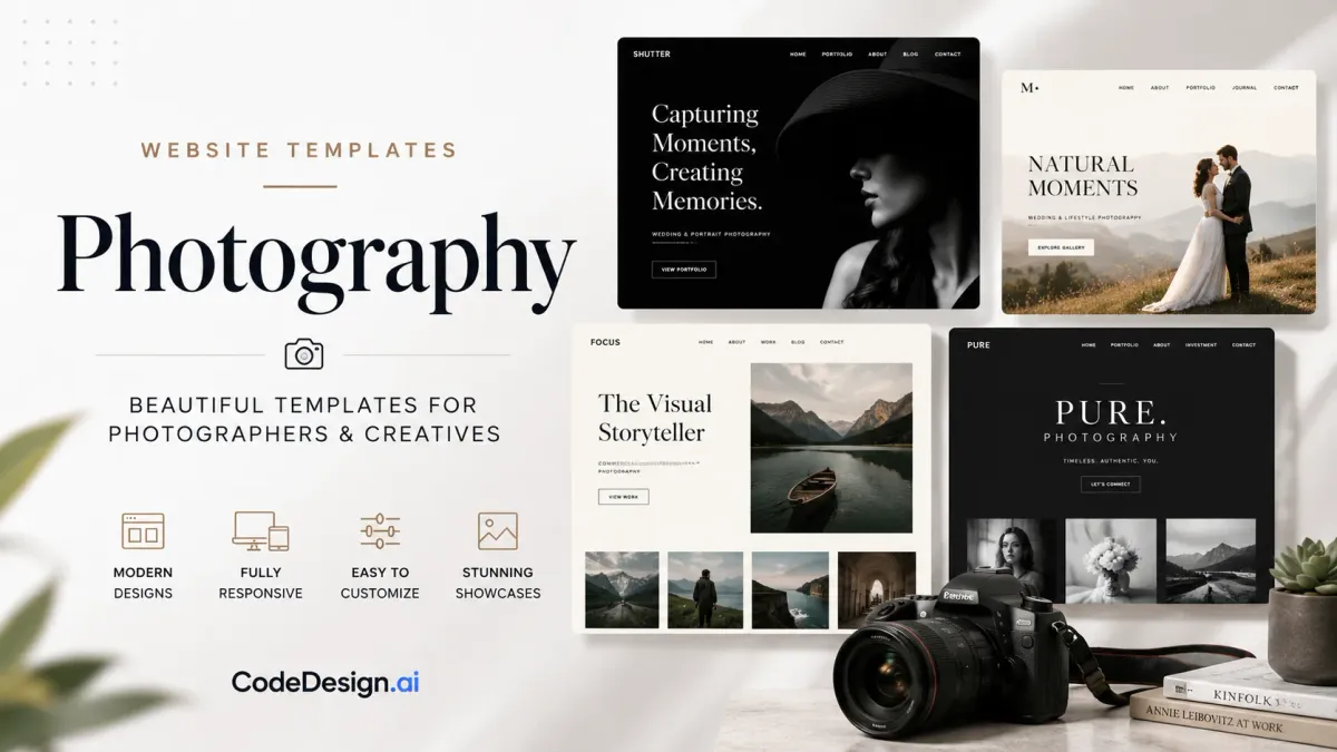
You know the feeling. The portraits are strong, the retouching is clean, the selects are finally ready, and then the website turns into the weak link. A gorgeous hero image lands on a template that drags on mobile, buries the contact form, and makes the whole portfolio feel heavier than the work itself. That's why website templates photography should be chosen like a business asset, not like wallpaper.
Photographers don't lose inquiries because their camera isn't good enough. They lose them because the site loads slowly, the navigation gets confusing, or the visitor can't find a clear next step fast enough. The right template handles the quiet work in the background, it loads the images cleanly, keeps the structure readable, and makes booking feel obvious without yelling for attention.
Table of Contents
- Why Your Photography Template Choice Matters More Than Your Camera
- What to Look For in a Photography Website Template
- Comparing Gallery Layouts for Photographers
- Customizing Your Template With AI and Drag-and-Drop
- Image Optimization and SEO That Move the Needle
- Publishing, Hosting, and Keeping Ownership of Your Site
- Your First Week With a New Photography Template
Why Your Photography Template Choice Matters More Than Your Camera
A wedding photographer can shoot a beautiful ceremony, then send the couple to a portfolio that opens with a massive hero image, stacked animations, and a menu that disappears into a tiny icon on mobile. The work is strong. The site feels weak. That mismatch costs inquiries, because the template is the first proof of whether a visitor trusts the photographer enough to reach out.
The portfolio is usually where people decide. In a review of top photographer websites, 67% used their site under their personal name, 15% did not load securely on HTTPS, and 85% had no contact information on the homepage, while sites typically had between 2 and 26 navigation links (Foreground Web photography website statistics). Those figures point to a simple truth. The template affects trust, reachability, and whether the visitor can act without friction.
Screenshots don't book clients, pages do
A template can look excellent in a preview and still fail in practice. The common mistake is choosing a design for the full-screen mockup, then discovering it forces oversized media, awkward spacing, or a homepage that hides the inquiry path below the fold. That is why I treat the template as the site's operating system, not its decoration.
Practical rule: if the homepage does not make the visitor understand who the photographer is, what they shoot, and how to contact them within a few seconds, the template is working against the business.
The best-performing portfolios do the boring things well. They keep the path to contact obvious, preserve image quality without bloating the page, and make the site feel confident on a phone in a coffee shop, not just on a wide desktop monitor. That matters because a visitor rarely arrives with patience. They arrive with a quick scan, a comparison against two or three other photographers, and a short attention window.
Template libraries have expanded fast, which makes selection harder, not easier. As of March 2025, Squarespace offered 186 website templates, up from 110 in 2023, a 69.09% increase in two years, while other libraries cited in the same roundup included 100 core templates on Duda, over 800 premium templates on Bluehost, and over 10,000 templates on Nicepage as of 2023 (SendPhoto template roundup). More choice means more chances to pick something pretty but impractical. A strong template saves time later because it gives you a structure that already supports the kind of client action you want. If you are comparing options, a practical place to start is CodeDesign.ai templates, where the layout decision is tied to how the site will be built and maintained.
What to Look For in a Photography Website Template
A template looks polished in a demo, then falls apart once you load it with real work. Open it on a phone, drop in a few large gallery images, and check what happens to the first screen, the captions, the contact path, and the page flow. If the template cannot handle a heavy visual portfolio without slowing down or hiding the next step, it will create more cleanup than it saves.
The seven checks that matter
A practical buying rubric keeps the choice grounded:
- Fast hero image load: Does the opening image appear cleanly, or does it stall and shift while the page settles?
- Clean grid layout: Can the template handle mixed aspect ratios without looking broken?
- Mobile-first design: Does the menu, gallery, and text stack naturally on a smaller screen?
- Intuitive navigation: Can a visitor find galleries, pricing cues, and contact paths without hunting?
- SEO-friendly structure: Are headings, text blocks, and page sections arranged so search engines can understand them?
- Gallery customization: Can you change how projects are displayed without rebuilding the whole site?
- Support and updates: Does the platform give you a workable path for fixes and changes after launch?
That checklist matters because image-heavy sites need more than style. For photography websites, a strong template should support fullscreen or masonry galleries, lazy loading, and image compression, while still behaving well on mobile devices. Showit guidance on photographer templates lays out the same basic trade-off, the template has to carry visual work without turning every page edit into a technical chore. Pretty demos often hide that problem until after launch.
A good template also needs room for business basics. The homepage should leave space for an inquiry button, a contact block, or at least a direct route to booking. The safer choice is usually the one that lets the portfolio breathe without burying the next step. If you are comparing collections inside the CodeDesign.ai template library, look for templates that already support image-rich pages, clear CTAs, and flexible section editing instead of designs that force every photographer into the same visual rhythm.
A template should reduce decisions after launch, not create them.
When a demo leans on decorative clutter to feel premium, treat that as a warning. Strong photography templates look calm because they frame the work instead of competing with it.
Comparing Gallery Layouts for Photographers
A gallery layout shapes how the work lands before a visitor reads a single caption. A wedding portfolio, a fine art archive, and a commercial headshot site each need a different rhythm. The wrong layout makes strong images feel cramped, repetitive, or oddly hard to scan.
Which gallery pattern fits the job
| Layout | Best For | Mobile Performance | Lazy Load Friendly |
|---|---|---|---|
| Masonry | Mixed aspect ratios, weddings, lifestyle work | Usually solid if spacing stays simple | Strong, if images are handled well |
| Fullscreen sliders | Hero-driven portfolios, a few showcase images | Can feel heavy and slower to browse | Mixed, because each slide has to load cleanly |
| Justified grids | Large sets of similar images, editorial-style galleries | Good when the grid stays responsive | Good, as long as images aren't oversized |
| Stacked scroll galleries | Narrative projects, slow visual storytelling | Often comfortable on mobile | Good when media is compressed and sequenced carefully |
Masonry gives flexibility. Mixed crop ratios feel natural, and the layout can handle a portfolio with both vertical portraits and wide environmental shots. Fullscreen sliders create drama, but they are risky when a photographer has a lot of work to show, because visitors have to click or swipe through every frame. Justified grids are tidy and efficient, though they can feel rigid if the work is stylistically diverse. Stacked scroll galleries work well when the story matters as much as the frame, but they need discipline so the page does not turn into an endless wall.
The performance issue is practical, not theoretical. Photography sites are image-heavy by nature, and template guidance now emphasizes lazy loading, image compression, and mobile-first responsive behavior because those choices protect speed while preserving the visual quality clients expect (Showit guidance). A layout that looks premium but forces oversized media or slow transitions can hurt both user experience and credibility.
A template can look excellent in a preview and still fail in practice.
The safest default for most working photographers
If the visual language is not fully defined yet, masonry is usually the least risky starting point. It handles mixed image ratios without demanding a perfect editorial system, and it gives enough structure for a portfolio that may grow into new sessions, new categories, or client-proof galleries later.
If you are comparing options inside CodeDesign.ai's free portfolio site templates, test the gallery on a phone first, then on a larger display. The template should keep the sequence readable in both places without forcing you to rebuild sections every time the content changes.
Customizing Your Template With AI and Drag-and-Drop

A template only becomes recognizable once the photographer strips out the generic bits. The default hero shot, the stock copy, and the placeholder CTA usually tell the wrong story. A few targeted edits can make the site feel like an actual business instead of a demo that never got dressed.
The edits that change the site fastest
Start with the opening frame. Replace any stock image with a signature shot that says what kind of work this is, then rewrite the headline so it names the service in plain language. A vague line about creativity usually underperforms a direct statement about weddings, portraits, commercial work, or whatever the studio sells.
Then move to the about page. The best about page on a photographer site acts like a filter, not a biography dump. It should help the right client feel confident and the wrong client self-select out.
- Swap the hero image: Use one image that carries the style of the whole portfolio.
- Tighten the headline: Say what the photographer does in one clear line.
- Add a booking CTA above the fold: Make the next action visible immediately.
- Trim the about copy: Keep only the details that build trust or clarify fit.
- Standardize typography: Keep captions, headings, and body text consistent across every page.
- Check section spacing: Remove crowded blocks that make the gallery feel cramped.
That workflow fits well inside an AI-first builder. In CodeDesign.ai's AI website builder, you can describe the brand, regenerate sections that feel generic, and then move into drag-and-drop edits for spacing, type, and CTA wording. That combination works especially well for photographers who want speed without giving up control over the final feel.
The right time to bring in a designer is usually after the structure is already clear. If the site still needs brand direction, AI prompts can get the first version done quickly. If the visual identity is already established and the layout needs subtle polish, a designer can refine the last 10% without rebuilding the whole site.
Image Optimization and SEO That Move the Needle
A photography site can look polished and still lose inquiries if the hero file is too heavy, the heading copy is vague, or the contact path sits too low on the page. The fix is not more visual polish. It is a tighter image workflow and a template that handles search, accessibility, and conversion basics without making the gallery feel clumsy.
The image pipeline that keeps the page usable
Start with export settings. A portfolio image needs enough detail to show texture and color accurately, but it should not be so large that every page loads like a waiting screen. Use modern formats, compress with care, and check how skin tones, shadows, and fine detail survive the process. The goal is not the smallest file possible, it is the smallest file that still presents the work well.

A practical workflow is simple:
- Export in WebP at the right width. Match the file to the display size instead of uploading camera-native dimensions.
- Compress before upload. Keep the image crisp, but do not carry extra weight onto the page.
- Write descriptive alt text. Use language that explains the image, not generic filler.
- Let lazy loading do its job. Do not force every gallery image to load at once.
That matters because photography sites live or die on how images are handled. Showit guidance points to lazy loading, image compression, and responsive behavior as core requirements, not optional extras. A weak template makes those choices harder by forcing oversized galleries or awkward image treatment.
SEO and trust signals still matter on a visual site
Search engines still need structure. Use headings that describe the service, captions that add context, and page sections that let each gallery make sense without asking the crawler to guess. The homepage also needs trust cues, because the stats on photographer sites show how often those cues are missing. In the review cited earlier, 15% of sites did not load on secure HTTPS, and 85% had no contact information on the homepage (Foreground Web photography website statistics). Those are easy failures to avoid, and they directly affect whether a visitor feels safe enough to inquire.
A blog or journal helps a portfolio feel active. Not every photographer wants to write long posts, but a few useful entries about sessions, venues, or client work can give search engines more context and give potential clients a reason to trust the studio before they reach out. If you want the technical side to stay clean while you work on content, the CodeDesign.ai SEO guide is a practical reference for keeping the structure readable without turning the site into a keyword mess.
For photographers comparing templates with booking growth in mind, Wedding Studio is a useful example of how presentation, clarity, and inquiry flow can work together without crowding the page.
Practical rule: if a page looks stunning but crawls poorly or hides the contact path, it is not doing its job as a business page.
Publishing, Hosting, and Keeping Ownership of Your Site
The safest photography template is the one that doesn't trap you. Plenty of sites are easy to launch and hard to move later, and that becomes a real problem when the photographer wants a new CMS, a developer handoff, or a different hosting setup. Ownership is part of the template decision, not an afterthought.
Three publishing paths worth expecting
Managed cloud hosting is the simplest launch path. It gets the site live quickly, usually includes SSL, and reduces the setup burden for solo photographers who want to spend time shooting instead of maintaining infrastructure. WordPress sync is the middle path for people who want a familiar CMS and more conventional editorial workflows. Clean HTML, CSS, or React export is the portability path, which matters when a site may be handed off to a developer or moved to another host later.
The trade-off is straightforward. Managed hosting is easier to run. Exportable code is easier to own. WordPress sync sits between those two worlds, which can be useful if the photographer already knows that workflow or expects to hand content management to someone else.
A useful benchmark is how easy it is to change the site without rebuilding it. If a template only works inside one vendor's closed system, the photographer may get speed now and friction later. If it exports cleanly, the portfolio stays more portable as the business grows.
For photographers who want to compare how real studios package their web presence, Wedding Studio is a helpful reference because it keeps the focus on what a studio site needs to do, not just how it looks. That kind of reference is useful when you're deciding whether your template supports the business side of the site or just the visual side.
If you want a workflow that blends launch speed with ownership, CodeDesign.ai's publishing options are worth a close look. The platform supports cloud publishing, WordPress sync, and code export, which gives photographers a way to launch now without locking themselves into one path forever.
Your First Week With a New Photography Template
The first week should be about momentum, not perfection. Lock the template, choose the core pages, and put the strongest images where they'll do the most work. Don't start by polishing the last gallery before the homepage even has a clear call to action.

A simple launch rhythm keeps the project moving:
- Day 1: Lock the template and core pages.
- Day 2: Import and optimize the top 20 images.
- Day 3: Connect analytics and SEO basics.
By the end of that first pass, the site should already feel publishable. Add the contact flow, test the mobile version, and ask one trusted person to click through the inquiry path without coaching. If they get confused, the template still has work to do.
The long-term moves are easy to ignore in week one, but they're what turn a portfolio into a business tool. Print sales, client galleries, and a booking funnel all depend on a template that can grow without a rebuild. That's why the template choice matters before the launch, not after the complaints start.
If you want a photography site that's built to launch quickly, stay editable, and keep the portfolio portable, visit CodeDesign.ai and start with a template that supports galleries, contact paths, and clean publishing from the beginning. It's a practical way to turn a visual portfolio into a working website without getting stuck in one rigid setup.