
How to Turn an AI-Built Website Into an Online Store That Actually Sells
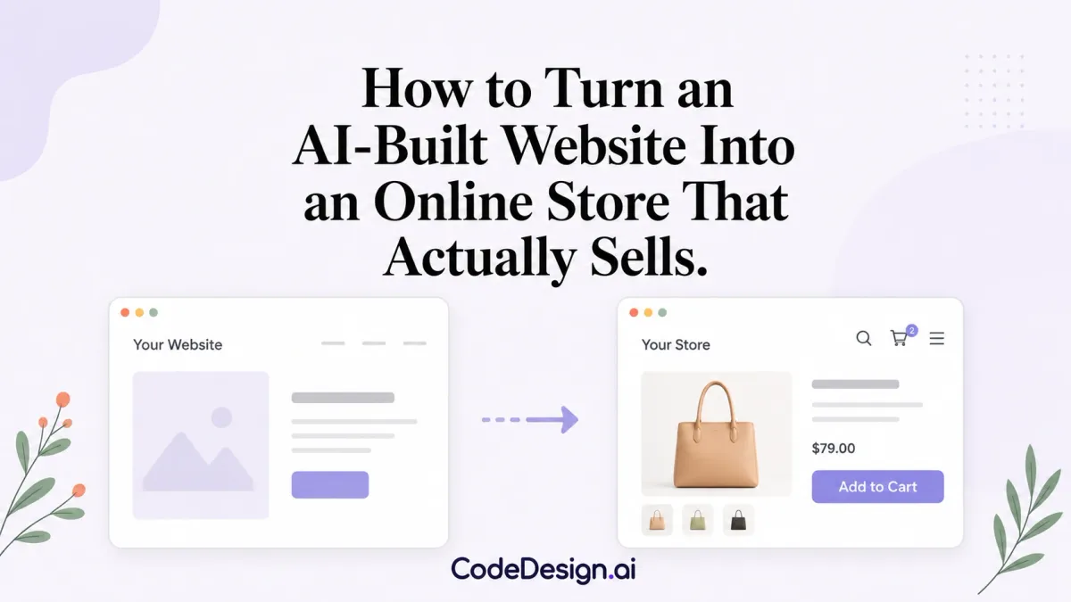
Building a website used to be the expensive part. Weeks of back and forth with a developer, a budget that crept, a launch date that didn't. Now you describe what you want, an AI builder drafts it, you nudge the layout around, and you're live before dinner. Which is wonderful, and also slightly dangerous, because the ease of launching makes it tempting to treat a store as a website with a buy button stapled on. The moment money moves through a page, the job changes.
A Store Is a Website With Consequences
The stakes explain themselves once you glance at the numbers. Somewhere around one in five retail dollars worldwide is now spent online, going by Statista's share of retail tracking, and the line keeps inching up year after year. That's a crowded room to walk into. Every shopper landing on your product page has bought from Amazon this month, probably this week, and their patience is calibrated to that experience. They won't consciously compare your checkout to Amazon's. Their thumbs will do it for them.
A brochure site can get away with quirks. A store can't, because every quirk now carries a price: the confusing menu costs a sale, the buried returns policy costs a sale, the form that rejects a perfectly valid postcode costs a sale and earns you a small grudge on top.
Pick the Commerce Layer the Way You Picked Your Builder
Founders agonise over the visible tools and rush the invisible ones. Odd, when you think about it. The same person who compared six website builders over a weekend will bolt on the first payment plugin they bump into. The commerce layer, meaning the catalogue, the cart, checkout, tax handling, and everything that happens after the click, deserves at least the scrutiny the front end got. Commerce, the company behind BigCommerce and Feedonomics, builds ecommerce technology meant to sit underneath whatever front end you've created, so the storefront you designed stays yours while the machinery below stays boring and dependable.
Boring is the compliment, to be clear. Nobody wants an exciting checkout. Once a card number is involved, shoppers want the dullest, most familiar sequence possible, and creative flourishes start reading as risk.
The invisible layer also decides how badly growth hurts. Ten orders a week, and you can run everything from a spreadsheet and goodwill. Two hundred, and suddenly you're living inside tax rules for three regions, inventory that drifts out of sync, and a returns pile with opinions. The kind of complexity that pushes most founders toward cloud finance software long before they expected to need it.Platforms handle that gracefully or they don't, and you rarely find out which before you need it. Ask the awkward scaling questions on day one, while switching is still cheap.
Three Seconds Is the Whole Game
Speed sounds like a technical detail, something for the launch checklist between SSL and favicons. In a store it behaves like a design decision, arguably the biggest one you'll make. Google's mobile speed research found 53 percent of mobile visits get abandoned when a page takes longer than three seconds, and mobile is where most first visits happen now. Three seconds. A hero video, two chat widgets, and one uncompressed banner will spend that entire budget before your headline renders.
A rough rule I hold my own projects to: every element on a product page justifies its kilobytes the same way it justifies its pixels. The 4 MB lifestyle photo might be gorgeous. Gorgeous and unseen, if half the audience left while it loaded.
Design Choices That Sell, and Ones That Just Decorate
Good store design is mostly restraint. If the fundamentals are new to you, the website design for beginners guide on this blog covers them properly, but the store-specific version comes down to a few habits. One accent colour, saved for the add-to-cart button. Product photos on consistent backgrounds. Prices that never hide. Shipping costs mentioned early instead of appearing at the final step like a penalty.
Product copy deserves the same restraint. Shoppers scan, they don't read, so the sentence that matters goes first: what it is, what it's made of, when it arrives. The poetic paragraph about your founding story can live further down the page for the three people who scroll that far. They're lovely people. There are three of them.
And learn what your tools can and can't do before you commit deeply. The honest overview of what no-code can build published here makes the point well: visual builders have grown up, but every platform has edges, and finding them before your catalogue holds 400 products is a great deal cheaper than finding them after.
Trust elements earn their spot near the buy button too. A visible returns policy, recognisable payment icons, a contact page with an address that sounds like a place. None of it is decoration; it's the online stand-in for being able to look a shopkeeper in the eye.
One more habit, unglamorous but it pays. Open your store on your phone, on mobile data, standing in a queue somewhere. That's where your customers are. The version of your store that exists on your office monitor, on fiber, in a quiet room, is a version almost nobody else will ever see.
Launch Fast, Then Slow Down
The builders got fast, and that speed is genuinely yours to keep. Spend it on the first version. After launch, the useful pace is slower: one change a week, measured, kept or reverted, no drama. A store gets started at launch and then built for years.
The founders who do well treat the site the way a shopkeeper treats a shop. Sweep the floor daily. Rearrange the window when the season turns. Renovate rarely, and only with the receipts to justify it. Less exciting than a relaunch, sure. It also works.
The Checkout Is Where Good Intentions Go to Die
Everything upstream, the photography and the copy and the tidy accent colour, exists to deliver a shopper to one screen. And that screen is where most stores quietly bleed. A customer who has added an item to the cart has already agreed with you. They want the thing. The only job left is to not talk them out of it, and stores talk them out of it constantly, usually by accident.
The classic mistake is the forced account. A shopper reaches for their wallet and the store reaches back with a signup form. Create a password, confirm the password, verify the email, then, finally, pay. Every field is a small permission slip the shopper can decline, and plenty do. Offer guest checkout and mean it. The account can be invited afterward, once the money is safely in and the relationship has earned the ask.
Then there is the number of steps. Every extra page between cart and confirmation is a fresh chance to reconsider, to get distracted, to notice the price total and wince. Collapse the sequence. Ask only for what shipping and payment genuinely require, and nothing you merely find interesting. The birthday field, the "how did you hear about us" dropdown, the newsletter checkbox pre-ticked in a way that feels sly, all of it can wait. A checkout is not a survey.
Payment options belong to the shopper, not to you. The person who lives inside a digital wallet will abandon a form that demands they dig out a physical card, and the person who trusts one particular pay-later button will follow it like a handrail. You don't have to offer everything, but offer the few your actual customers actually use, and let the platform underneath carry the compliance weight so a stray checkbox never becomes a headline.
Abandoned Carts Are Not Lost, Just Paused
Most stores treat a left cart as a death. It's closer to a pause. People shop on their phones between other things, get pulled away by a doorbell or a meeting, and mean to come back. Whether they do often depends on whether you made returning easy. A saved cart that survives until tomorrow, a single gentle reminder that doesn't grovel or panic, a link that drops them back exactly where they stopped rather than at the homepage to start over. Small mercies, and they recover sales you'd otherwise have written off as never-were.
The tone of that reminder matters more than the discount inside it. Desperation reads as desperation. A store that immediately slashes ten percent the moment you hesitate teaches shoppers to hesitate on purpose, and you've trained your best customers to wait for a coupon that now costs you margin on every order. A calm nudge beats a fire sale, and it doesn't rot your pricing from the inside.
The Work That Starts After the Sale
The sale is not the finish line; it's the introduction. What happens next decides whether you have a customer or a transaction. A confirmation that arrives instantly and reads like a human wrote it. Shipping updates that show up before the shopper thinks to worry. A package that isn't wrapped in a fight, the kind of plastic clamshell that turns unboxing into combat. These are cheap to get right and expensive to get wrong, because the memory of them is what a shopper carries into the decision to buy again, or not.
Returns deserve a special mention, because founders dread them and shoppers judge them. A generous, legible returns policy is not a loss column; it's a confidence tax you pay upfront to remove the risk that stops people buying at all. The shopper who knows they can send it back is the shopper who clicks buy without a three-day deliberation. Hide the policy, make it grudging, bury it in a link that loads slowly, and you've simply moved the friction earlier, to the moment before purchase, where it costs you the whole order instead of part of one.
Let the Store Tell You What to Fix
Once the doors are open, opinions get cheap and data gets valuable. You will have theories about why a page underperforms, and some of them will be wrong in ways only the numbers reveal. Watch where people leave. If a specific step in checkout empties the room, that step is the problem, not your prices and not your product. If a product page draws visitors and converts none of them, the mismatch is usually between what the ad promised and what the page delivers.
Resist the urge to change five things at once. Fix one, watch, keep or revert. It's slower and far less satisfying than a grand overhaul, but a redesign that moves twenty variables tells you nothing about which one mattered. The shopkeeper who rearranges a single shelf and counts what sells learns something. The one who guts the whole store every quarter just gets tired.
None of this requires the store to be finished, because a store is never finished. It requires it to be tended. The AI got you through the door in an afternoon, and that was the hard part made easy. The easy part, the part that never ends, is the daily sweeping, the seasonal window, the quiet attention that turns a website with a buy button into a shop people come back to. Launch fast. Then stay.