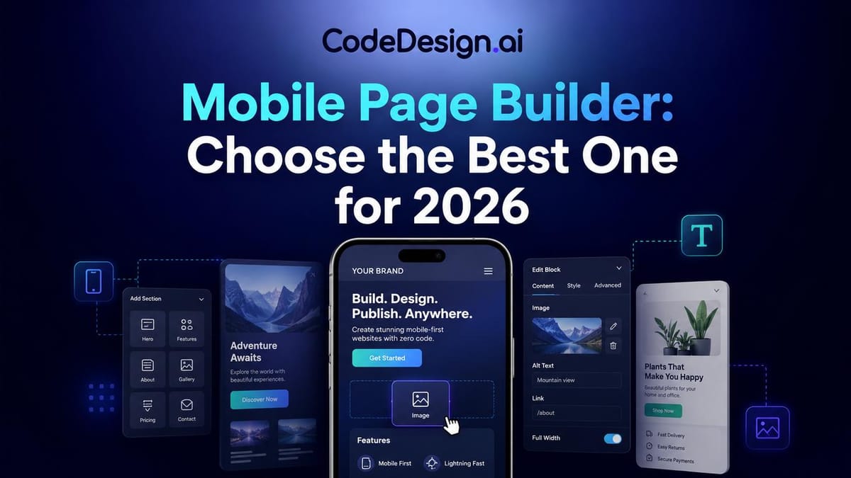
Mobile Page Builder: Choose the Best One for 2026
You're probably in one of two situations right now. Either your site looks polished on a laptop but awkward on a phone, or you're trying to launch something quickly and don't want mobile design to become a side project that eats a week.
That tension is exactly why the mobile page builder category matters. A modern business site isn't just a desktop page that happens to shrink. It has to load cleanly, guide a thumb instead of a mouse, keep forms easy to finish, and make buying or booking feel simple on a small screen. That's a different job from “make it responsive and hope for the best.”
This guide takes the practical route. Not just what features a mobile page builder should have, but how those features affect the full workflow from layout choices to speed, usability, and conversion.
Table of Contents
- Why Your Business Needs More Than a Mobile-Friendly Site
- What Exactly Is a Mobile Page Builder
- The Three Technical Approaches to Mobile Web Design
- Core Features to Evaluate in a Mobile Page Builder
- Weighing the Pros and Cons of Mobile Page Builders
- Mobile Page Builder Best Practices A Stepwise Checklist
- How CodeDesignai Delivers a Superior Mobile Experience
Why Your Business Needs More Than a Mobile-Friendly Site
A common small-business problem looks harmless at first. You open your homepage on your phone and technically everything is there. The logo appears. The headline appears. The button exists. But the text wraps badly, the image pushes the call to action too far down, and the menu feels like it was built for a desktop cursor, not a thumb.
That site is mobile-friendly in the loosest sense. It is not mobile-ready for business.
The difference matters because mobile creation is no longer a side branch of web design. Mordor Intelligence projects the broader website builder market will grow from USD 3.57 billion in 2026 to USD 7.67 billion by 2031, and within that market mobile website builders are projected to grow at 17.43% CAGR through 2031. The same forecast notes PC website builders held 63.12% share in 2025, which tells you something useful: the market still carries a desktop legacy, but growth is shifting toward mobile-first workflows in Mordor Intelligence's website builder market outlook.
Mobile usability affects business outcomes
If someone taps your ad, lands on your page, and has to pinch-zoom to understand your offer, you're asking them to work before they trust you. Most won't.
A mobile page builder exists to reduce that friction. It gives you a way to shape the phone experience intentionally instead of letting the desktop version collapse into mobile by accident.
Practical rule: A page that merely fits on a phone is not the same as a page that helps a visitor act on a phone.
That's where many entrepreneurs get stuck. They think the problem is “design.” It's usually workflow. They need a tool that lets them preview, edit, simplify, and publish with mobile behavior in mind.
A tool choice is also a UX decision
This is why a builder isn't just software procurement. It's part of your customer journey design. If you're thinking through broader strategies for UX optimisation, mobile page creation belongs in that conversation because it shapes first impressions, navigation clarity, and how quickly people can move toward a sale or enquiry.
A good mobile page builder helps you answer questions like these:
- What should appear first on a phone screen: Your value proposition, social proof, or contact action.
- What should disappear on mobile: Decorative sections, oversized images, or side-by-side layouts that become cluttered.
- What should change shape: Menus, forms, spacing, and button placement.
That's the key shift. You're not building “a smaller website.” You're designing a shorter, faster path to action.
What Exactly Is a Mobile Page Builder
A mobile page builder is a visual tool that helps you create and control how a web page behaves on phones, tablets, and desktops without rebuilding the whole site for each device.
The easiest analogy is a smart construction kit. Traditional web development can feel like ordering raw timber, cutting every piece by hand, and adjusting each angle yourself. A mobile page builder gives you pre-made parts, snap-fit sections, and device controls so you can assemble a page quickly and still adjust the result for smaller screens.
That matters because mobile isn't a niche traffic source anymore. One independent 2026 dataset reports that mobile traffic accounted for 60.67% of web traffic, while average mobile page load time was 8.6 seconds versus 2.5 seconds on desktop, making mobile pages 3.4x slower on average in this 2026 website statistics roundup. A mobile page builder is supposed to help close that gap by making mobile design and performance easier to manage together.
What it lets you do in practice
A strong builder usually combines page structure, content editing, and device preview in one workflow. Instead of asking a designer to mock it up and a developer to fix the mobile version later, you can do things like this yourself:
- Start with a layout: Pick a page template or section library.
- Adjust by device: See how the hero, text blocks, and forms appear on phone screens.
- Refine interactions: Change spacing, reorder sections, hide clutter, or simplify navigation.
- Publish faster: Ship a page without opening a code editor unless you want to.
If you're comparing platforms inside the WordPress ecosystem, this guide to Wordpress page builders is useful for understanding how visual editing tools differ from each other in day-to-day use.
The difference between a page builder and a page shrinker
Some tools only make a desktop layout smaller. That's not enough.
A real mobile page builder gives you room to make mobile-specific decisions. You may need to shorten a headline, stack columns differently, or move a form higher on the page. In a drag-and-drop environment like CodeDesign.ai's visual builder, the point isn't just convenience. It's control without turning every edit into a development ticket.
The best way to think about it is simple. The builder handles the structure, but you still decide what matters most on a small screen.
That distinction helps busy founders. You don't need to become a front-end specialist. You do need a tool that lets you shape the mobile experience deliberately.
The Three Technical Approaches to Mobile Web Design
When people talk about mobile websites, they often lump everything together. In practice, there are three different approaches, and they create very different editing and maintenance experiences.

Responsive design
Responsive design is one website that rearranges itself to fit the screen.
Imagine a flexible outfit made from stretch fabric. The same garment adjusts to different body shapes without needing an entirely different version. In web terms, the same content reflows across devices.
This is the default model most modern builders favor. Weebly's mobile website guidance describes the core idea clearly: a technically sound builder uses responsive templates plus device-specific editing controls so one set of content can adapt across screen sizes, with mobile preview and edit modes helping prevent layout breakage on publish in Weebly's mobile website feature overview.
Responsive design usually works best for businesses because it keeps maintenance simpler. One page. One URL. One content base.
Adaptive design
Adaptive design uses multiple predefined layouts for different screen categories.
The clothing analogy here is custom outfits hanging in separate garment bags. One for phone, one for tablet, one for desktop. The system detects the device and serves the version built for that size.
This can give you tighter control over layout behavior, but it also creates more design overhead. Every variation can become another thing to maintain. For larger teams with strict design systems, that trade-off might be acceptable. For a small business moving fast, it often isn't.
Separate mobile sites
A separate mobile site is a distinct mobile version of your website, often treated as its own build.
This is the old two-storefront model. Your desktop visitors enter one shop, and phone visitors get redirected to another. It can work, but it creates duplication, more upkeep, and more chances for inconsistencies between versions.
Here's a quick comparison:
| Approach | How it works | Main advantage | Main drawback |
|---|---|---|---|
| Responsive | One site adapts to different screens | Easier to manage | Can still need careful mobile tuning |
| Adaptive | Different layouts served by device type | More design control | More versions to maintain |
| Separate mobile site | Independent mobile website | Fully custom mobile experience | Highest maintenance burden |
For most entrepreneurs, responsive design is the practical standard. It gives enough flexibility without multiplying your workload. If code ownership matters too, it helps to use a builder that supports modern responsive creation and export options, such as AI HTML website builder for code export.
Responsive design handles the foundation. Good mobile editing handles the details people actually feel.
That second part is where many buying decisions go wrong.
Core Features to Evaluate in a Mobile Page Builder
Choosing a mobile page builder gets easier when you stop asking, “How many features does it have?” and start asking, “Which features help me produce a better phone experience with less rework?”
The editor architecture matters more than most buyers realize. Expert roundups note that builders with drag-and-drop or section-based editing plus a true mobile preview are what separate tools that merely scale layouts from tools that let users tune the actual mobile experience in Cybernews' mobile website builder roundup.
A visual checklist helps here:

Start with layout control, not templates alone
Templates are useful, but templates alone don't solve mobile UX. You need a builder that lets you reshape the page after the template gets you started.
Look for these capabilities first:
- Responsive templates: They give you a solid baseline so sections don't immediately break across devices.
- Live mobile preview: You should be able to see the phone version while editing, not after publishing.
- Drag-and-drop or section editing: This makes it easier to adjust order, spacing, and emphasis without touching code.
A short product walkthrough can make these differences easier to spot when you're comparing tools:
Then evaluate mobile-specific controls
The buyer's guide becomes more serious. Many builders claim to support mobile, but they only offer auto-resizing. That's not the same as control.
Here's what to inspect during a trial:
- Hide or show elements by device: Useful when a decorative desktop block becomes noise on a phone.
- Separate spacing and alignment controls: Mobile often needs tighter gaps, shorter sections, and cleaner stacking.
- Mobile-friendly navigation options: Menus should adapt cleanly, not just shrink.
- Form editing on small screens: Fields, labels, and buttons should remain easy to complete by touch.
Buyer's lens: Ask whether the builder helps you edit for mobile intent, not just mobile width.
Don't ignore ownership and future-proofing
Two features look “technical” but matter to non-technical founders too.
First, code access or export protects you from being trapped. If your team grows or you need custom development later, exported HTML, CSS, or React can make that transition smoother.
Second, performance and SEO tooling matters because mobile quality isn't just visual. You want image handling, clean page structure, metadata controls, and publishing workflows that don't create unnecessary bloat.
A concise evaluation table can keep your trial process honest:
| Feature | Why it matters on mobile | What to test |
|---|---|---|
| Template library | Speeds up launch | Are templates usable on phones without major rework? |
| Device preview | Prevents surprises | Can you switch views while editing? |
| Element visibility controls | Reduces clutter | Can you hide sections on mobile? |
| Code export | Avoids lock-in | Can your team take the site elsewhere later? |
| Performance tools | Supports speed | Are images, scripts, and page structure handled cleanly? |
| Integrations | Connects the funnel | Can forms, analytics, and marketing tools plug in easily? |
A good mobile page builder doesn't just help you make pages. It helps you make fewer compromises.
Weighing the Pros and Cons of Mobile Page Builders
A mobile page builder is a trade-off tool. That's not a criticism. It's the reason it works for so many businesses.
The biggest advantage is speed. You can move from idea to published page without waiting on a full design and development cycle. For founders testing offers, agencies shipping client pages, or marketers iterating on campaigns, that speed changes how often you can improve the site.
The second advantage is accessibility. Non-technical teams can make meaningful edits themselves. Copy changes, section reordering, CTA placement, and simple design refinements no longer need to sit in a ticket queue.
Where builders help most
Mobile builders are especially useful when your priority is operational momentum.
- Fast launches: You can publish landing pages, service pages, and campaign pages quickly.
- Lower coordination cost: Fewer handoffs between strategist, designer, and developer.
- Built-in guardrails: Responsive structures and preview modes reduce common layout mistakes.
That said, there are real drawbacks.
Where the limits show up
Absolute creative freedom is usually lower than with custom code. If your brand experience depends on highly unusual interaction patterns or very specific front-end behavior, some builders will feel restrictive.
Performance can also go sideways if the tool encourages heavy layouts, oversized media, or too many decorative blocks. A page builder doesn't guarantee a good mobile result. It just lowers the difficulty of producing one.
A builder compresses the path from idea to page. It doesn't replace judgment about what belongs on that page.
There's also a design sameness risk. If you accept the default template structure without editing for your audience, your site may look competent but generic. That isn't fatal for every business, but it does matter when trust and differentiation drive conversions.
The useful question isn't “Are mobile page builders perfect?” It's “Do they give me enough control, speed, and ownership for the stage my business is in?” For many teams, the answer is yes. The caveat is that the strongest outcomes come from using the builder as a workflow system, not a one-click shortcut.
Mobile Page Builder Best Practices A Stepwise Checklist
A strong mobile page starts before the first drag-and-drop action. It starts with deciding what the visitor needs to do quickly on a small screen. Read, call, book, buy, or submit.
The practical rules are more specific than most tutorials make them sound. Business.com's guidance on mobile-friendly websites stresses that mobile optimization goes beyond layout. Key mechanics include touch targets at least 44×44 pixels, link spacing, clickable phone numbers, input types that trigger the right mobile keyboard, avoiding intrusive pop-ups, and testing on real devices rather than relying only on emulators in this mobile-friendly website guide.

Build the page in this order
Use this checklist when you're creating or reviewing a page:
Lead with the main action
Put the core message and CTA near the top. On mobile, visitors often decide fast whether your page is worth continuing with.Trim content aggressively
Phone screens punish clutter. If a section doesn't support trust, clarity, or action, shorten it or remove it.Check every tap target
Buttons and important links should be easy to hit with a thumb. Tiny text links create hesitation and mistakes.Simplify navigation
Keep menus compact. On smaller screens, fewer choices often help more than more visibility.
Tune the interaction details
This is the part many teams skip because the page already “looks fine” in preview. But these details affect conversion.
- Use the right form field types: Phone, email, and numeric fields should trigger the right keyboard on mobile.
- Make phone numbers actionable: If calling is part of the funnel, don't make people copy and paste.
- Watch pop-ups carefully: A desktop-style interruption can swallow the usable screen area on a phone.
- Review text blocks on-device: A paragraph that feels normal on desktop can become exhausting on mobile.
Keep mobile copy shorter than you think you need. Small screens make even decent writing feel dense.
Test on real devices before you publish
Preview modes are useful, but they don't fully replicate hand position, browser chrome, keyboard behavior, or connection quirks. That's why real-device testing catches issues mock screens miss.
A final pass should answer questions like these:
| Check | What to look for |
|---|---|
| Hero section | Can you understand the offer immediately without zooming? |
| Buttons | Are they easy to tap and clearly labeled? |
| Navigation | Can a first-time visitor find key pages quickly? |
| Forms | Do fields feel easy to complete with one hand? |
| Media | Do images support the message without slowing or crowding the page? |
Homestead's builder guidance adds another useful lesson from day-to-day user pain. Mobile editing often works better when you adjust as you go, use separate text boxes when desktop copy doesn't translate well, hide elements on mobile where needed, and switch navigation to a Menu Button rather than relying on a resized desktop menu in Homestead's mobile editing advice.
That's a practical reminder. Responsive isn't the finish line. Usable is.
How CodeDesignai Delivers a Superior Mobile Experience
If you map the needs above to a real workflow, a few capabilities matter more than marketing labels. You need responsive templates, device-specific editing, a visual builder that doesn't slow you down, and a path to publish or export without boxing your business into one platform.

CodeDesign.ai fits that workflow by combining AI-assisted generation with visual editing and code export. You can start from a prompt, shift into drag-and-drop editing, switch between desktop, tablet, and mobile views, and refine the page before publish. That matters when the phone version needs its own spacing, hierarchy, or CTA placement instead of just inheriting the desktop structure.
How that looks in practice
A founder building a lead-gen page might begin with an AI-generated layout, then make mobile-specific changes inside the editor:
- move the signup form higher on the phone view
- shorten a headline that wraps awkwardly on smaller screens
- remove a decorative section that interrupts scroll flow
- tighten spacing between testimonial cards
- publish to hosted infrastructure or export code for a dev team
That combination is useful because mobile work is iterative. You often don't know what needs changing until you see the layout in a narrow viewport.
Why ownership still matters
A lot of site builders are easy at the beginning and restrictive later. CodeDesign.ai's option to publish, sync, or export helps avoid that problem. For businesses that want the speed of no-code now and the flexibility of custom work later, that's a practical advantage.
You can review its capabilities directly on the CodeDesign.ai features page. The key point isn't that one tool solves every scenario. It's that a mobile page builder becomes more valuable when it supports the whole job: generate, edit, preview by device, publish quickly, and keep control of the output.
A mobile experience succeeds when the page feels obvious to use. The right builder makes that easier. Your choices inside it still decide whether the result converts.
If you want to create pages that work well on phones without giving up editing control or code ownership, CodeDesign.ai is worth exploring. It lets you generate pages with AI, refine them in a visual editor, preview across devices, publish quickly, and export clean code when you need more flexibility later.