The Ultimate Service Business Website Blueprint for 2026

94% of first impressions come from website design for service businesses, which means prospects often decide whether you're credible before they read a full sentence of copy, according to Hostinger's website design statistics. That is the primary function of a service business website. It isn't an online brochure. It's the first sales conversation, the first trust test, and often the first filter a buyer uses to decide whether to contact you.
Most service sites fail because they're built like checklists. They have a homepage, an about page, a few stock photos, and a blog no one updates. They look finished, but they don't help a visitor take the next step. The sites that generate inquiries do something different. They make the service clear, reduce friction, and push the visitor toward one action.
That's the standard worth building for. A modern service business website should answer three questions fast: what you do, who you help, and how someone contacts or books you. Everything else is secondary.
Table of Contents
- Your Website Is Your Most Important Employee
- Blueprint Your Client-Winning Website
- Design and Copy That Builds Instant Trust
- Choosing the Right Tech to Build and Scale
- Your Pre-Launch Checklist for a Flawless Debut
- Launch and Optimize for Continuous Growth
- Frequently Asked Questions
Your Website Is Your Most Important Employee
A strong service business website works all day without waiting for office hours. It qualifies leads, answers objections, explains your offer, and routes people to the right next step. That makes it closer to a sales rep than a flyer.
The difference matters because buyers already research online before they call. If your site feels vague or dated, people don't pause and give you the benefit of the doubt. They leave, compare alternatives, and usually contact the company that made the buying process easier.
Practical rule: If a visitor can't understand your core service and how to contact you within a short scan, the website is underperforming.
Many owners overinvest in the wrong things. They debate logo size, color palettes, and whether to publish weekly articles, while actual leaks sit elsewhere. Weak service pages, buried contact options, and forms that ask too much too early are far more damaging.
A better way to think about the site is operationally:
- It should qualify demand. Explain what you do clearly enough that poor-fit visitors screen themselves out.
- It should build trust quickly. Professional layout, clear headings, and proof points reduce hesitation.
- It should capture intent. Calls, quote requests, and booking actions need to be obvious on every key page.
- It should support your team. Fewer repetitive questions and better inquiry quality save time after launch.
This is why service websites shouldn't be planned like media sites. A local consultant, agency, repair company, clinic, or contractor doesn't win because the navigation looks clever. They win because a prospect lands on the page and feels, “These people understand the problem, and contacting them looks easy.”
Blueprint Your Client-Winning Website
Around 71% of small businesses worldwide maintain a website, and over 81% of consumers research online before making a purchase, making a website a basic requirement for service businesses that want to be found and evaluated online, as noted in HubSpot's small business statistics summary. The key distinction isn't whether to have a site. It's whether the site is built around inquiry intent.
Start with the buyer, not the branding
The planning mistake I see most often is starting from aesthetics. Owners pick fonts, browse themes, and collect inspiration before they've decided what the visitor needs to feel comfortable contacting them.
Start with three planning decisions:
- Define the buyer's immediate problem. Not the broad market category. The immediate problem. “Need a reliable bookkeeping partner” is weaker than “Need month-end reporting cleaned up before investor review.”
- Choose one primary conversion action. Request a quote, book a consult, or send a project inquiry. Pick one dominant action and support it everywhere.
- Map the minimum information needed to say yes to contact. Service details, service area, proof, pricing signals if appropriate, and a low-friction contact path.
Most service websites need less content than owners think, but better-organized content than they usually create.
If budget is part of the planning process, it's also worth reviewing funding and support options available in your market. For businesses evaluating digital transformation support, you can explore Digital Kit support for small businesses before deciding how much to build in-house and how much to outsource.
Build around essential pages
For most service businesses, the core structure is simple. You don't need a bloated sitemap. You need pages that each do a specific job.
| Page | Primary 'Job-to-be-Done' | Key Elements |
|---|---|---|
| Home | Clarify the offer and route visitors | Clear headline, service summary, trust signals, visible CTA |
| Services | Explain what you do and for whom | Individual service sections, outcomes, process, FAQ, CTA |
| Contact | Convert intent into inquiry | Short form, phone/email details, availability cues, next-step expectations |
That foundation beats a larger site full of thin pages. If a page doesn't help someone understand, trust, or contact you, it probably doesn't deserve a place in the first build.
A good blueprint also respects how people scan. Homepages should introduce, not explain everything. Service pages should carry the sales weight. Contact pages should remove friction, not create it.
Design and Copy That Builds Instant Trust
A visitor decides fast whether a service business looks credible. That decision usually happens before they read a full paragraph. Design and copy need to reduce doubt early, especially on pages that ask for a call, quote request, or booking.
Good design removes doubt
Professional design is about clarity. People should know what you do, who it is for, and where to click within seconds.

For consultants, agencies, and other expertise-led firms, a structured starting point usually outperforms a blank canvas. Its chief advantage is speed and consistency. You can spend more time tightening the offer, proof, and inquiry path instead of debating layout details that do not affect lead quality.
Use these trust-building design rules:
- Make hierarchy obvious. The headline should state the service and audience clearly. Primary buttons should stand out. Proof should appear close to forms, pricing cues, or service decisions.
- Use space with purpose. Dense pages feel harder to trust. Spacing helps visitors scan and find the next action.
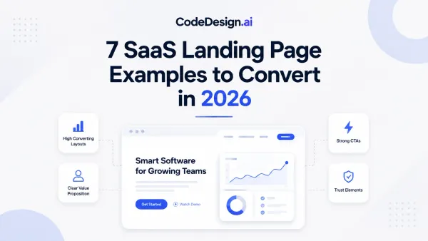
- Choose images that support the sale. Real team photos, before-and-after examples, project visuals, and interface screenshots usually build more confidence than generic stock art.
- Keep patterns consistent. Repeating the same button styles, spacing, card layouts, and typography makes the business feel organized.
Strong page structure improves conversion more than decorative design choices. Teams that need a tighter framework for sections, headlines, and CTA placement should review these landing page best practices for conversion-focused pages.
Your design should answer a simple question fast: “Do these people look competent enough to trust with my problem?”
Copy should sound like a confident sales conversation
Weak service copy talks about the company first. Strong service copy starts with the buyer's problem, desired outcome, and next step.
I see the same mistake on service sites every week. The homepage opens with vague claims, the service page stays high-level, and the contact form asks for too much too soon. That combination lowers inquiry volume because the visitor still has basic questions the page should have answered.
A stronger approach looks like this:
- Weak headline: “Professional Consulting Services”
- Better headline: “Operational consulting for teams that need cleaner systems and faster execution”
Buttons matter too. “Submit” creates hesitation because it says nothing about the outcome. “Request a Quote,” “Book a Consultation,” or “Check Availability” sets a clearer expectation and usually fits service buying behavior better.
Social proof works best when it is specific. Short testimonials tied to a result, recognizable client logos, certifications, review counts, and concise case-study snippets all help. Generic praise in a rotating slider does less. On service sites, proof near the decision point usually beats proof buried in a separate testimonial page.
The priority is not adding more words. It is placing the right words where people decide whether to contact you.
Choosing the Right Tech to Build and Scale
A service business website doesn't need a complicated stack. It needs a setup your team can maintain after launch. That's where many traditional builds fall apart. They're slow to ship, hard to edit, and too dependent on developers for routine updates.
Traditional builds vs modern builders
The old model usually looks like this. A designer creates mockups. A developer translates them. Revisions take time. Content updates queue up. Small businesses end up with a site that technically works but becomes stale because every change feels expensive.
Modern builders reduce that drag. They let owners and teams adjust copy, update sections, test new layouts, and publish pages without rebuilding everything from scratch.

If you're comparing options, one practical route is CodeDesign.ai's website builder, which can generate page structure from a prompt, includes a visual editor, supports forms, hosting, and export options, and gives non-technical teams more direct control over service pages and contact flows.
For owners trying to budget the build properly, this guide on what it costs to build a website is useful because it forces the right conversation. Not “what's the cheapest way to launch,” but “what setup can we maintain and improve without friction?”
What matters more than a blog
The more important tech decision is what your stack enables you to publish and optimize. The SBA guidance behind this topic raises the key question directly. What content drives leads on a service site? In many cases, FAQs, pricing signals, and easy appointment booking deserve priority over generic blog content, as discussed in the SBA's guidance on essential small business website pages.
That changes what “good website tech” means. A useful platform should make it easy to:
- Create service-focused pages quickly. You'll update these more often than broad corporate pages.
- Edit FAQs and objection-handling copy. Buyers need answers near the point of contact.
- Collect and route inquiries cleanly. The form flow is part of the product.
- Support SEO and AEO improvements over time. Structure matters if you want pages to stay discoverable.
What doesn't work is choosing a platform because it can do everything, then never using the parts that affect inquiries.
Your Pre-Launch Checklist for a Flawless Debut
A site can look polished and still fail on launch day. Most missed leads come from simple problems. Slow key pages, broken forms, awkward mobile layouts, and unclear copy near the CTA.
A practical benchmark is sub-2-second load time on key pages, especially for home, services, and contact pages, because faster pages reduce drop-off and improve usability on mobile, according to PJM Consult's website performance guidance.
Test the things that lose leads first

Before publishing, check the parts of the site tied directly to revenue:
- Forms and booking flows: Submit every form yourself. Confirm confirmations appear and messages reach the right inbox.
- Mobile navigation: Open the site on an actual phone, not just a resized browser. Make sure menus, buttons, and tap targets are easy to use.
- Primary CTAs: Every “book,” “quote,” and “contact” button should lead to the right destination.
- Page speed on money pages: Home, service pages, and contact matter more than low-traffic pages.
A launch isn't successful because the homepage is live. It's successful when a real prospect can find the service, trust the business, and complete the inquiry without friction.
Review what prospects actually experience
The second pass should focus on credibility. In this phase, small errors create avoidable doubt.
Use a short review sweep:
- Read the copy out loud. Clunky sentences and vague claims become obvious fast.
- Check every link. Internal links, email links, policy links, social links, all of them.
- Review images and proof. Make sure every photo, badge, review snippet, and logo feels current.
- Verify legal and trust basics. SSL, privacy policy, and business contact details should all be visible and consistent.
If you only have time for one deep test, test the full path from landing to inquiry on mobile. That's where most service site friction shows up first.
Launch and Optimize for Continuous Growth
Publishing isn't the finish line. It's when the actual work becomes visible.

Once the site is live, the first priority is measurement. You need to know which pages attract visits, which CTAs get clicks, and which forms generate real business conversations. Without that, updates become guesswork.
Watch the money pages first
A practical optimization method is to improve the highest-intent pages first, especially home, services, contact, and booking flows, and to validate those pages on mobile while tracking every major CTA as a conversion, based on Farmboy's web design performance guidance.
That gives you a simple post-launch order of operations:
- Track inquiry sources. Learn which page and CTA produced the lead.
- Watch service-page behavior. If visitors land there but don't contact you, the page may not answer the right objections.
- Compare form completion against clicks. If many people click but few submit, friction likely sits inside the form.
- Review mobile first. Buyers often discover and judge service businesses on a phone before switching devices later.
For teams working on growth after launch, this guide on marketing a service company online is a helpful next step because website performance and marketing performance are tied together. A weak contact path can waste good traffic.
Turn post-launch data into site changes
Optimization works best when changes are small and specific. Don't redesign the entire website every time inquiry volume feels inconsistent. Change one meaningful variable at a time. Rewrite the service headline. Shorten the form. Move the CTA higher. Add a sharper FAQ near pricing uncertainty.
The walkthrough below is worth watching if you're thinking about the site as a living asset instead of a one-time project.
The strongest service sites get better after launch because the owner treats them like an active part of sales, not a finished design file.
Frequently Asked Questions
What pages does a service business website actually need
Start with the essentials. For most businesses, that means a homepage, clear service pages, and a contact page. If the service has multiple offers, split those into separate service pages only when each one has a distinct buyer intent and a distinct sales argument.
You can add supporting pages later, but the first version should be tight. Too many low-value pages make the site harder to maintain and dilute attention.
How should I handle multiple service areas without creating thin pages
This is one of the most mishandled parts of local service websites. Businesses often create dozens of near-identical town pages with the same copy and only the place name swapped. That usually creates weak pages for users and weak signals for search.
A better rule is simple. Create a separate area page only when you have something specific to say about that location.
Useful location-specific content can include:
- Service logistics: response times, travel policies, or how delivery differs in that area
- Proof: local testimonials, project examples, or known client types in that market
- Relevant service nuance: regulations, neighborhoods served, or common service requests unique to that location
If you can't make the page meaningfully different, keep service areas consolidated on a stronger regional page instead. Quality beats volume here.
One strong page for a region is better than ten thin pages that all say the same thing.
Do I still need a blog on a service business website
Sometimes yes, often not at the start.
If you have the time and expertise to publish useful, non-generic content, a blog can support visibility and authority. But many service businesses would get better results by improving service pages, adding stronger FAQs, clarifying pricing signals, and tightening the booking path first.
The mistake isn't blogging. The mistake is blogging before the high-intent parts of the site are doing their job.
When should I build it myself and when should I hire help
Build it yourself when the offer is simple, the site structure is straightforward, and you're willing to own updates after launch. That works well for solo consultants, small agencies, and local operators with a focused service set.
Hire help when one of these is true:
- Your positioning is unclear. A strategist or copywriter can help sharpen the offer.
- You serve several markets or service lines. Information architecture gets more important.
- You need custom workflows. Complex forms, integrations, or multi-step booking usually benefit from expert setup.
- You won't maintain the site yourself. In that case, build with a workflow your team can realistically support.
The smartest middle ground is often a modern builder plus selective expert help for messaging, SEO structure, or conversion tuning.
How often should I update the site after launch
Update it whenever the business changes in ways a prospect should know. New services, revised service areas, stronger proof, different onboarding steps, or recurring sales objections all justify edits.
Beyond that, review the site regularly with a practical lens:
- Monthly: check forms, links, mobile usability, and basic analytics
- Quarterly: revise service copy, FAQs, and proof points
- When sales patterns shift: update pages to reflect what qualified leads are asking before they contact you
A neglected service business website slowly drifts out of sync with the actual business. That hurts trust even if the design still looks acceptable.
If you want a faster way to create, refine, and maintain a service business website, CodeDesign.ai gives you an AI-assisted builder, visual editing, responsive templates, hosting, forms, and export options so you can launch the core pages quickly and keep improving them as your business grows.