Website Design for Recruitment Agency: Boost Conversions
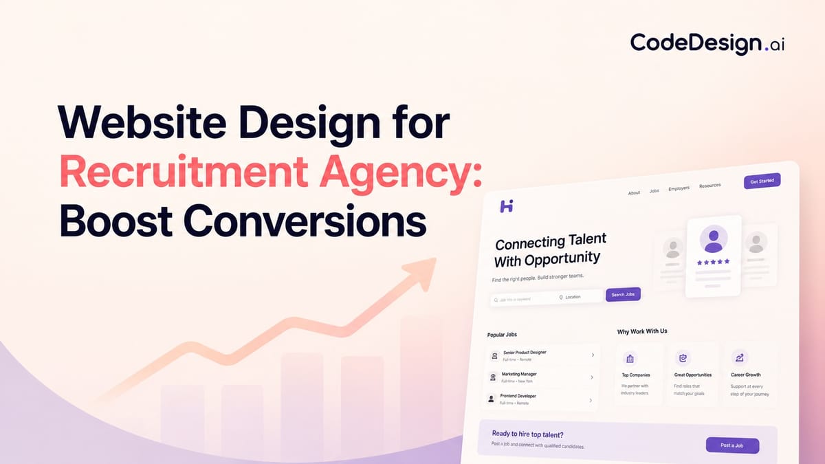
If you're redesigning a recruitment agency website, you're probably stuck between two bad options. One is a polished brochure site that looks credible but doesn't help candidates find jobs or help clients start a conversation. The other is a functional job board that handles listings well but does almost nothing to sell your agency.
That tension sits at the center of website design for recruitment agency firms. You're not building for one audience with one intent. You're building for people who want work, and for companies that want hiring outcomes. If the structure doesn't reflect that reality from the first screen, the site starts leaking value immediately.
A strong recruitment site acts like a front desk with two trained receptionists, not one overloaded generalist. It routes visitors fast, proves competence early, and connects the public-facing experience to the operational systems behind it. That's the difference between a site that merely exists and one that supports placements, lead generation, and day-to-day delivery.
Table of Contents
- Foundation First Planning Your Dual-Audience Website
- Designing for Conversion Key Pages and UX Elements
- The Tech Stack Integrating Job Boards and Your ATS
- Attracting Your Audiences with SEO and Content
- Building Your Site with AI-Assisted Tools
- Launch and Beyond Analytics Forms and Optimization
Foundation First Planning Your Dual-Audience Website
Most recruitment websites fail before design starts. They fail in the brief.
A recruitment agency website has to serve both candidates and employers, so its structure can't follow the same logic as a generic service business site. Guidance on recruitment web design consistently points to dual-audience navigation, separate pathways for job seekers and clients, and visible trust signals like client logos, testimonials, and placement statistics as core requirements, not decorative extras, as outlined in this recruitment website design guidance.

Start with two journeys, not one homepage
The homepage isn't the strategy. It's the traffic controller.
Candidates usually want speed, relevance, and reassurance. They need to know what kinds of roles you handle, whether there are live jobs worth viewing, and how quickly they can apply or upload a CV. Clients arrive with a different filter. They want proof that you understand their hiring context, can fill the roles they care about, and can be trusted with a commercially important search.
That means planning should begin with a split map:
- Candidate path: Landing page, job search, job detail, apply flow, CV upload, sector page, career advice.
- Client path: Homepage, niche or sector page, service page, proof points, consultation or vacancy form, contact route.
Practical rule: If a first-time visitor can't tell within seconds whether the site is for candidates, clients, or both, the navigation is already underperforming.
A lot of agencies try to solve this with one broad headline and a menu packed with everything. That usually creates hesitation. Better practice is to present two clear lanes above the fold and support each lane with a distinct promise.
Define conversion goals before design direction
Before anyone picks colors, define what counts as success on each side.
For candidates, the primary actions are usually applying for a job, uploading a CV, signing up for alerts, or contacting a recruiter. For clients, they tend to be submitting a vacancy, requesting a consultation, or opening a direct conversation with a sector specialist.
A simple planning table helps keep the project honest:
| Audience | What they need first | What they should do next |
|---|---|---|
| Candidates | Relevant roles, credibility, easy search | Apply, upload CV, join talent pool |
| Clients | Niche expertise, proof, clear services | Submit vacancy, request call, enquire |
| Returning users | Fast access to known destination | Resume previous action quickly |
The best planning documents also force decisions about content ownership. Who updates jobs. Who approves testimonials. Who writes sector pages. Who handles expired listings. That's where strategy turns into execution.
If you want to prototype this structure quickly, an AI website builder for agencies can help model the split navigation and page hierarchy early, before development gets heavy. The point isn't speed for its own sake. It's getting the architecture right before the design hardens around the wrong assumptions.
Designing for Conversion Key Pages and UX Elements
Once the structure is set, the design job becomes much clearer. Every page needs to help one audience move with less effort and more confidence.

What the homepage must do immediately
A recruitment homepage has a short list of responsibilities. It should identify who you help, show where each audience goes next, and establish credibility without making people scroll through generic brand language.
What works:
- Split calls to action: One route for candidates, one for employers.
- Visible trust assets: Client logos, testimonials, niche specialisms, recognisable sectors.
- Search or action above the fold: Job search for candidates, consultation or vacancy submission for clients.
- Straight headlines: Say what the agency does and who it does it for.
What doesn't work:
- Abstract positioning: Phrases that sound polished but don't explain the offer.
- Crowded hero areas: Video, sliders, and overlapping messages competing for attention.
- Buried actions: Making users hunt for jobs or contact options.
- One CTA for everyone: It forces both audiences through the same door, which rarely fits either well.
Candidate pages should reduce friction
Candidate experience is often lost in small, avoidable obstacles. Too many fields. Confusing filters. Application steps that feel like admin work.
A candidate-facing setup should include a clear jobs page, meaningful filters, readable job detail pages, and a short route to apply. CV upload should feel like a shortcut, not a side quest. If your process requires registration too early, many users will abandon the flow.
Use page design to answer practical questions fast:
- Jobs page: Role title, location, contract type, seniority, and clean filtering.
- Job detail page: Salary context if appropriate, responsibilities, benefits, process, and recruiter contact path.
- Talent pool page: For candidates who aren't applying to a specific role yet.
- Resource pages: Career advice, interview guidance, CV support.
A good candidate journey feels less like filling out paperwork and more like being guided by a recruiter who already understands why you're there.
Copy matters here. A vague button like "Learn More" underperforms compared with direct wording tied to user intent. If you're refining action language, a website call-to-action generator for recruitment page copy can help generate alternatives that fit job pages, vacancy forms, and talent-pool flows.
Client pages should reduce doubt
Client journeys work differently. Friction isn't just form length. It's uncertainty.
A hiring manager wants to know whether your agency understands the function, role level, and market they hire in. So client pages need sharper positioning than a generic "about our services" paragraph can provide.
The core pages usually include:
- Sector or niche pages: Show where you recruit and what roles you handle.
- Service pages: Retained search, contingent recruitment, contract hiring, or embedded support.
- Proof pages: Testimonials, client logos, awards, or anonymised outcomes where needed.
- Contact routes: Vacancy submission, consultation forms, or direct consultant contact.
A useful test is this: if a prospective client lands on a sector page, can they tell what kinds of searches you run, what businesses you serve, and what the next conversation should be about? If not, the page is informational, not persuasive.
The Tech Stack Integrating Job Boards and Your ATS
The public site gets the attention. The integrations determine whether the whole thing works.
For recruitment websites, the technical baseline should prioritise ATS and job-board integration, structured job filtering, and SEO-ready content architecture. Recruiter-focused guidance also recommends powerful search and filter tools, intuitive navigation, fast loading times, and secure handling of candidate and employer data because those features directly affect engagement and conversions, according to this recruiter website technical guide.

Your website is a system, not a skin
When agencies treat the website as separate from the ATS, problems appear quickly. Jobs go out of date. Recruiters publish the same vacancy in multiple places. Applications arrive by email, form, and portal, then have to be sorted manually.
The cleaner model is sync, not duplication. Vacancies should feed from the ATS or your central job system into the website. Applications should return to the same operational system your recruiters already use. That reduces data fragmentation and keeps the public site aligned with the live business.
A useful mental model is airport departures. The screen in the terminal isn't the flight system. It's the public display connected to it. Your jobs pages should work the same way.
Build filters around your real job taxonomy
Many recruitment sites have filters, but the filters don't reflect how the business classifies roles. That's why users end up with thin results or cluttered search pages.
Start with your real taxonomy:
- Role family: Finance, engineering, sales, legal, operations.
- Location model: City, region, remote, hybrid, multi-site.
- Seniority: Entry level, manager, director, executive.
- Engagement type: Permanent, contract, interim, freelance.
That structure shapes both UX and SEO. It also makes internal reporting easier later because the website categories match the way consultants already think about the market.
If you need to connect forms, job data, and downstream tools without custom development for every workflow, Zapier integration options for website workflows can help bridge the website with recruiting and operational apps.
Security and speed are operational requirements
Candidate and client data isn't casual website content. It's sensitive business information.
That changes the standard for forms, uploads, and storage. Basic good practice includes encryption, controlled access, and routine reviews of how data moves between the site, CRM, ATS, and email notifications. It also means being selective with plugins and third-party scripts. Every extra dependency increases complexity.
Slow pages don't just annoy visitors. They interrupt application intent at the exact moment the candidate was ready to act.
On the performance side, optimise media, keep templates lean, and avoid loading decorative assets that don't support the user journey. Recruitment teams often ask for motion-heavy homepages and large video backgrounds. Those can work in selective places, but they should never delay job discovery or form completion.
Attracting Your Audiences with SEO and Content
A recruitment website without traffic is a well-organised office in an empty building. Structure matters, but visibility decides whether the system gets used.
SEO starts with structure, not blog volume
Recruitment SEO isn't only about publishing articles. The foundation sits in how the site is organised.
Job listings need a consistent template, logical internal linking, descriptive metadata, and clean category relationships. Sector pages should target hiring intent. Location pages should reflect real market coverage, not thin duplicates. Service pages should explain what the agency delivers in language clients search for.
Many agencies make a common mistake: they pour effort into blog posts while leaving core commercial pages vague. Search engines and human buyers both struggle with that.
A practical framework looks like this:
| Content type | Primary audience | Job to do |
|---|---|---|
| Job pages | Candidates | Capture active demand |
| Sector pages | Clients and candidates | Show specialisation |
| Service pages | Clients | Explain commercial offer |
| Advice content | Candidates or clients | Build trust and discovery |
Content should mirror how both audiences think
Candidate content should answer career questions that appear before application. Think CV advice, interview guidance, market insights, and role-specific expectations. Good candidate content attracts search traffic, but of even greater value, it makes the agency feel useful before a placement conversation starts.
Client content should sound different. Hiring managers look for clarity on topics like search process, role definition, market movement, and recruitment challenges in their function or region. That content helps qualify your expertise long before a sales call.
Use editorial judgment here. Not every page needs to rank. Some pages exist to support conversion after the click. The key is alignment between query, landing page, and next action.
- For candidates: Link advice posts to talent-pool forms, relevant sector pages, and live jobs.
- For clients: Link insight content to service pages, niche pages, and consultation forms.
- For both audiences: Keep internal linking intentional. A page should lead somewhere useful, not just somewhere available.
The strongest recruitment content doesn't try to impress everyone. It helps one audience make one decision with less uncertainty.
If your website design for recruitment agency growth relies too heavily on paid traffic, SEO and content become your stabilisers. They create durable entry points for both sides of the market, and they keep the site discoverable even when campaigns pause.
Building Your Site with AI-Assisted Tools
A recruitment team often reaches this stage with a clear plan, then loses speed in the build. Pages stall in review. Copy stays generic. Forms sit outside the actual workflow. AI-assisted tools can shorten that gap, but only if they are used to execute a defined structure rather than invent one.

Use AI to speed production, while keeping the decisions human
AI builders are strongest once the strategy is already settled. Feed them a vague prompt and they return a vague staffing site. Feed them a defined page map, audience routes, conversion goals, proof points, and integration requirements, and the output becomes far more usable.
That distinction matters. Recruitment websites serve two audiences with different intent, different trust triggers, and different actions. AI can draft layouts, propose section structures, generate placeholder copy, and help test variants. It cannot decide how your firm should position itself in a crowded market, what proof a hiring manager needs before enquiring, or where an application flow breaks down in practice.
A useful companion read is this strategic B2B AI marketing guide. It treats AI as an execution layer that supports a real strategy, which is the right model for recruitment websites as well.
A practical workflow for building faster
The cleanest builds usually follow a simple sequence.
Start with the page map
Build the structure first. Define the key templates, primary user routes, form destinations, and system touchpoints before anyone tweaks fonts or hero images.Generate first drafts at section level
Use AI to create rough blocks for service pages, sector pages, consultant bios, proof panels, and contact sections. This saves production time, especially for agencies with multiple specialisms.Edit every page for commercial accuracy
Generic AI copy sounds polished and says very little. Replace broad claims with specifics about role types, regions, hiring process, candidate support, and outcomes your team can deliver.Connect the site to operations
A website is only as useful as the process behind it. Applications, CV uploads, job alerts, and client enquiries need to route into the ATS, CRM, or shared workflows your team already uses. Otherwise the build looks efficient and behaves like a bottleneck.
CodeDesign.ai is one option in this category. It supports AI-generated layouts, drag-and-drop editing, hosting, form collection, SEO controls, WordPress sync, and code export. For recruitment firms, that combination is practical because the site often needs to launch quickly and still remain editable after handover.
Here's the kind of implementation walkthrough that helps teams visualise the workflow in practice:
Choose tools based on ownership, not novelty
Recruitment websites change constantly. New desks open. Teams add niche pages. Marketing needs campaign landing pages. Operations needs forms adjusted without waiting for a developer.
That makes flexibility a commercial decision, not just a technical one.
Before committing to any AI-assisted builder or no-code platform, check four things:
- Can consultants or marketers update key pages without submitting development tickets?
- Can the site or code be exported if the platform no longer fits your stack later?
- Can forms, metadata, and landing pages be managed in-house without workarounds?
- Can the structure grow without turning the site into a patchwork of disconnected pages?
The best AI-assisted builds feel controlled, not automated. That is the key advantage. They reduce production time while preserving the structure, message, and operational fit the strategy requires.
Launch and Beyond Analytics Forms and Optimization
Launch day matters less than is often assumed. What matters more is whether the site is measurable, editable, and tied to real business goals from day one.
The broader market explains why this work deserves more than a rushed template. The global web design services market was valued at $61.23 billion in 2025, and credible website projects usually run through multiple stages: planning and briefing 1 to 2 weeks, design approval 3 to 4 weeks, development and integrations 4 to 6 weeks, testing 2 to 4 weeks, and launch about 1 week, as noted in these web design statistics and project timelines.
Treat launch as handover, not completion
A recruitment website should be handed over like an operating asset, not unveiled like a campaign.
That means the team needs clear ownership after go-live. Someone should review form submissions. Someone should monitor job page quality. Someone should check whether client enquiry routes still reflect the sales process. If those responsibilities stay vague, performance usually slides within weeks.
A clean post-launch checklist includes:
- Tracking setup: Key events for job views, applications, CV uploads, and client enquiries.
- Content governance: Who updates jobs, sector pages, team pages, and proof points.
- Technical checks: Form routing, indexing, mobile usability, and broken-link monitoring.
- Commercial review: Whether the CTAs still match the agency's current service mix.
Measure by journey, not just by traffic
Raw traffic doesn't tell you much in recruitment. A thousand irrelevant visits to blog content can distract from the fact that candidates aren't completing applications or clients aren't reaching the right form.
Measure by pathway.
For candidates, look at the sequence from landing page to jobs page to job detail to application start. For clients, follow homepage or sector page visits into service pages and enquiry forms. Where people hesitate matters more than where they arrive.
A recruitment site improves when teams stop asking "How much traffic did we get?" and start asking "Where did intent stall?"
That mindset usually leads to better decisions. Sometimes the fix is copy. Sometimes it's form length. Sometimes it's a missing trust signal on a commercial page. Analytics should expose those friction points, not just decorate a report.
Forms are part of the user experience
Forms are often treated as admin plumbing. They're not. They're the final step in conversion.
Candidate forms should feel short, clear, and proportional to the action. A quick CV upload should stay quick. A direct application can ask for more, but only when the role justifies it. Client forms should gather enough context for a meaningful follow-up without reading like an internal recruiter intake sheet.
Two design rules help here:
- Match the form to the intent: A "submit a vacancy" form can ask different questions than a "request a call" form.
- Reduce uncertainty around submission: Tell users what happens next and who will respond.
Website design for recruitment agency teams pays off when the site keeps learning after launch. The strongest agencies don't freeze the site once it goes live. They tune it the same way they tune outreach, delivery, and service positioning.
If you're building or rebuilding a recruitment website, CodeDesign.ai is one practical option for moving from plan to launch with AI-assisted layout generation, visual editing, built-in forms, hosting, and exportable code, while keeping the site editable as your agency evolves.