
How to Optimize Images for Web: 2026 Performance Guide
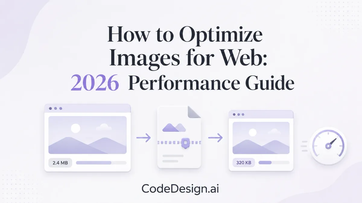
You're probably here because your site looks good, but it doesn't feel fast. The hero image is gorgeous. The product shots are crisp. The brand photography does its job. Then the page opens like it's dragging a piano upstairs.
That's the trap. Images make a website feel premium, but they're also the easiest way to degrade performance. If you care about Core Web Vitals, search visibility, and whether a visitor sticks around long enough to read your copy, image optimization stops being a design detail and becomes infrastructure.
Good image work on the web is a balancing act. You want files light enough to move fast, sharp enough to feel intentional, and smart enough to adapt to the screen in front of them. The old workflow was manual and annoying. The modern workflow is much better.
Table of Contents
- The Heavy Toll of Unoptimized Images
- Choosing Modern Image Formats That Matter
- The Art of Resizing and Compressing Pixels
- Smart Delivery for a Faster User Experience
- Automating the Friction Away in Your Workflow
- Final Touches for Accessibility and Great SEO
The Heavy Toll of Unoptimized Images
A slow site rarely announces the culprit. It just feels sticky. The top section hangs for a beat. Text appears, then shifts. A polished landing page starts behaving like a half-finished prototype.
In practice, oversized images cause that more often than people think. Images are the Largest Contentful Paint element on 85% of desktop pages and 76% of mobile pages, and sites using optimized formats report up to 47% faster LCP times, according to Upward Engine's Core Web Vitals image optimization analysis. If your biggest visible element is an image, your image strategy is your performance strategy.
That affects more than Lighthouse bragging rights. A slow LCP makes the page feel late. A shifting layout makes it feel sloppy. Both undercut trust before your headline gets a chance.
What bad image handling looks like in the wild
The pattern is familiar:
- Oversized hero files: A designer exports a huge photo meant for print-level flexibility, then the browser squeezes it into a much smaller frame.
- Wrong formats: Logos get shipped as bulky raster files. Photos stay in legacy formats long after better options became standard.
- No dimensions set: The browser guesses layout, then redraws the page when the image finally lands.
- Everything loads at once: Offscreen gallery shots compete with the content users are waiting to see.
Practical rule: If a page feels slow before you've loaded any app logic, images are one of the first things worth auditing.
Beautiful visuals should make a page feel richer, not heavier. The best-performing sites don't use fewer images. They use images with intent.
Choosing Modern Image Formats That Matter
Format choice used to be a minor export setting. It isn't anymore. Choosing between JPEG, PNG, WebP, and AVIF changes how much data the browser pulls, how quickly the page becomes usable, and how much quality you preserve while doing it.
Why format choice is now a product decision
Think of image formats like luggage for a flight. JPEG and PNG are the older hard-shell suitcases. Reliable, familiar, sometimes bulky. WebP and AVIF are the newer travel systems that fit more into less space.
WebP is the most widely adopted modern format, and it can significantly reduce image size while maintaining quality compared to JPEG or PNG. Google also explicitly recommends that a photo should be about 200KB, which is a useful threshold for keeping image weight under control on the web, as noted in this web developer discussion on practical image optimization.
AVIF pushes compression even further. In expert analysis, AVIF files can be 1/3 or 1/4 of the size of traditional formats without noticeable quality loss. That's a serious gain when you're shipping image-heavy pages, especially on mobile connections.
For creators, the question isn't “What's the most advanced format?” It's “What gets me the look I want without charging the visitor a performance tax?” Most of the time, that answer is WebP by default, AVIF where your pipeline supports it cleanly, JPEG as fallback for older compatibility, and PNG only when you require transparency or hard-edged graphics.
If you're creating portraits or profile images, it also helps to start with assets designed for the destination. A solid reference for that is Secta Labs' guide on how to create perfect LinkedIn headshots with AI, which is useful when you want image dimensions and presentation to match the platform instead of improvising after export.
A practical format cheat sheet
| Format | Best For | File Size | Transparency | Recommendation |
|---|---|---|---|---|
| WebP | Most website images, especially photos and mixed content | Smaller than JPEG or PNG in many common web use cases | Yes | Default choice for most sites |
| AVIF | High-efficiency delivery when supported in your workflow | Can be 1/3 or 1/4 of traditional formats | Yes | Use when your stack handles it well |
| JPEG | Traditional photos and broad fallback support | Larger than modern formats at similar perceived quality | No | Keep as fallback, not first choice |
| PNG | Logos, UI graphics, images needing clean transparency | Often heavier than WebP for web delivery | Yes | Use selectively |
Use PNG because the image needs transparency, not because it's the only format you know.
A lot of image optimization gets easier once format choice stops being emotional. You're not betraying photography by picking a smaller file. You're respecting the medium it's being delivered through.
The Art of Resizing and Compressing Pixels
Resizing and compression get lumped together all the time, but they solve different problems. If you mix them up, you'll either ship giant files that look great in theory or tiny files that look like they survived a fax machine.

Resizing changes dimensions, compression changes weight
Resizing is about physical pixel dimensions. Compression is about how tightly the file stores visual information.
Here's a simple explanation:
- Resizing is tailoring the suit to fit the body.
- Compression is choosing a lighter fabric.
If your layout shows an image in a relatively small frame, don't upload a massive original and hope the browser sorts it out. The browser will display it smaller, yes, but the visitor may still download far more data than needed.
Then comes compression. That's where you decide how much data the file keeps. Google's PageSpeed Insights guidelines have long recommended reducing JPEG quality to 85%, because after that point file size rises quickly while visible improvement becomes marginal. The same guidance also established web-specific technical rules like 72 PPI, 4:2:0 chroma sampling, and using progressive JPEGs for images over 10,000 bytes, all documented in Google's image optimization guidelines.
A sane compression baseline
If you want a starting point that doesn't waste your afternoon, use this:
- Photos: Start around 85% quality for JPEG exports.
- Transparent graphics: Keep compression lossless where clarity matters.
- Large photographic assets: Prefer progressive export when JPEG is still part of the pipeline.
- Web display: Keep the file sized for the actual container, not the original camera output.
That baseline works because web image quality is mostly about perceived quality, not pixel purity. A page doesn't need to deliver gallery-master files. It needs to look sharp at viewing distance, on the device in hand, under realistic network conditions.
If you want a fast hands-on tool for testing that balance, Devnitys has a useful walkthrough on how to optimize images for content creators using Squoosh. It's one of the better ways to see, side by side, where the visual drop-off starts.
Most image mistakes aren't caused by aggressive compression. They're caused by exporting far larger dimensions than the layout will ever display.
Smart Delivery for a Faster User Experience
Optimizing the file is only half the job. Delivery decides whether the browser gets the right image at the right moment, with the right priority.

Responsive images stop waste before it starts
A desktop monitor, a phone, and a tablet do not need the same file. That's why srcset and sizes matter. They let the browser choose an image variant that matches the viewport instead of forcing everyone to download the largest version.
This matters even more on mobile-first projects. If you're building for smaller screens and speed-sensitive visitors, the logic behind responsive delivery overlaps closely with the broader principles in this guide to a mobile page builder workflow. The idea is the same. Serve only what the device needs.
A good delivery setup also includes explicit width, height, or aspect ratio so the browser reserves the right space before the image appears. That keeps layout stable and prevents those annoying jumps during load.
Lazy loading needs one important exception
Lazy loading is excellent for images below the fold. It keeps early network activity focused on the content people can already see.
But there's a mistake I still see everywhere: loading="lazy" slapped onto every image, including the main hero or featured visual at the top of the page. That can delay the download of the LCP image. The better pattern is to remove lazy loading from that image and use fetchpriority="high" instead. According to DebugBear's image optimization guidance, this nuance can prevent a 20-30% increase in page load time.
Don't make the browser “discover” your most important image late. Tell it that image matters.
CDNs and caching do the final mile work
A CDN is just a smart distribution layer. Instead of every visitor pulling image files from one distant origin, the system serves them from a nearer location. That shortens the trip.
Caching handles repeat views. When done properly, the browser stops re-fetching the same image over and over. For the visitor, that means the site feels lighter every time they come back.
The asset may be identical. The experience won't be.
Automating the Friction Away in Your Workflow
The old workflow for image optimization was manual and repetitive. Export from a design tool. Run the file through a compressor. Rename it. Upload it. Repeat for every page, every update, every variant.
That process used to be tolerated because the stack was fragmented. It feels dated now, especially for teams that publish fast and expect the platform to handle production chores without constant hand-holding.

Manual optimization is the old bottleneck
Founders, marketers, and designers have better work to do than pushing each image through a chain of third-party tools. The manual path breaks consistency, slows publishing, and makes quality depend on whether someone remembered the checklist that day.
A better setup treats image handling like any other build step. Upload the asset once. The system creates the right variants, applies compression, attaches responsive rules, and publishes optimized files during deployment.
Cache behavior belongs in that same pipeline. Embedding a hash of the image bytes in the URL and using headers like cache-control: public,max-age=31536000,immutable can eliminate re-fetches and improve page speed by up to 40% on repeat visits, as described in this practical guide to improving image performance on the web.
If you are evaluating builder-based workflows instead of stitching everything together by hand, this explanation of what no-code means in a modern publishing workflow helps frame why more teams now expect platform-level automation for assets too.
What modern automated pipelines should handle
A useful image pipeline should cover the repetitive work in the background:
- Generate responsive sizes: One upload should produce the breakpoints needed for
srcset. - Convert where appropriate: WebP should be a standard output, with AVIF added when the workflow supports it reliably.
- Compress with restraint: File size should drop without making gradients fall apart or product shots look crunchy.
- Apply delivery rules: Important images should get priority, offscreen images should load later, and layout stability should be preserved by default.
- Publish with cache safety: Fingerprinted asset URLs and long-lived cache headers should be part of deployment.
That is the shift in image optimization. The creator sets visual intent. The system handles the byte-level cleanup.
CodeDesign.ai is one example of that model. It processes image resizing, WebP conversion, and compression during deployment so the workflow stays focused on design, copy, and publishing instead of file babysitting.
There is also a practical payoff beyond convenience. On recent programmatic SEO pages built on that platform, image-heavy pages reportedly moved from an LCP of around 3.5 seconds to 0.8 seconds after the automated pipeline processed the assets. That kind of shift demonstrates why manual image handling feels increasingly obsolete.
A quick demo says more than a paragraph can.
The "vibe coding" version of image optimization is straightforward. Define the look you want. Let the platform handle resizing, compression, and delivery rules in the background. That division of labor is faster, cleaner, and much easier to maintain.
Final Touches for Accessibility and Great SEO
A fully optimized image isn't just small and fast. It's understandable.
Help humans and search engines understand the image
alt text should describe the image's purpose in context. If the image is decorative, keep the alt treatment appropriately minimal. If it carries meaning, describe what a user needs to know, not every tiny visual detail.
File names also matter more than people give them credit for. black-running-shoes-side-view.webp tells both humans and systems something useful. IMG_4827-final-final-2.webp tells nobody anything.
Search visibility also benefits when the surrounding page supports the image properly. Captions, nearby headings, and relevant copy all reinforce context. If SEO is part of the job, this guide on website builder SEO fundamentals connects those page-level signals well.
A simple finishing checklist
Before publishing, check these quickly:
- Alt text: Write it for accessibility first, with context, not keyword stuffing.
- File naming: Use descriptive names before upload.
- Dimensions: Make sure layout space is defined so images don't shove content around.
- Discovery: If visual content is central to your site, help search engines find it through clean structure and indexing support.
Fast images get the page loaded. Clear images help the page get understood. You need both.
If you want a workflow where image handling doesn't become a side job, CodeDesign.ai is worth a look. It lets you focus on design and content while the platform handles the repetitive optimization work in the background during deployment.