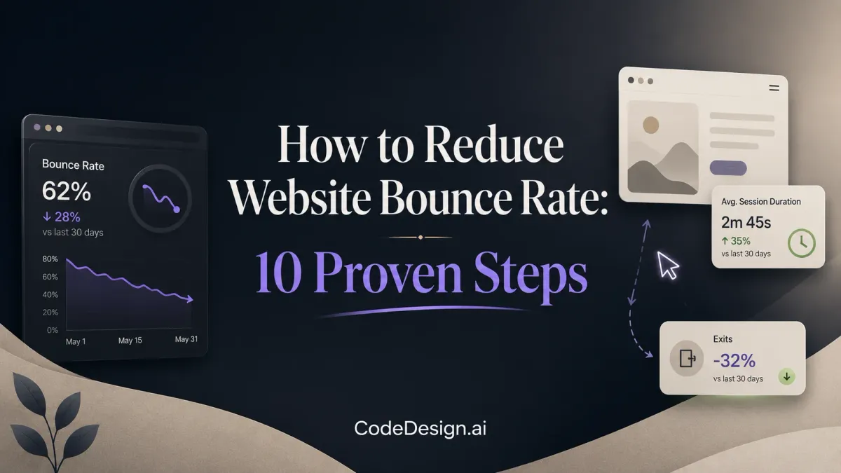
How to Reduce Website Bounce Rate: 10 Proven Steps
Bounce Rate Isn't Just a Metric. It's a verdict.
When a page misses the mark, visitors don't negotiate with it. They leave. And on mobile, that happens fast. 53% of mobile site visits are abandoned if pages take longer than 3 seconds to load. That one stat explains why so much bounce rate advice feels useless in practice. If your page is slow, generic, unstable, or mismatched to the query, the visitor is gone before your copy even gets a chance.
That's why the core answer to how to reduce website bounce rate isn't “write better content” or “add more CTAs.” Those can help, but they're downstream fixes. The most impactful work starts earlier, with rendering speed, layout stability, intent match, mobile UX, and analytics that show where people drop.
There's another nuance most founders miss. Not every bounce is bad. SmartBug Media points out that some visitors leave because the page answered their question, and that's a success, while 78% of SEO guides still treat all bounces as negative without segmenting by intent depth. On a FAQ page, that can be fine. On a money page, it usually isn't.
What follows skips the recycled advice and focuses on what moves the metric on modern sites, especially pSEO-heavy properties and AI-assisted builds. Start with speed. Then fix relevance, stability, and flow. That's how you turn one-page exits into second clicks, deeper sessions, and better conversion paths.
Table of Contents
- 1. Crush Your LCP The #1 Fix for Impatient Visitors
- 2. Use AI-Driven Content to Match Visitor Intent Instantly
- 3. Ditch Third-Party Scripts for Integrated Analytics
- 4. Stabilize Layouts to Prevent Rage Bounces
- 5. Align Your Headline and Hero with Search Intent
- 6. Adopt a Mobile-First Design with Thumb-Friendly UX
- 7. Structure Content for Scannability with Clear Hierarchy
- 8. Strengthen Internal Linking to Guide the User Journey
- 9. Refine Traffic Quality to Attract the Right Audience
- 10. A/B Test Everything and Let Data Lead the Way
- 10-Point Bounce Rate Reduction Comparison
- Stop Losing Visitors Your Path to a Lower Bounce Rate
1. Crush Your LCP The #1 Fix for Impatient Visitors

Most bounce rate projects start too late. Teams rewrite copy, redesign buttons, and tweak CTA colors while the hero image still crawls onto the screen. If you want the fastest path to lower bounces, start with Largest Contentful Paint.
Google treats a good LCP as under 2.5 seconds for at least 75% of page loads. That threshold matters because the first meaningful visual is usually the visitor's first trust check. If the hero, headline, or main image drags, your page feels slow even when everything else is technically fine.
Why LCP is the first lever
The practical fixes are not mysterious. They're just often skipped.
- Convert heavy images automatically: Move PNG and JPG assets to WebP or AVIF where supported.
- Split code aggressively: Load only the code needed for the critical rendering path first.
- Lazy load below-the-fold media: Keep non-essential assets out of the initial request waterfall.
- Prioritize the hero section: Make the browser fetch the assets that shape the first screen before anything decorative.
- Stabilize what loads first: Prevent shifting headlines, buttons, and images from moving while users try to read.
Practical rule: If the hero section isn't visible almost immediately, nothing else on the page matters yet.
What changed on a real pSEO page
One high-traffic pSEO landing page had the classic failure pattern. Layout shift, slow initial asset loading, and a bloated build made the page feel unreliable. After an automated optimization pass that stabilized layout elements and minified the build, bounce rate dropped from 68% to 41%.
That kind of improvement doesn't come from “better engagement tricks.” It comes from removing friction before the visitor notices it.
The trade-off is tooling. You'll need a modern build setup, or a platform that automates image conversion, code splitting, and asset prioritization for you. Legacy browser support can also require fallbacks. But in real-world terms, this is still the highest-ROI technical fix for how to reduce website bounce rate.
2. Use AI-Driven Content to Match Visitor Intent Instantly
A static page has one story. Your traffic doesn't.
Someone arriving from a problem-aware query needs different framing than someone searching for a branded solution. A visitor from one region may trust different proof points than a visitor from another. When the first screen ignores that context, bounce rate climbs because the page feels generic.
Static pages lose relevance too fast
The strongest pages today adapt messaging without turning into gimmicks. That means dynamic content blocks that change headline emphasis, proof, and calls to action based on incoming search intent or geographic context.
A modern AI website builder makes this easier because you're not stitching together personalization through plugins, custom conditions, and brittle front-end hacks. You can generate, edit, and refine pages inside one workflow instead of sending every variation back to a developer queue.
Where AI personalization actually helps
Used well, AI-driven contextualization reduces the “wrong page” feeling in the first few seconds.
- Intent-based headlines: Match the problem language the visitor already used.
- Geo-relevant proof: Show testimonials, examples, or trust elements that feel locally credible.
- Segmented CTAs: New visitors may need education. Returning visitors may need a direct action.
- Contextual social proof: Highlight the evidence most relevant to the query, not the most impressive evidence overall.
The trade-off is restraint. Over-personalization can feel creepy, and shallow personalization often feels fake. The page shouldn't announce that it's adapting. It should feel unusually relevant.
I've found this matters most on pSEO landing pages, service pages, and solution pages where visitors arrive with a narrow intent. If your page can subtly confirm, “Yes, this is exactly what you searched for,” you earn the second scroll. That's often the difference between a bounce and a real session.
3. Ditch Third-Party Scripts for Integrated Analytics
A lot of sites create their own bounce problem. They install tag managers, heatmaps, chat widgets, popups, ad pixels, cookie layers, and session tools until the browser spends more time negotiating with scripts than rendering the page.
Then they wonder why engagement falls.
Script bloat creates the problem you are trying to measure
If you care about bounce rate, don't measure it in a way that slows the page down. A native dashboard with first-party analytics is the cleaner approach. It reduces render-blocking JavaScript and gives you direct visibility into behavior and technical issues together.
That's why integrated reporting matters more than another script. A platform with built-in analytics, such as CodeDesign's website analytics dashboard, lets you monitor page views, session duration, bounce behavior, and technical errors side by side without bolting on another external dependency.
The best analytics setup for bounce rate is the one that doesn't become part of the bounce rate problem.
What to track in one dashboard
What matters is correlation, not just collection.
- Page views with technical errors: See whether a spike in exits lines up with broken rendering, script failures, or layout bugs.
- Session duration beside bounce trends: A single-page visit with time on page means something different than a two-second exit.
- Real-time monitoring: Sudden bounce spikes often point to deploy issues, not copy issues.
- SEO and UX in one view: You want landing-page performance and user behavior close enough together to diagnose intent mismatch fast.
The trade-off is that specialized third-party tools can still offer niche features, especially session replay or highly custom event layers. But for many small teams, integrated analytics is the better operating system. It's lighter, easier to maintain, and far more useful when you need to pinpoint exactly where a page loses people.
4. Stabilize Layouts to Prevent Rage Bounces
A page can load fast and still lose the visit if the interface jumps under the user's finger.
That bounce is rarely about copy. It happens because the page feels unreliable. Someone tries to tap a CTA, an image slot expands, a sticky bar appears, and the click lands somewhere else. On programmatic SEO and AI-generated sites, this problem shows up even more often because templates pull in dynamic modules, variable-length summaries, related links, and personalization blocks after the first paint.
Why layout instability drives exits
Users do not separate front-end bugs from brand quality. They treat both as the same experience.
If the hero shifts, trust drops. If the reading position moves, momentum breaks. If a consent banner, recommendation widget, or chat bubble appears late and pushes content downward, the page feels unfinished. I see this often on fast-growing content sites that optimized for traffic production before they locked down component behavior.
The result is a rage bounce. The user did not finish evaluating the page. The page failed the interaction test.
Fix the unstable elements first
The highest-impact fixes are usually simple:
- Reserve space for media: Set explicit
widthandheightattributes, or useaspect-ratiofor images, videos, and thumbnails. - Pre-size dynamic components: Forms, related-article modules, AI answer boxes, and ad slots need containers with defined minimum heights before content arrives.
- Load fonts carefully: Use
font-display: swapand choose fallback fonts with similar metrics to reduce visible text reflow. - Audit sticky elements: Headers, promo bars, cookie notices, and floating CTAs often create avoidable movement in the first screen.
- Avoid injecting content above existing content: Personalization works better when it swaps within a reserved component than when it inserts new blocks after render.
This is one of the few bounce-rate fixes where engineering discipline beats marketing creativity.
Where modern sites usually break
Template systems create hidden CLS problems. A headline fits in two lines on one page and four on another. An AI summary expands only when the model returns a longer answer. A “related tools” widget loads after the main content and pushes the intro down. None of these issues look dramatic in staging, but they stack up on live pages across thousands of URLs.
That is why I prefer component rules over one-off page fixes. Define max heights where needed. Set placeholder states. Test worst-case content lengths, not just the happy path. If you are also tightening topic targeting across large content sets, this guide on adding keywords to your website without hurting UX pairs well with layout QA because both problems tend to appear at the template level.
A practical standard
Protect the first viewport.
Keep the hero, primary CTA, intro copy, and navigation stable from the moment they appear. Decorative motion matters far less than positional trust. If something must load late, give it a reserved space lower on the page. Third-party widgets are frequent offenders here, so every added plugin should justify its cost in conversions, not just features.
Stable layouts feel easier to use, and users stay long enough to judge the content on its merits.
5. Align Your Headline and Hero with Search Intent
Fast pages still bounce when they answer the wrong question.
Founders often misread the data. They see traffic, they see impressions, and they assume the page is relevant. But the visitor only cares about one thing on arrival. “Am I in the right place?”
The above-the-fold relevance test
When search intent and page content don't align, bounce rate can push into the 80%+ range on specific landing pages. That usually happens because the headline, hero, and opening copy force the visitor to interpret the page instead of confirming the match instantly.
The fix is simple in principle and hard in discipline. Mirror the query's intent in the first screen. If the query suggests comparison, show comparison. If it suggests local service, make location obvious. If it suggests a product use case, lead with that use case.
Three elements that reduce intent mismatch
The cleanest framework here is the Three Cs.
- Confirmation: Show right away that the page offers what the visitor came for.
- Credibility: Prove the claim with authority, proof, or experience signals.
- Clear instructions: Give the user an obvious next step.
If you're tightening your keyword targeting and on-page message at the same time, this guide on how to add keywords to your website is a useful reference point for making sure the page copy and keyword intent don't drift apart.
If a visitor has to decode your headline, you've already lost time you didn't have.
The trade-off is page variation. Better intent matching often means building multiple versions of pages instead of one generic “catch-all” page. That's more work upfront, but it usually beats paying for traffic that pogo-sticks back to search.
6. Adopt a Mobile-First Design with Thumb-Friendly UX

Bounce rate often looks like a content problem when it's really a thumb problem.
Buttons sit too close together. Text is cramped. Forms are annoying. The navigation assumes a large screen and a patient user. On mobile, those flaws don't feel minor. They feel like friction, and friction gets interpreted as a reason to leave.
Mobile friction shows up as bounce
A strong mobile experience starts by respecting the constraints of the device.
- Use generous touch targets: Buttons need enough space to tap cleanly.
- Keep type readable: Body text should be comfortable without pinching or zooming.
- Prefer single-column layouts: Horizontal scrolling is a fast trust killer.
- Place key actions where thumbs can reach: Especially on long landing pages.
For teams building responsive pages quickly, a dedicated mobile page builder workflow can speed up iteration because you're designing for mobile behavior from the start instead of shrinking a desktop layout later.
The mobile patterns worth copying
The best mobile pages remove decisions before visitors feel overloaded. They simplify navigation, shorten forms, and surface one clear action per screen.
Product-led teams also borrow from video-first onboarding because mobile users often decide faster when they can see the offer in action. This product demo video guide from Screen Charm is useful if you want to explain a workflow without forcing visitors through dense copy walls.
What doesn't work is pretending “responsive” automatically means “mobile-friendly.” A page can technically adapt to screen width and still be miserable to use. Mobile-first design fixes that by treating the smaller screen as the primary constraint, not an afterthought.
7. Structure Content for Scannability with Clear Hierarchy
Bad structure hides good content.
Visitors decide fast whether a page looks easy to consume. If the screen opens with a vague headline, a wall of text, and no visual hierarchy, many of them leave before they judge the quality of the advice. Bounce rate often drops after copy edits, not because the ideas changed, but because the page became easier to parse.
Scannability is a UX system, not a formatting trick. Strong pages guide the eye from promise to proof to next question. That matters even more on programmatic SEO and AI-assisted sites, where pages are produced at scale and weak templates can multiply confusion across hundreds or thousands of URLs.
Build hierarchy around intent, not aesthetics
Clear hierarchy starts with the reader's job. A founder comparing tools scans for differentiators. A buyer troubleshooting a workflow scans for steps, examples, and edge cases. Your headings should mirror those goals so the visitor can confirm, within seconds, that the page matches what they came for.
Dense writing increases effort. Effort drives exits.
A practical structure usually includes one claim per section, descriptive subheads, short paragraphs, and lists only where they reduce friction. If a section needs five sentences to get to the point, the structure is doing too much work.
Formatting choices that keep people reading
These patterns consistently improve readability.
- Use headings that answer real questions: Generic labels like "Overview" or "Details" force readers to interpret too much.
- Keep paragraphs tight: Two to four sentences is usually enough before attention drops.
- Turn comparisons and steps into lists: Readers can scan sequence and trade-offs faster that way.
- Front-load the important words: Put the outcome, problem, or qualifier early in the sentence.
- Use whitespace to separate decisions: Every block of text should feel skimmable at a glance.
Visual content still needs editorial discipline. Images, tables, screenshots, and embedded demos should support the argument, not interrupt it. If media pushes key text below the fold or breaks the reading flow, it hurts comprehension even when the page is technically fast.
AI-generated content often fails here for a simple reason. It tends to produce structurally flat copy. The facts may be acceptable, but the page reads like one long answer instead of a guided path. Strong hierarchy fixes that. It helps visitors find the exact subsection they need, which is often enough to earn the next 30 seconds of attention.
8. Strengthen Internal Linking to Guide the User Journey
A page with no next step is a dead end. Dead ends produce bounces.
Internal linking matters because engagement is often less about convincing someone to stay on the same page forever and more about making the second click feel obvious. If the visitor sees the next relevant step without effort, they're more likely to keep moving.
Fight for the second click
This is especially important on blog posts and informational content. Even when the page satisfies the immediate query, you still want to offer a logical continuation.
Good internal links do three things at once. They help users explore, they clarify your site architecture, and they pass authority to pages that need visibility.
Internal links that feel useful, not forced
The strongest patterns are simple.
- Use descriptive anchor text: The user should know what they'll get before they click.
- Link high-traffic pages to strategic pages: Send readers from popular content into commercial or supporting pages that deepen the journey.
- Add relevant “see also” paths: Related guides, examples, and comparison pages work better than generic “read more” modules.
- Build linear information paths: Let readers move from beginner material to more specific answers without searching your nav again.
As noted earlier, search intent mismatch can drive abandonment hard. Internal links help recover some of that by exposing alternate paths when the landing page only partially fits. They don't save a completely irrelevant page, but they do reduce unnecessary exits on pages that need one more click to become useful.
9. Refine Traffic Quality to Attract the Right Audience
Sometimes the bounce rate diagnosis is wrong because the page isn't the problem. The traffic is.
A page can be well designed, fast, and clearly written, then still bounce because it's attracting visitors who never wanted that offer in the first place. That happens constantly with broad keywords, loose ad targeting, and content that ranks for adjacent searches.
Sometimes the page is fine and the traffic is wrong
Segmentation is paramount. A site-wide bounce rate hides too much. You need to look at page type, traffic source, and query intent together.
There's also an important nuance many teams miss. Some high bounces are healthy. On informational pages, the visitor may get the answer and leave. That's not the same as a pricing page losing a qualified buyer.
How to clean up acquisition quality
A tighter acquisition strategy usually lowers bounce rate without touching the page.
- Cut irrelevant paid traffic: Negative keywords remove visitors who were never likely to engage.
- Target narrower organic intent: Long-tail pages often attract users with clearer expectations.
- Review query-to-page fit: Ranking isn't enough if the page format doesn't match what the query implies.
- Segment social campaigns carefully: Social clicks often need different landing pages than search clicks.
If you're thinking about content formats that attract more qualified discovery traffic over time, this article on virtual tours for organic growth is a helpful example of aligning content format with audience intent rather than chasing raw sessions.
The trade-off is volume. Better traffic quality can reduce top-line traffic in the short term. But lower-volume, higher-fit traffic is usually the path to a healthier bounce rate and a more honest view of page performance.
10. A/B Test Everything and Let Data Lead the Way
No founder is objective about their own page. That's normal.
The headline you love may be the one visitors ignore. The hero image you fought for may be slowing the page. The “obvious” CTA may be unclear on mobile. Testing is what turns those opinions into evidence.
Testing beats opinion
A/B testing matters because bounce rate is rarely controlled by one variable. It sits at the intersection of speed, intent, readability, layout, and trust. You won't reliably solve that with instinct alone.
That said, not every page needs constant experimentation. Test the pages where a lower bounce rate changes business outcomes, such as landing pages, solution pages, signup pages, and high-traffic pSEO pages.
What to test first

Start with the elements that shape first impression and first action.
- Headline and subheading: Test clarity before cleverness.
- Hero media: Compare static images, product visuals, and short demo-led treatments.
- CTA wording and placement: Especially above the fold and in mobile thumb zones.
- Layout density: Simpler structures often outperform crowded ones.
For paid traffic cleanup, this piece on using negative keywords to reduce bounce rate is worth reviewing because testing the page without fixing traffic quality can give you false conclusions.
Good bounce rate optimization is less about finding one winner and more about building a repeatable testing system.
The trade-off is patience. Tests need enough traffic and enough time to produce useful direction. But once you treat bounce reduction as a sequence of measured hypotheses instead of random design changes, progress becomes a lot more predictable.
10-Point Bounce Rate Reduction Comparison
| Item | Implementation 🔄 | Resources ⚡ | Expected outcomes 📊 | Ideal use cases ⭐ | Key advantages 💡 |
|---|---|---|---|---|---|
| Crush Your LCP: The #1 Fix for Impatient Visitors | Moderate–High: requires build tooling and automated asset pipelines. | Moderate: modern bundlers (Vite), CI, image pipeline, dev time. | Lower bounce, improved LCP/CLS, reduced bandwidth. | High-traffic landing pages, hero-first SaaS/e‑commerce pages. | Highest ROI for bounce reduction; direct Core Web Vitals gains. |
| Use AI-Driven Content to Match Visitor Intent Instantly | High: integrates AI models and contextual logic into pages. | High: AI APIs, first‑party data, engineering and testing. | Increased relevance, time-on-page, and conversions. | Personalized SaaS landing pages, dynamic offer pages. | Scales personalization; hard for competitors to replicate. |
| Ditch Third-Party Scripts for Integrated Analytics | Low–Moderate: migrate analytics to a native platform. | Low: platform adoption and migration effort. | Faster page loads, clearer metric correlation, better privacy. | Sites bloated with tracking scripts; privacy-focused sites. | Consolidated insights, reduced render-blocking scripts. |
| Stabilize Layouts to Prevent "Rage Bounces" | Low–Moderate: front-end fixes (CSS, image dimensions, fonts). | Low: developer time and QA on embeds/ads. | Reduced CLS, fewer accidental clicks, higher trust. | News sites, e‑commerce with dynamic content or ads. | Direct improvement to CLS and perceived professionalism. |
| Align Your Headline and Hero with Search Intent | Moderate: keyword analysis and above‑the‑fold edits. | Low–Moderate: SEO tools, copywriting and landing variations. | Reduced pogo-sticking; higher relevance and conversions. | SEO landing pages, paid search landing pages. | Immediate relevance; better Quality Scores and SEO signals. |
| Adopt a Mobile-First Design with Thumb-Friendly UX | Moderate: design system and layout changes for mobile. | Moderate: designers, devs, and real-device testing. | Higher mobile retention and conversion; fewer usability bounces. | Mobile-dominant audiences, e‑commerce, on‑the‑go content. | Improves mobile SEO and usability; forces leaner design. |
| Structure Content for Scannability with Clear Hierarchy | Low: editorial changes to headings, paragraphs, and lists. | Low: writers/editors and content templates. | Increased time-on-page and accessibility; easier discovery. | Blogs, documentation, long-form content. | Boosts readability and retention with minimal cost. |
| Strengthen Internal Linking to Guide the User Journey | Moderate: content architecture and contextual linking work. | Low–Moderate: content updates, CMS tweaks, editorial effort. | Higher pages/session, improved SEO and reduced dead ends. | Blogs, knowledge bases, product catalogs. | Guides users to next steps and distributes link equity. |
| Refine Traffic Quality to Attract the Right Audience | Moderate: audit analytics and adjust targeting/copy. | Moderate: analytics tools, PPC/SEO effort, campaign management. | Higher conversion rates, lower irrelevant bounce, clearer metrics. | Paid campaigns, broad organic reach, high-volume sites. | Improves ROI and ensures visitors match page intent. |
| A/B Test Everything and Let Data Lead the Way | Moderate–High: requires experimentation platform and analysis. | High: tools (Optimizely, Unbounce), traffic volume, analyst time. | Validated improvements and compounding conversion gains. | High-traffic sites focused on conversion optimization. | Data-backed decisions; reduces risk of harmful changes. |
Stop Losing Visitors Your Path to a Lower Bounce Rate
If you want a cleaner answer to how to reduce website bounce rate, here it is. Fix the parts of the experience that visitors judge before they consciously decide anything. Speed. Stability. Relevance. Mobile usability. Clear next steps. Then measure all of it in a way that doesn't slow the site down.
The biggest mistake I see is treating bounce rate like a copy problem first. Usually it isn't. If the page loads slowly, shifts during render, or opens with a vague hero that doesn't confirm intent, your copy never gets a fair shot. That's why LCP is usually the first place to look, especially on pSEO landing pages and SEO-heavy sites with lots of template-driven content. If the largest element on the screen appears late, the visitor interprets the whole page as slow.
From there, move to intent match. Many pages lose users not because they're low quality, but because they're trying to serve too many query types at once. One generic page may rank for several variations, but that doesn't mean it satisfies those visitors equally well. In practice, a tighter page with stronger message match often outperforms a broader one because it confirms relevance faster.
Mobile deserves its own level of attention. Too many teams still design on desktop and validate on mobile later. That workflow misses the core problem. Mobile users are more exposed to slow rendering, crowded UI, and awkward tap targets. If your page is difficult to use with one hand, bounce rate will tell you before your conversion report does.
Internal linking and content structure matter after the first-screen issues are solved. They help you earn the second click. That's especially useful on blog content, glossary pages, and educational resources where a bounce isn't always bad, but a deeper session would still be more valuable. Good formatting also does more work than is commonly understood. A readable page feels trustworthy and faster, even when the actual content hasn't changed much.
Analytics is the operating layer that makes all of this sustainable. You need page views, session duration, bounce behavior, and technical issues in one place so you can connect symptoms to causes. If a bounce spike happens right after a deploy, that points to rendering or layout problems. If one traffic source consistently bounces while another doesn't, the issue may be targeting, not UX. That's why integrated analytics is so useful for small teams. It reduces both script bloat and diagnostic lag.
Testing closes the loop. Don't assume your preferred headline, layout, or CTA is the right one. Put it against an alternative and let visitor behavior decide. Over time, that habit compounds. A site that gets a little faster, a little clearer, and a little more relevant every month usually outperforms a prettier site that relies on assumptions.
If you're rebuilding this system from scratch, start with item one on this list. Get LCP under control. Then check layout stability, hero relevance, mobile UX, and traffic quality. That order tends to produce the cleanest wins.
For teams that want these optimizations closer to the page-building workflow, CodeDesign.ai is one relevant option because it combines AI-assisted site creation with integrated analytics, hosting, and export flexibility. That kind of setup can reduce the developer friction that often slows bounce-rate improvements down.
If you want a faster path from idea to a lower-bounce, better-performing site, take a look at CodeDesign.ai. It gives you an AI-powered workflow for building, editing, publishing, and analyzing pages without piling on extra tools that can slow the experience down.