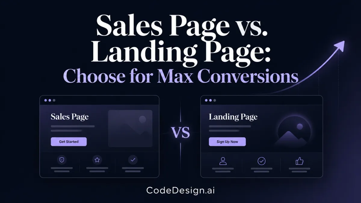
Sales Page vs. Landing Page: Choose for Max Conversions
You've got an offer ready to sell. Maybe it's a coaching package, a digital product, a free webinar, or a new SaaS plan. Then you hit a familiar snag. Should you build a sales page or a landing page?
A lot of small business owners lose time here because the two terms get used loosely. They sound similar, and some tools blur the line even more. But the choice matters because each page asks your visitor to do a different kind of job. One asks for commitment now. The other asks for permission to continue the conversation.
If you choose the wrong page type, the page can still look polished and still underperform. That's why the primary question in the sales page vs landing page debate isn't design style first. It's what action you want from the visitor, how warm they are, and how that page has to work on mobile in 2026.
Table of Contents
- What Is the Real Difference Between a Sales Page and a Landing Page
- The Singular Focus of a Landing Page
- The Conversion Engine of a Sales Page
- Key Differences in Structure Design and Copy
- When to Use a Sales Page vs a Landing Page
- Optimizing for Conversion Best Practices in 2026
- How to Build Your High-Converting Page in Minutes
What Is the Real Difference Between a Sales Page and a Landing Page
The cleanest way to separate these two page types is simple. A sales page asks for money. A landing page usually asks for contact information or another non-monetary action. That core mechanical difference is the one that matters most, as explained in SeedProd's breakdown of landing pages vs sales pages.
A landing page usually sits in the middle of the buying journey. Someone clicks an ad, sees a specific offer, and gives you an email address, books a demo, or signs up for a free resource. A sales page sits closer to the bottom of the funnel. The visitor is already aware of the problem and is deciding whether your offer is worth buying.
That's why these pages shouldn't be treated as interchangeable templates.
| Page type | Primary goal | Typical conversion | Best fit |
|---|---|---|---|
| Landing page | Capture a lead or a single action | Email signup, form fill, registration, demo request | Cold or semi-warm traffic |
| Sales page | Close a purchase | Direct sale to checkout or payment processor | Warm traffic or buyers near decision |
The question that decides the format
If you're offering a checklist, webinar seat, waitlist, or free audit, a landing page usually fits. If you're selling a course, premium service, or a focused product offer, a sales page usually fits better.
Practical rule: If the visitor still needs nurturing, capture the lead. If they're already deciding, make the sale.
This distinction also helps you avoid copying the wrong model. Many business owners see a competitor's long page and assume they need one too. But length only works when the buyer needs more proof, more objection handling, and more reason to trust the price.
If you're comparing business tools and trying to understand how product positioning affects page strategy, this comparison is a useful example of how different buyer needs change what a page must communicate before someone takes action.
The Singular Focus of a Landing Page
A landing page succeeds or fails in the first few seconds after the click. Someone taps your ad on their phone, lands on the page, and makes a fast decision: continue or leave. If the page asks them to think too much, scroll past distractions, or hunt for the next step, you lose them.
According to Storydoc's definition of a landing page, a landing page is a post-click web page that visitors reach immediately after clicking from ads, social posts, or other specific traffic sources, and it's built to guide them toward a single focused action without the distractions of full website navigation.

What belongs on the page
A good landing page keeps its promise with very little friction. It does not need to explain your entire business. It needs to answer one practical question: why should this visitor take this step now?
In 2026, that decision is often made on a small screen. Structure matters as much as copy. A landing page should put the headline, core benefit, form or button, and supporting proof near the top so the visitor can act without pinching, zooming, or digging.
The core pieces are usually:
- A clear headline that matches the message from the ad, email, or social post
- A short supporting section focused on the outcome, not a feature dump
- A simple form or action area with as few fields and choices as possible
- A visible CTA that makes the next step clear
What to remove
Small business owners often hurt landing page performance by pasting in standard website elements. Navigation menus, multiple offers, sidebar promos, and long footers all compete with the action you want.
On mobile, that problem gets worse. Every extra block pushes the form or CTA farther down the screen. Every extra link gives the visitor another way to leave before they convert.
A landing page wins by narrowing attention and lowering effort.
That trade-off is the whole point. You give up exploration so you can get more focused action.
Why small businesses should care
If a visitor is interested but not ready to buy, a landing page helps you capture intent before it disappears. That matters for businesses with longer buying cycles, higher-trust services, or offers that need follow-up.
Landing pages are usually the better fit for:
- Lead magnets like guides, checklists, or templates
- Event registrations for webinars, workshops, or launches
- Trial or demo requests when the buyer needs more evaluation before making a decision
This is usually the right choice for colder traffic and lower-commitment offers. Ask for one clear action, make that action easy on a phone, and remove anything that does not help the visitor say yes.
The Conversion Engine of a Sales Page
A sales page is your digital closer. It has one job. Turn intent into revenue.
This page isn't built for casual browsing. It's built for a buyer who's close enough to act, but still needs answers. They may believe the problem is real, but they haven't fully decided that your offer is the right solution, at the right price, with low enough risk.
Why sales pages need more persuasion
Sales pages target bottom-of-funnel visitors. They're designed to move someone from interest to purchase, often by sending them directly to checkout or a payment processor. Collabs notes that sales pages are used to close sales, especially for single-product high-ticket offers over $500, where buyers need more education, proof, and risk reduction before they buy.
That extra persuasion changes the whole structure. A sales page usually needs to do all of the following in one experience:
- Build belief in the product
- Explain the mechanism or approach
- Address objections before they stall the sale
- Show proof that the offer works
- Justify the price
- Make the next step feel safe
What strong sales pages usually include
A good sales page doesn't dump information in random blocks. It follows buyer psychology.
You'll often see these elements appear in sequence:
- A promise that speaks to the desired outcome
- Problem agitation that helps the buyer feel understood
- Offer explanation that shows what's included
- Proof elements such as testimonials or examples
- Objection handling through FAQs, comparisons, or guarantees
- Repeated purchase CTAs at moments where belief rises
If a landing page is a handshake, a sales page is a full conversation.
Why length isn't a flaw
Short pages can sell simple offers. But when the price, complexity, or skepticism rises, short copy often leaves too many gaps. The buyer starts asking silent questions, and if the page doesn't answer them, they leave.
That's why long-form sales pages still work. They aren't long for decoration. They're long because uncertainty is expensive. When a business owner sells a premium consulting package, a course, or a complex software offer, the page must carry the weight of a real sales conversation.
Key Differences in Structure Design and Copy
The clearest difference shows up after the first thumb scroll.
On mobile, a landing page asks for one quick decision. A sales page has to keep earning attention section by section without losing the visitor. That structural difference matters more in 2026 than the old “short page versus long page” debate, because most visitors now judge clarity, trust, and effort from a small screen before they read much copy.
Here's the fast comparison.
| Criteria | Landing page | Sales page |
|---|---|---|
| Primary goal | Generate a lead or one action | Drive a purchase |
| Copy style | Short, focused, direct | Longer, persuasive, objection-handling |
| CTA pattern | One dominant CTA | CTA repeated at key persuasion points |
| Navigation | Usually removed | Minimal or selectively kept |
| Visitor readiness | Cold to semi-warm | Warm to decision-stage |
| Typical traffic source | Paid campaigns, social, post-click traffic | Direct traffic, email, retargeted warm traffic |

Structure decides how much thinking the page must carry
A landing page usually works best with a tight sequence: headline, supporting benefit, proof cue, form or button. Every extra block has to justify its place. If the action is simple, such as downloading a guide or booking a demo, too much copy can lower response because it adds work before the click.
A sales page carries more of the sales conversation on the page itself. It needs room for specifics, proof, pricing context, and objection handling. On desktop, that often means a longer narrative. On mobile, it means stacking those elements in the right order so the visitor never has to hunt for the next reason to believe.
That is the design split. Landing pages reduce choice. Sales pages reduce doubt.
Copy length is really a trust and friction decision
Business owners often ask whether they should keep the page short because people do not read. The better question is whether the visitor can say yes with the information you gave them.
If the offer is low commitment, short copy often wins because it respects momentum. If the offer is expensive, unfamiliar, or easy to question, short copy leaves gaps. Those gaps turn into hesitation.
As noted earlier from Advantage Marketing, sales pages tend to be longer because they are built to close a bottom-of-funnel decision, while landing pages stay brief and centered on one immediate action. That pattern lines up with what performs in practice. Simpler ask, simpler page. Bigger decision, more explanation.
CTA design follows buying readiness
Landing pages usually need one clear action and very little else competing with it. That is especially true on mobile, where a cluttered screen makes every choice feel heavier. A button, a form, and a single promise often beat a page trying to push a download, a call, and a newsletter signup at the same time.
Sales pages use CTAs differently. Repetition is not there for decoration. It gives ready buyers a chance to act when their confidence peaks. Some people are convinced after the opening promise. Others need testimonials, pricing, or FAQs first. Repeating the CTA lets the page meet both groups without forcing either one through unnecessary steps.
Design has to match the click that brought them there
Traffic source changes the structure that makes sense.
A visitor from a paid ad often lands cold and needs instant message match. The headline must connect directly to the ad, the page must load fast, and the first screen has to answer, “Am I in the right place?” A visitor coming from your email list or retargeting campaign already has more context, so the page can spend less time on orientation and more time on proof or offer detail.
That is also why search intent work matters before design work. If you want to align page structure with what people are already looking for, this guide on how to add keywords to your website helps you shape the message before you build the page.
The practical split
- Landing page: compact structure, one action, fewer exits, faster scan on mobile
- Sales page: deeper structure, more proof, repeated CTAs, stronger objection handling, longer mobile scroll path
A good rule is simple. Build the page around the amount of belief the visitor still needs before acting.
When to Use a Sales Page vs a Landing Page
A small business owner runs a paid campaign on Monday, sends traffic to the wrong page type, and spends the rest of the week wondering why clicks did not turn into revenue. That decision matters more on mobile, where attention is shorter, scrolling is harder to earn, and page structure has to match buyer intent fast.
Use a landing page when the next step is a micro-conversion. Use a sales page when the page needs to create enough conviction for someone to buy.

Choose a landing page when you want momentum, not commitment
Landing pages work best when the ask is easy to say yes to. You are collecting intent, starting a conversation, or getting a prospect into the next step of your funnel.
Good fits include:
- Free resources such as templates, checklists, or guides
- Webinar registrations where the presentation handles the persuasion later
- Demo requests for software or services that need a sales follow-up
- Waitlists and early access offers where interest matters before launch
This is usually the better choice for colder traffic from ads, social, or search. On a phone, that matters even more. A visitor who is not ready to buy will often convert better on a short page with one obvious action than on a long page asking for full commitment.
If you are refining that kind of page, these landing page best practices for higher conversion rates will help you tighten the structure.
Choose a sales page when the page has to do the closing work
Sales pages earn their keep when someone can buy without needing a call, a nurture sequence, or a rep to explain the value. The offer is defined. Its purpose is reducing doubt.
Use one for:
- Digital courses with a clear outcome
- Coaching or consulting packages that need authority, proof, and objection handling
- Premium software plans aimed at people who already know the category
- Single-product offers where the page itself needs to carry the sale
I usually recommend a sales page when the buyer is already problem-aware and comparing options. In that situation, sending them to a thin lead-gen page can slow the sale. They want pricing context, proof, answers, and a reason to act now.
Match the page to the amount of decision-making left.
One important exception
Some low-ticket offers do better with a direct sales page, even for relatively cold traffic. Phrasemine argues that lower-priced products can outperform lead capture flows because asking for an email first adds friction that interrupts impulse purchases.
That does not mean every inexpensive product needs a long-form sales page. It means the buyer's context decides the format. If the product is simple, the price feels safe, and the offer is easy to grasp on a mobile screen, going straight to the sale can work better than adding an extra step.
The practical rule is simple. If your visitor still needs education, use a landing page to get the next yes. If your visitor mainly needs reassurance, use a sales page to finish the job.
Optimizing for Conversion Best Practices in 2026
A lot of advice on sales page vs landing page still treats mobile like a formatting issue. It isn't. Mobile changes page architecture.
The strongest practical shift for 2026 is this: landing pages and sales pages shouldn't use the same CTA placement logic on mobile.
Mobile-first structure is no longer optional
Apexure's analysis highlights the structural divergence clearly. Landing pages succeed with top-form CTAs, reaching 68% conversion on mobile, while sales pages need mid-scroll sticky CTAs after key persuasion elements to maintain mobile conversion rates. The same source notes that neglecting this divergence can drop mobile sales page conversion by up to 40%.
That's a major design decision, not a cosmetic one.
On mobile, CTA timing matters as much as CTA wording.
A landing page visitor often arrives ready to act quickly. The ask is smaller, so the CTA should appear early and stay obvious. A sales page visitor usually needs proof before tapping. On a phone, that means the buy prompt should reappear after the testimonials, pricing context, or FAQ section, not just at the very top.
What to test on each page type
Don't run the same optimization checklist for both pages. The page goal is different, so the tests should be different too.
For landing pages, focus on:
- Headline-message match with the ad or email that drove the click
- Form friction by reducing unnecessary fields
- Top-of-page clarity so the offer is obvious without scrolling
For sales pages, focus on:
- Offer framing and how quickly the page establishes value
- Proof placement so testimonials support the strongest claims
- CTA repetition at moments where confidence spikes
If you're refining mobile layouts and form flow, these landing page best practices are worth reviewing alongside your page tests.
Metrics should match the page goal
A landing page shouldn't be judged the same way as a sales page. Lead generation pages need attention on cost per lead and lead quality. Sales pages need attention on purchase behavior and revenue quality.
Daydream's analysis makes that point well by recommending that teams prioritize metrics like CPA, MER, AOV, and lead quality rather than obsessing over CTR alone.
The practical takeaway is straightforward. Don't celebrate a high click-through rate if the leads never buy. Don't panic over lower traffic volume if the page produces stronger revenue per visitor.
How to Build Your High-Converting Page in Minutes
A good page starts with the right page type. After that, speed matters. Momentum matters too. Most small business owners don't need a month-long build process. They need a clean page live this week.

A simple build path for each page
For a landing page:
- Pick one offer. A free guide, webinar, audit, or trial works well.
- Write one promise. Keep the headline tied to a single outcome.
- Keep the form short. Only ask for what you need.
- Remove distractions. Strip away anything unrelated to the conversion.
For a sales page:
- Start with the core promise and audience pain point
- Add proof and objection handling
- Place CTAs throughout the page where belief rises
- Connect the page directly to checkout
Performance basics still matter. Unbounce's benchmark data found that the average landing page conversion rate across industries was about 6.6% as of Q4 2024, and pages loading in under 3 seconds converted 32% better than slower versions. That gives you a practical target. Build for clarity first, then make sure the page is fast.
If you need to create forms quickly without extra complexity, this guide to an HTML form builder can help streamline that part of the process.
CodeDesign.ai gives you a fast way to build either page without juggling separate tools. You can generate a page with AI, refine sections in a visual editor, publish on secure hosting, collect form submissions, track performance, and keep full ownership through export options. If you're ready to launch a landing page or sales page that fits your offer instead of forcing your offer into the wrong format, CodeDesign.ai is a strong place to start.