E-Commerce Website Development: Your Step-by-Step Guide

You've chosen the products, photographed them, and perhaps even announced a launch date. Then the practical questions arrive: Which platform should host the store? How much control do you need? Will the checkout work smoothly on a phone? Can customers find products through search, trust the payment screen, and complete an order without friction?
That's why e-commerce website development shouldn't be treated as a coding checklist. It's the construction of a revenue system. Every technical choice affects acquisition, conversion, operations, or retention, and the most attractive storefront can still underperform if it loads slowly or makes buyers work too hard.
Table of Contents
- What E-Commerce Website Development Really Means in 2026
- Choosing the Right Platform and Build Approach
- Planning Your Store Before You Touch a Builder
- Designing Product Pages and a Mobile Checkout That Converts
- Engineering Performance with Core Web Vitals
- Trust Signals, Accessibility, and Compliance as a Growth Lever
- SEO, Internal Linking, and the Post-Launch Growth Loop
What E-Commerce Website Development Really Means in 2026
Successful e-commerce website development treats every technical choice as a revenue decision. The store must attract qualified visitors, clarify the offer, support a confident purchase, process payment securely, manage inventory, and give the owner useful signals for improving the experience after launch.
Global retail e-commerce sales were estimated at US$5.8 trillion in 2023 and are projected to exceed US$8 trillion by 2027. Another forecast places global B2C e-commerce revenue at US$5.5 trillion by 2027, with a 14.4% compound annual growth rate. These projections appear in the U.S. International Trade Administration's e-commerce market overview. At that scale, development decisions need to address revenue flow, not only visual polish.
Mobile behavior raises the standard further. By 2024, smartphones accounted for nearly 80% of retail website visits worldwide, according to Statista's online shopping market overview. A mobile-first store needs responsive layouts, compact navigation, fast image delivery, readable product information, and a checkout that works comfortably with one hand.

The store is a connected system
A product page depends on the rest of the commercial path. A campaign creates demand, the landing page frames the offer, the product page answers objections, checkout removes friction, and fulfillment affects whether the customer returns. For visual campaigns, an ecommerce ad creative platform can help teams produce content that matches product pages instead of sending paid traffic into a disconnected experience.
The build method also affects that path. A no-code approach can shorten the route from idea to working storefront, while a custom stack can provide deeper control at the cost of time, specialist work, and maintenance. What is no-code explains where visual tools fit and where custom development remains necessary. CodeDesign.ai can suit solo founders who need an AI-assisted starting point while preserving a practical route to later changes.
The phases that matter
A reliable project covers planning, platform selection, information architecture, design, catalog setup, payments, security, SEO, testing, launch, and maintenance. Each phase affects how efficiently a visitor becomes a customer and how easily the business can improve that path. A page that looks finished but lacks analytics, reliable checkout behavior, or a maintenance plan is still an incomplete revenue system.
Choosing the Right Platform and Build Approach
The wrong platform usually enters the project before the business model is clear. A catalog with a few standard products has different needs from a marketplace, subscription service, wholesale portal, or store with complex fulfillment rules.
Four approaches cover most small-business decisions:
- SaaS all-in-ones: Hosted platforms provide a quick setup, managed infrastructure, built-in commerce features, and ongoing provider maintenance. The trade-off is recurring platform dependence and less control over the underlying system.
- Open-source frameworks: Solutions such as WooCommerce, Adobe Commerce, OpenCart, and PrestaShop offer substantial customization and code control. They also make the owner responsible for hosting, updates, security, integrations, and technical troubleshooting.
- Custom headless stacks: A separate commerce backend and frontend can support customized experiences and complex operations. This route suits teams with technical resources, but it introduces more systems to coordinate and maintain.
- AI-assisted builders: These tools can turn a plain-language business description into a starting structure and let non-technical owners refine pages visually. The important question is whether the resulting site can be exported, hosted flexibly, and extended later.
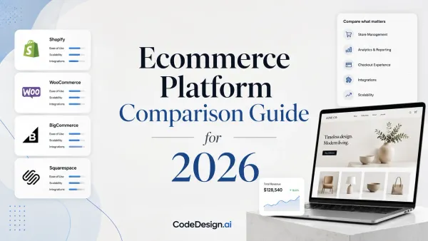
Platform categories compared for e-commerce website development
| Approach | Launch Speed | Monthly Cost | Code Ownership | Best For |
|---|---|---|---|---|
| SaaS all-in-one | Fast | Recurring subscription | Limited or platform-dependent | Owners who value convenience and managed operations |
| Open source | Moderate | Hosting and maintenance vary | High | Businesses needing control and custom integrations |
| Custom headless | Slower | Infrastructure and development vary | High | Technical teams with complex requirements |
| AI-assisted builder | Fast | Depends on plan and hosting choice | Can include exportable code | Solo founders and small teams validating a store |
The core trade-off is speed versus control, not good technology versus bad technology. SaaS removes infrastructure work but can make future changes dependent on its ecosystem. Open source provides ownership but shifts responsibility to the merchant. Custom headless development can solve advanced problems elegantly, but it's wasteful if the business hasn't validated its offer.
Practical rule: Choose the simplest architecture that supports the next meaningful stage of the business, not the imaginary version of the company several years from now.
CodeDesign.ai fits the AI-assisted category for founders who want to describe a business to an AI companion, edit visually, regenerate sections, and retain options for secure cloud publishing, WordPress synchronization, or clean HTML/CSS and React export. Its drag-and-drop workflow is useful when speed matters, while export and hosting flexibility reduce the risk of permanent lock-in. Before choosing any route, define how to publish a website and who will own its content, code, analytics, and operational accounts.
If you need to launch in under two weeks and want to keep your options open, an AI-assisted builder with exportable output is a sensible path. If the store depends on complex pricing logic, multi-system inventory, or unusual checkout behavior, budget for specialist development rather than forcing a simple builder to behave like an enterprise platform.
Planning Your Store Before You Touch a Builder
The fastest way to create a slow project is to open a builder before deciding what the store must do. Planning isn't paperwork. It prevents the homepage, catalog, checkout, and fulfillment process from pulling in different directions.
Start with the buyer. Don't define the audience as “everyone who likes quality products.” Describe the situation that creates the purchase, the objection that delays it, and the evidence that resolves doubt. A candle brand might serve gift buyers seeking a reliable local present, rather than every shopper interested in home fragrance.
Then choose the initial niche angle. The angle could be scent discovery, gifting, sustainability, local production, or another specific reason to choose the brand. That decision shapes product naming, photography, filters, copy, email capture, and paid traffic.

Make the first catalog operationally realistic
Consider a candle business launching with 18 SKUs and local shipping. The owner needs to decide whether each scent is always stocked, made to order, sold in bundles, or limited by seasonal availability. If those rules remain vague, the site may promise products the business can't fulfill, or require a rebuild when product variants and shipping zones are finally defined.
Payment and delivery scope deserve the same attention. Decide which payment methods customers in the target market expect, where orders can ship, how shipping costs are calculated, and what happens when an item is unavailable. A smaller launch with accurate operations usually performs better than a broad catalog that creates support problems.
Skipping discovery doesn't remove complexity. It moves complexity into design revisions, payment setup, inventory corrections, and customer support after launch.
Before opening the builder, answer these questions:
- Buyer: Who is most likely to purchase first, and what problem or occasion triggers the order?
- Offer: Why should that buyer choose this product instead of a familiar alternative?
- Catalog: Which products are available now, and which variants or bundles create operational risk?
- Payments: Which payment methods and currencies are required at launch?
- Fulfillment: Where can the business ship, and what delivery promise can it keep?
- Measurement: Which actions indicate progress, product views, add-to-cart events, checkout starts, or completed orders?
An AI companion can turn those answers into a starting sitemap, product-page structure, and content outline. Treat its first output as a draft, not a strategy. The owner still needs to verify pricing, inventory, policies, shipping rules, and customer promises before publishing.
Designing Product Pages and a Mobile Checkout That Converts
A product page earns the checkout visit. The checkout earns the order. Both need to work on a small screen, where cramped forms, slow assets, and unclear payment steps can stop a purchase even when the product offer is strong.
Mobile cart abandonment is reported at 85.65%, while mobile accounted for 68% of online shopping orders in Q1 2025, according to checkout conversion statistics from SHNO. That combination makes mobile checkout a structural revenue problem, not a cosmetic design detail.
Baymard's meta-analysis of 50 studies puts the global average cart abandonment rate at about 70.22%. Its research identifies unexpected extra costs at about 39% of abandonments, forced account creation at about 19%, and a checkout that is too long or complex at about 18%. Baymard also estimates that checkout UX redesign can raise conversion by 35.26% for a typical large e-commerce site, as documented in its checkout usability research.
Build the product page around decisions
A product page should answer the questions that block purchase:
- What is the product?
- Who is it for?
- What does it include?
- How will it arrive?
- When will it ship?
- What happens if the buyer changes their mind?
Use a clear title, useful product photography, visible price and availability, concise benefit-led copy, variant controls, delivery information, returns guidance, reviews, and a prominent add-to-cart action. Don't hide essential details below decorative sections. A beautiful image can't compensate for uncertainty about size, materials, compatibility, or delivery.
Remove work from the phone checkout
Use guest checkout, autofill-friendly fields, a single-column layout, inline validation, visible progress, and payment methods suited to mobile use. Show total costs before the final action, keep error messages next to the relevant field, and avoid asking for information the payment or shipping provider already has.
The mobile page builder approach is useful when a founder needs to test responsive layouts without rebuilding the entire desktop experience. In CodeDesign.ai, visual editing and AI-assisted regeneration can help revise product and checkout sections quickly, but the outcome still needs real-device testing, payment testing, and careful review of every error state.

Engineering Performance with Core Web Vitals
Performance decisions belong in development from the first product page. A store can look fast while oversized hero images, blocking JavaScript, or shifting content make shoppers wait and abandon the session.
Core Web Vitals are assessed at the 75th percentile. A passing experience requires Largest Contentful Paint under 2.5 seconds, Interaction to Next Paint under 200 milliseconds, and Cumulative Layout Shift under 0.1, according to this Core Web Vitals benchmark reference. A 2026 benchmark of major online stores found that only 36% passed all three metrics, as documented in the same Pagespeed Matters analysis. Treat those thresholds as development requirements, not post-launch cleanup targets.

Fix the bottleneck behind each metric
Largest Contentful Paint tracks how quickly the main content appears. Compress hero images, serve suitable formats, preload only the primary visual, and lazy-load content below the initial viewport.
Interaction to Next Paint shows how quickly the page responds after a tap or click. Remove unnecessary JavaScript, cut unused third-party scripts, split heavy bundles, and delay marketing tools until shoppers can interact.
Cumulative Layout Shift records unexpected movement on the page. Reserve space for images, banners, embedded reviews, and promotional modules so loading assets do not push content around.
Audit with Lighthouse during development, PageSpeed Insights for field-oriented checks, and Search Console for reported page experience after launch. CodeDesign.ai combines integrated analytics with fast publishing workflows, and its website analytics tools help connect performance changes with store behavior and revenue outcomes.
Trust Signals, Accessibility, and Compliance as a Growth Lever
Customers need reasons to believe the store will deliver what it promises. Trust isn't created by one badge placed beside the buy button. It comes from consistent evidence across the product page, cart, checkout, policies, and post-purchase communication.
Trust signals commonly fall into three groups: external validation, social confirmation, and technical security. Examples include recognizable press or partner references, visible buyer reviews, SSL encryption, familiar payment logos, and clear buyer-protection notices. These details reduce uncertainty at the moment a visitor decides whether to share payment and delivery information, as outlined in this e-commerce trust signals guide.
Accessibility improves the buying path
Accessibility work often gets framed as a compliance burden, but it also removes barriers that affect ordinary shoppers. Clear contrast, keyboard support, descriptive labels, logical focus order, readable text, useful alt text, and properly announced errors help people complete tasks with fewer interruptions.
Independent summaries of public research report 12–18% conversion uplifts for accessibility-focused e-commerce sites, along with higher customer satisfaction and lower abandonment, as discussed by AccessiVe Path's accessibility and conversion analysis. Treat that figure as directional rather than a promise for every store. The practical point is stronger: accessibility improvements often overlap with good mobile UX, clearer content, and better form usability.
Make compliance part of implementation
For payments, understand the relevant PCI-DSS responsibilities and keep sensitive card data with an appropriate payment provider rather than storing more information than necessary. For privacy, provide a clear policy, explain cookie use, and obtain consent where required by applicable rules such as GDPR. For accessibility, follow the expectations that apply in the markets where the business operates, including ADA-style requirements where relevant.
Security and accessibility shouldn't be bolted on after visual design. CodeDesign.ai provides free SSL, accessible templates, and exportable code, which gives small teams a starting point for these requirements. Those features don't replace legal review or responsible implementation, but they can reduce the amount of infrastructure a founder must assemble alone.
SEO, Internal Linking, and the Post-Launch Growth Loop
Search visibility starts inside the store architecture. Give each product a descriptive title, write a useful meta description, use structured product data where supported, create readable URLs, and add alt text that describes the image's purpose. Avoid stuffing keywords into copy that customers find awkward or unhelpful.
Internal links help search engines discover deeper pages and help shoppers move from broad intent to a specific product. A large analysis measured 23 million internal links across 1,800 websites and about 520,000 URLs, showing that internal-link structure is a measurable SEO variable, not merely a navigation preference, as reported in this internal link study.
Build links that explain the destination
An e-commerce internal-linking system should:
- Use descriptive anchors: Link phrases such as “soy candle gift sets” to the relevant category instead of repeating vague text.
- Reach deep pages: Link from buying guides, category pages, and related products to important product URLs that might otherwise sit several clicks away.
- Keep destinations distinct: Don't send identical anchor text to multiple pages when the destinations serve different intents.
- Connect related buying questions: A care guide can link to compatible products, while a comparison page can link to the categories it discusses.
The e-commerce SEO guide approach works best when SEO is part of page creation rather than a final metadata exercise. For off-site authority, keep metrics in context. A resource explaining mailX Domain Rating versus Authority can help distinguish link-based measures from broader site evaluation rather than treating one score as a complete SEO diagnosis.
Operate the store after launch
Before publishing, test product variants, out-of-stock states, discount rules, shipping calculations, payment success, payment failure, confirmation emails, refunds, mobile layouts, accessibility basics, analytics events, redirects, and indexability. Ask someone unfamiliar with the store to complete a purchase without guidance. Their confusion is valuable evidence.
After launch, establish a practical rhythm:
- Weekly: Review traffic sources, product views, add-to-cart activity, checkout starts, completed orders, revenue, refunds, and support questions.
- Monthly: Audit mobile checkout, broken links, search queries, slow templates, product availability, reviews, and the clarity of delivery and returns information.
- Quarterly: Reassess platform costs, integrations, security updates, catalog complexity, export needs, and whether the current architecture still matches the business model.
E-commerce website development is never finished at publication. It becomes a feedback system, where analytics reveal friction, customer questions expose missing information, and controlled page changes improve the path from discovery to purchase. Tools that combine AI-assisted generation, visual editing, analytics, publishing, and export can make that iteration practical for a solo founder, provided the owner keeps testing the commercial outcome rather than admiring the interface.
CodeDesign.ai lets solo entrepreneurs generate a store structure with an AI companion, refine product and landing pages in a visual editor, publish with secure hosting and free SSL, and export clean HTML/CSS or React code when more control is needed. Visit CodeDesign.ai to turn your e-commerce plan into a working, measurable storefront and start testing the customer journey before launch.