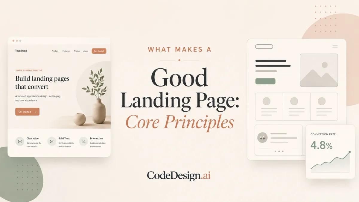
What Makes a Good Landing Page: Core Principles
A landing page can look polished and still perform poorly. One large benchmark covering 41,000 landing pages, 464 million visitors, and 57 million conversions reported a 6.6% median conversion rate, with top-performing pages reaching 10% or higher (Digital Applied's landing-page benchmark). That gap changes the question. What makes a good landing page isn't a trendy layout or an award-worthy hero image. It's a page that turns the right visitors into the intended action efficiently.
The answer depends on the audience, offer, traffic source, and business model. A page built for a high-intent search campaign shouldn't persuade visitors in the same way as one serving cold social traffic. The strongest landing pages combine clear messaging, low friction, technical reliability, relevant proof, and a disciplined testing process.
Table of Contents
- Redefining What Good Means
- The Essential Components of High-Converting Pages
- Why Traffic Source Changes Everything
- Speed and Technical Performance Requirements
- Industry-Specific Approaches That Work
- Testing and Iterating Toward Better Results
- Your Landing Page Optimization Checklist
Redefining What Good Means
A useful landing-page benchmark sets a starting point, not a universal pass mark. The 6.6% median conversion rate in the Q4 2024 dataset means a typical page converts roughly one in fifteen visitors into a lead or customer action, while the strongest pages reach 10% or higher (Digital Applied). Another benchmark summary places the top 25% at 11.45% or higher (Roast). These figures turn broad design debates into measurable performance targets.
“Good” still depends on context. A SaaS demo page asks for more commitment than an event-registration page. Financial-services visitors may need credentials and reassurance, while someone downloading a resource may respond to a clear promise and short form. One industry benchmark reports median conversion rates of 3.8% for SaaS, 12.3% for events and entertainment, and 8.4% for financial services (Medium benchmark summary). Generic templates become risky when marketers treat these differences as universal rules.
Measure the page against the right baseline
Calculate conversion rate consistently:
Conversions ÷ total visitors × 100
The same denominator allows comparisons across campaigns, time periods, and traffic sources (ZoomInfo). Raw lead counts can obscure performance. A larger traffic volume may produce more leads without making the page more persuasive.
| Industry | Average CVR | Top 25% CVR | Top 10% CVR |
|---|---|---|---|
| All industries | 6.6% | 11.45% or higher | 10% or higher |
| SaaS | 3.8% | Context-dependent | Context-dependent |
| Events and entertainment | 12.3% | Context-dependent | Context-dependent |
| Financial services | 8.4% | Context-dependent | Context-dependent |
The table combines the benchmark figures above with the industry comparison. “Top 25%” and “Top 10%” are different reference groups, so use them directionally rather than treating them as one ranking.
Practical rule: Judge a landing page by its conversion efficiency for a defined audience and traffic source, then improve it against that baseline.
Traffic-source fit should guide design decisions. Search visitors often arrive with a specific problem in mind, while social visitors may need more context before taking action. Whitespace, testimonials, and button color can help, but their effect depends on the offer and audience. The principles in a beginner's guide to website design provide a foundation, while AI-powered builders such as CodeDesign.ai can help teams create variants quickly and test which message, layout, and call to action meet their chosen threshold.
The Essential Components of High-Converting Pages
A high-converting landing page usually has seven connected components. They don't work as isolated decoration. Each one answers a question the visitor is asking, such as “Am I in the right place?”, “Can I trust this offer?”, or “What happens after I click?”

Start with clarity
Headline and subheadline: The opening should identify the offer and its main benefit quickly. Clever copy can be memorable, but specificity usually does more practical work. “Automate client intake for your accounting firm” gives a visitor more useful information than a vague promise about working smarter.
Value proposition: State what you offer, who it's for, and why it deserves attention now. A strong value proposition connects the visitor's problem to a credible next step. Don't lead with an internal feature list if the buyer cares about an outcome.
Make the action feel easy
Call to action: Use button copy that describes the next step. “Start Free Trial” creates a clearer expectation than “Submit,” while “Book a Consultation” tells a service prospect what will happen. Use enough contrast for the button to stand apart, place the primary CTA where visitors can find it without searching, and repeat it at sensible points on a longer page.
Form design: Ask only for information needed at the next stage. A short form can increase completion, but fewer fields may also reduce your ability to qualify leads. The right choice depends on sales capacity, offer complexity, and the cost of following up with weak prospects. Marketing Experiments' guidance on reducing form friction supports treating perceived effort as a conversion variable rather than a cosmetic detail.
Build confidence without clutter
Social proof and trust signals: Testimonials, customer logos, security explanations, credentials, and relevant reviews can reduce uncertainty. Place proof close to the claim it supports. A security reassurance beside a payment form is more useful than a generic badge buried at the bottom.
Layout and responsive design: Use visual hierarchy to make the intended path obvious. Headings, short sections, whitespace, and a restrained color system help visitors scan. F-pattern layouts can work well for text-heavy pages, but the essential principle is simpler: put the most important message and action where the eye naturally travels, then make the experience work on small screens.
A landing page builder can help you assemble these elements, but it won't decide whether the promise is credible or whether the CTA matches the traffic. Use a form HTML builder to reduce implementation friction, then validate the result with actual visitor behavior.
Why Traffic Source Changes Everything
The same page can appear successful in one campaign and disappointing in another because visitors arrive with different expectations. One large benchmark reports median conversion rates of 5.2% for email, 3.1% for paid search, 2.4% for organic traffic, and 1.2% for social media (DollarPocket). Those differences don't prove that one channel is better. They show why traffic-source fit belongs in the definition of landing-page quality.
| Traffic source | Typical benchmark CVR | Visitor intent | Optimal page strategy |
|---|---|---|---|
| 5.2% | Familiar or previously engaged | Direct offer, concise copy, clear next step | |
| Paid search | 3.1% | Active problem or solution search | Strong ad-to-headline message match |
| Organic | 2.4% | Research and comparison | Useful context, proof, and a logical next action |
| Social media | 1.2% | Browsing with variable awareness | More context, stronger trust, lower-friction offer |
These channel figures come from the DollarPocket benchmark report. The page strategy column is practical interpretation, not an additional statistical claim.
Match the message to the click
Message match means carrying the visitor's expectation from the ad, email, or search result into the page. If an ad promises “automated invoice reminders for freelancers” and the landing page opens with a broad statement about business growth, the visitor has to reconstruct the connection. Many won't.
SaaS teams often send paid search, partner referrals, email, and social traffic to one generic product page. That approach saves production time, but it forces every visitor through the same argument. Create variants around intent instead. A search visitor may need direct relevance and product detail. A cold social visitor may respond better to education, proof, and a low-commitment download.
The page doesn't need a completely different design for every channel. It needs a different emphasis. A website builder SEO guide can help with discoverability, but organic visitors still need a page that answers the question they came to investigate.
Speed and Technical Performance Requirements
Speed sets a measurable floor for a landing page. One independent benchmark reported 3.05% conversion at a one-second load time versus 0.60% at five seconds, while Google mobile research found that bounce probability rises 90% as load time increases from one to five seconds (DevSammy). Results vary by audience, device, and traffic source, so use these figures as warning signals rather than a universal forecast. Performance belongs in the conversion plan because a delayed first interaction can erase the value of strong copy and design.
Protect the first interaction
Prioritize the files and scripts that delay meaningful content.
- Compress images: Serve appropriately sized images and modern formats when your publishing stack supports them.
- Reduce blocking scripts: Delay nonessential JavaScript so the headline, offer, and CTA render first.
- Audit third-party tools: Analytics, chat widgets, embedded forms, and tracking pixels can add requests and page weight.
- Control visual effects: Animation should explain the product or direct attention, not compete with the primary action.
Core Web Vitals offer practical technical targets. Keep LCP under 2.5 seconds and CLS under 0.1, as specified in the verified performance guidance. A stable layout protects the moment when a visitor is ready to act, especially if the form or CTA shifts while the page loads.
| Load time | Bounce risk | Conversion impact | Recommended action |
|---|---|---|---|
| Under 2 seconds | Lower abandonment risk | Typically stronger performance | Preserve the lean asset and script budget |
| 1 second | Baseline in the cited benchmark | 3.05% in the cited benchmark | Protect the critical rendering path |
| 5 seconds | Bounce probability rises substantially | 0.60% in the cited benchmark | Compress assets and remove blocking work |
The figures in the table come from DevSammy's speed benchmark. The qualitative risk labels are practical guidance, not additional measured values.
Test the experience you ship
Run Lighthouse audits, review field data where available, and test on real mobile connections instead of trusting a fast office computer. Check whether the hero image loads before the CTA, whether consent tools delay interaction, and whether video begins downloading before a visitor chooses to watch it.
Rich media earns its place when it demonstrates a product, answers an objection, or makes an intangible service concrete. It becomes a liability when autoplay, oversized files, or decorative motion pushes the action below the point of attention. A mobile page builder can simplify responsive layouts and speed up iteration, but the published page still needs testing on actual devices.
Industry-Specific Approaches That Work
A page's conversion rate only makes sense beside its offer and audience. A benchmark summary reports 3.8% median conversion for SaaS, 12.3% for events and entertainment, and 8.4% for financial services (Medium). These figures don't establish a universal target for every company, but they do make one point clear: copying a layout from another industry can create the wrong balance of information, proof, and friction.

Choose structure by buying psychology
SaaS: A free-trial page can lead with the product experience, a short explanation of the outcome, and an easy first step. Prospects may want to see the interface, understand setup effort, and know whether support exists. Use product visuals when they explain the workflow, not merely because screenshots are available.
E-commerce: Buyers need product clarity, visual confidence, pricing context, delivery information, and reassurance around returns or payment. A focused product offer can work better than a page that presents every category at once.
Professional services: A legal, accounting, or consulting page must reduce perceived risk. Put credentials, relevant experience, service boundaries, and a clear consultation path near the decision point. A short qualification form may be appropriate when the provider needs context before responding.
Real estate: Visitors often need location relevance, property details, financing context, and a fast route to enquire. Visuals matter, but the page should also answer practical questions that stop prospects from contacting you.
Education: Prospective students usually need clarity about the program, schedule, support, outcomes, and next steps. Use testimonials and student stories to make the path tangible, while keeping enrollment or enquiry actions easy to find.
The right form length, CTA wording, and proof format will vary within each category. A high-consideration service often needs more explanation than a low-friction registration, while a familiar brand may earn the right to use a shorter page. A recruitment-agency website design guide offers a useful reminder that the audience's decision process should shape the structure.
Testing and Iterating Toward Better Results
The page you launch is a hypothesis expressed in copy and layout. Testing turns that hypothesis into evidence, but only if you define the conversion event clearly and avoid changing multiple major variables without a reason.
Start with a testable question
Write the hypothesis in plain language: “If we replace the feature-led headline with an outcome-led headline, more qualified visitors will begin the trial.” Then identify the primary conversion, the audience segment, the traffic source, and the decision that will follow the result.
Use a prioritization method such as PIE, which scores Potential, Importance, and Ease. A headline test may be easy to launch and important to the first impression. A new onboarding flow may have greater potential but require more implementation work. Prioritization keeps a small team from spending weeks polishing a low-impact detail.
Keep the experiment clean
Track the conversion event, not only clicks. A button click that doesn't lead to a completed signup can create a false win. Segment results by source when possible, because a variant that helps warm email visitors may confuse cold prospects.
Change one major variable at a time unless you're deliberately testing a complete page concept. Let the experiment collect enough relevant data to support a decision, and don't stop only because an early result looks exciting. If traffic is limited, combine quantitative behavior with session recordings, form abandonment observations, and direct customer feedback. Qualitative evidence won't replace a controlled test, but it can help you form a better next hypothesis.
AI-powered builders can shorten the production loop by generating alternate layouts, sections, and copy directions without waiting for every change to pass through design and development. CodeDesign.ai, for example, lets users generate responsive pages from a prompt, edit them visually, regenerate sections, and export site code. That makes rapid iteration more practical for solo operators and small teams, provided they still evaluate each variant against real conversion data.
A faster publishing workflow only improves results when the team uses it to test meaningful hypotheses, not when it produces more unmeasured page variations.
Your Landing Page Optimization Checklist
Use this checklist as a working sequence, not a permanent scorecard. The page should evolve as your traffic mix, offer, and customer expectations change.
Pre-launch essentials
- Define the primary goal: Choose one main conversion action and make every major section support it.
- Craft the core message: State the audience, problem, offer, and benefit in language that matches the acquisition source.
- Set the performance baseline: Record visitors, conversions, conversion rate, device mix, and traffic source before making changes.
- Check the mobile experience: Verify hierarchy, tap targets, forms, images, and scrolling on small screens.
- Add relevant trust: Use proof that answers the objections your audience is most likely to have.
Launch validation
- Verify tracking: Test the form, CTA, thank-you state, analytics event, and attribution path yourself.
- Inspect speed: Review Lighthouse results and check whether the main content appears before nonessential scripts.
- Watch visitor behavior: Use heatmaps and recordings to find hesitation, dead clicks, and sections people ignore.
- Review lead quality: A higher completion rate isn't useful if the resulting enquiries can't become customers.
Ongoing optimization
- Segment traffic: Compare performance by source and intent instead of blending every visitor into one average.
- Prioritize experiments: Test the headline, offer framing, form, CTA, proof, and page structure in a deliberate order.
- Recheck benchmarks: Use relevant industry and channel references, then compare them with your own baseline.
- Schedule regular reviews: High-performing pages can weaken as campaigns, competitors, and buyer expectations change.
The right checklist won't tell you which headline will win. It gives you a reliable way to discover the answer. Build variants quickly, but let your own conversion data decide what stays.
CodeDesign.ai helps solo entrepreneurs and small businesses generate responsive landing pages, edit layouts with drag-and-drop tools, refine copy with AI, connect forms, and publish without requiring a separate development workflow. Create a page for one offer and traffic source, then visit CodeDesign.ai to build and iterate on the next version.