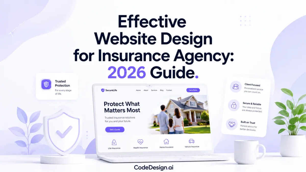
Effective Website Design for Insurance Agency: 2026 Guide
Your website might be getting traffic right now, but not enough quote requests. Or it's getting referrals who check you out online, then disappear. That's the frustrating part of insurance marketing. People may already trust the person who referred them, yet a weak site can still break the sale.
For many agencies, the problem isn't visibility alone. It's friction. A clunky homepage, generic stock copy, buried contact details, and a long quote form can make a serious buyer hesitate. In insurance, hesitation is expensive because the buyer often arrives with a real need and a short attention span.
Good website design for an insurance agency does two jobs at once. It builds trust fast, and it moves people toward a quote without making them work for it. In 2026, that second job is changing. The best sites aren't just collecting contact forms. They're using permissionless lead capture, such as premium calculators, guided recommenders, and chat-style quote flows, to let visitors self-qualify before they ever talk to an agent.
Table of Contents
- The Foundation Building Trust and Authority Online
- Architecting Your Site for Customer Journeys
- Designing High-Conversion Lead and Quote Flows
- Using AI Tools to Build Your Website Faster
- Attracting Local Clients with SEO and Content
- Your Pre-Launch and Maintenance Checklist
The Foundation Building Trust and Authority Online
Insurance buyers don't hand over personal information casually. They're evaluating whether your agency feels competent, reachable, and safe. That judgment happens in seconds, long before they compare coverage details.
This is why design isn't decoration. It's business infrastructure. According to VWO's web design statistics roundup, investing in UX can yield a 200% uplift in conversion rates, with some studies showing up to 400%, and every $1 invested in UX can return $100. The same source notes that allocating 10% of a development budget to UX can generate an 83% conversion uplift. For an insurance agency, that changes how you should think about budget. Spending on design isn't the “nice” part after the core work. It is the core work.

Trust is a conversion tool
A polished site tells a prospect that your agency pays attention to detail. In insurance, detail matters. If your menus are confusing, your typography is sloppy, or your contact page looks abandoned, visitors start wondering what else gets missed.
That's the hidden cost of bad design. It doesn't just look outdated. It creates doubt.
Practical rule: If a prospect has to search for your phone number, guess what you insure, or wonder whether a form is secure, your site is asking for trust before earning it.
Trust-building design has to be visible and functional. A good insurance site should make a visitor feel oriented within moments. They should know who you help, what lines you write, where you operate, and how to reach a real person.
What trust looks like on an insurance website
Trust signals work best when they're woven into the experience instead of dumped into one page. These are the elements I'd treat as essential:
- Clear identity: Put your agency name, service area, and policy types near the top of the homepage. Don't make visitors decode vague slogans.
- Real contact access: Show a clickable phone number, contact page, and office details prominently.
- Human presence: Use actual team photos where appropriate. Insurance is personal. People want to know who they're trusting with protection advice.
- Visible reassurance: Include privacy language near forms, security cues, and straightforward explanations of what happens after someone submits a request.
- Credibility content: Publish useful resources that show expertise, not just sales intent.
- Accessible design: High contrast, readable font sizes, clear buttons, and logical page structure all signal professionalism.
A common mistake is treating trust like a testimonial widget. Testimonials can help, but they don't rescue a weak experience. If the page feels cluttered, slow, or difficult to use, social proof won't fix that.
Here's the better trade-off. Reduce visual noise. Use fewer colors. Keep layouts consistent. Give each page one primary action. Your website should feel less like a flyer rack and more like your best producer at the front desk: calm, clear, and ready to help.
A site that earns trust early makes every later step easier. Quote requests feel safer. Contact forms feel less risky. And policy pages feel more credible because the surrounding experience supports the message.
Architecting Your Site for Customer Journeys
Most agency websites are organized around what the agency wants to say. Stronger sites are organized around what the buyer needs to decide next. That sounds subtle, but it changes the whole structure.
A prospect rarely lands on your site thinking, “I'd love to browse a nice navigation menu.” They arrive with a job to do. They want to know whether you handle their situation, whether you serve their area, and how quickly they can get a quote.

Build around decisions, not departments
Think of your website like the layout of a well-run office. The visitor shouldn't walk in and wonder where to go. Every major page should answer one stage of intent.
The homepage should route people quickly. It's not there to tell your whole story. It should point visitors toward personal lines, commercial lines, quote options, and your strongest trust signals.
Your service pages do the heavy lifting. Each major line of business deserves its own page. Auto, home, renters, life, business, Medicare, or specialty lines shouldn't be buried in one long generic “Services” page. Separate pages let you speak to specific buyer concerns and make navigation easier.
A practical page structure
Here's a structure that works well for many agencies:
| Page | What it should do | Common mistake |
|---|---|---|
| Homepage | Direct visitors to the right next step | Trying to explain everything at once |
| About page | Build personal confidence in the agency | Writing a company history nobody asked for |
| Coverage pages | Explain who the policy fits and why it matters | Using carrier jargon and dense blocks of text |
| Quote or contact page | Make starting easy | Asking for too much too soon |
| Blog or resource center | Answer real client questions | Publishing generic filler with no local relevance |
Navigation matters as much as page count. If people can't find what they need fast, the architecture is failing. Keep top-level navigation simple. Use plain labels such as “Auto Insurance,” “Business Insurance,” “About,” and “Get a Quote.” Avoid clever wording.
A visitor should know where to click without thinking. If they have to interpret your menu, they're already working too hard.
Within each policy page, keep the structure predictable. Start with who the coverage is for. Then explain common risks, key protection considerations, and the next action. If you write commercial insurance, break out industries or policy categories where useful. If you serve families, explain scenarios in plain English instead of carrier language.
A few practical page-level decisions make a major difference:
- Open with buyer context: “Protect your home in [service area]” is stronger than a generic introduction.
- Use scannable sections: Subheads, short paragraphs, and bullets help overwhelmed buyers.
- Place action points naturally: Quote prompts should appear after useful context, not just in the footer.
- Link related pages: Auto should connect to home. Home should connect to umbrella. Commercial auto should connect to general liability where relevant.
The best website design for an insurance agency doesn't feel deep because it has many pages. It feels easy because every page moves the visitor forward without confusion.
Designing High-Conversion Lead and Quote Flows
The quote flow is where many insurance websites underperform. Agencies spend time polishing the homepage, then send buyers into a form that feels like paperwork. That's where intent dies.
The old model was simple: place a form in the sidebar, ask for a long list of details, and wait. That approach treats every visitor like they're equally ready to commit. They aren't. Some want a quote now. Others want a fast estimate. Others just want to know whether you handle their situation before they hand over personal data.
Why traditional quote forms keep losing buyers
Projected data for 2026 reported by AgencyBloc's insurance website guide shows that 68% of insurance shoppers prefer interactive tools like premium calculators or chat-based quote estimators over traditional contact forms. The same source says 72% of traffic is mobile. That combination matters. Mobile users are less patient with long forms, more likely to abandon on friction, and more willing to engage with guided tools that feel lighter.
This is the shift toward permissionless lead capture. Instead of forcing a prospect to “contact us for more information,” you give them a useful tool first. They get value without a full commitment. You get intent data without pushing too early.
The first conversion isn't always the lead form. Often it's the moment a visitor answers one simple question and keeps going.
What a stronger quote flow looks like
A high-conversion flow usually starts with a micro-commitment. Ask one question. Then another. Let the visitor feel progress. Don't confront them with a wall of fields.
Compare the two approaches:
| Approach | Visitor reaction | Likely outcome |
|---|---|---|
| Long static form | Feels like work immediately | Abandonment |
| Guided estimator | Feels interactive and relevant | More starts, better completion quality |
| “Contact us” button only | Too vague | Low motivation |
| Specific quote CTA | Clear value exchange | Higher intent |
Button copy matters more than agencies think. “Submit” is weak. “Contact Us” is vague. A stronger CTA names the result. “Get My Free Quote,” “Check My Coverage Options,” or “Estimate My Premium” gives the user a reason to click.
Permissionless lead capture in practice
This doesn't require turning your website into a science project. Start with one interactive flow tied to a core line of business. For example:
- Personal auto: A quick premium estimator that asks vehicle count, driver age range, and coverage priority.
- Homeowners: A guided flow that asks property type, ownership status, and location before offering next steps.
- Commercial: A policy recommender that routes by industry, team size, or fleet needs.
- Life insurance: A simple needs-based guide that helps users narrow policy direction before requesting advice.
The point isn't to replace the agent. It's to remove dead friction before the conversation starts.
If you're designing the form layer itself, tools like an HTML form builder for lead capture workflows can help you map shorter, cleaner interactions without forcing every inquiry into the same static structure.
A few design rules consistently help:
- Keep the first step easy: Ask for one low-friction input first.
- Show progress: Multi-step flows work better when users know where they are.
- Delay sensitive fields: Don't ask for a phone number before earning a reason.
- Match the CTA to the offer: “Estimate,” “Check,” and “Compare” fit early-stage tools better than “Submit.”
- Design for thumbs: Large buttons, clean spacing, and simple inputs matter on mobile.
Static forms still have a place. Some visitors are ready to talk now. But if you want more high-intent starts from modern buyers, interactive self-qualification is the most valuable upgrade you can make.
Using AI Tools to Build Your Website Faster
Many agency owners delay redesign projects because they assume the process will be slow, technical, and expensive. That used to be true more often than not. Today, AI-assisted builders have changed the production side of web design.
The biggest benefit isn't just speed. It's that you can move from strategy to working pages without waiting on a full custom build cycle.

Start with strategy, then prompt the build
The mistake is opening a builder and picking a template before you've made key decisions. Start with inputs, not colors.
Write down:
- Your priority lines of business
- Your service area
- Your primary audience, such as families, small businesses, contractors, or retirees
- Your main conversion actions, such as quote requests, callbacks, or guided estimators
- Your differentiators, such as local expertise, bilingual service, commercial specialization, or bundled coverage guidance
Then use an AI website builder for business sites to generate the initial structure. The first draft should give you a homepage, service pages, contact flow, and resource section you can refine.
What AI does well is speed up the blank-page problem. It can generate a layout, propose copy blocks, and assemble sections fast. That's useful when you already know the business decisions the site needs to support.
Use AI for speed, not for blind trust
AI-generated websites still need human review. Insurance content is too sensitive to publish carelessly. Treat AI like a fast junior assistant, not a licensed producer.
Review every page for:
- Accuracy of coverage language
- Clarity of disclaimers and contact information
- Consistency with your actual service area and carriers
- Brand voice that sounds local and credible, not generic
- Lead flow logic that matches how your agency sells
A practical workflow looks like this:
- Generate the site structure.
- Replace placeholder copy with agency-specific language.
- Add real team photos, office details, and local references.
- Build or embed your quote and estimator flows.
- Tighten page headlines so each one speaks to a clear buyer need.
- Check mobile layouts before you worry about visual polish.
After that, use AI again for iterative improvements. Rewrite a weak hero section. Shorten a policy explanation. Draft FAQ content based on client conversations your office hears every week.
Here's a useful walkthrough if you want to see how AI-assisted site creation works in action:
A key advantage is control. You can launch faster, test ideas sooner, and keep improving without turning every website edit into a separate project.
Attracting Local Clients with SEO and Content
A well-designed website that nobody finds is just a polished brochure. Insurance agencies need traffic with intent, especially local intent, because that's where search becomes pipeline.
The upside is that insurance searchers often aren't browsing casually. They're looking for answers, pricing direction, or an agent they can trust quickly.
Why SEO matters more in insurance than in many other niches
According to DesignRush conversion statistics, insurance agency websites have a desktop conversion rate of 9%, which is notably high for the broader financial category. That matters because it changes the economics of search. If your agency can attract the right visitor, the website has a real chance to turn that visit into a quote request or conversation.
That's why SEO for insurance agencies shouldn't be treated like a side task for your intern. It's a lead acquisition channel aimed at high-intent buyers.
Local SEO that turns searches into conversations
Local SEO starts with relevance and consistency. If someone searches for “auto insurance agent in [city]” or “business insurance near me,” your digital presence should make it obvious where you operate and what you do.
Focus on the basics first:
- Location clarity: Put your city, region, and service area in page titles, headings, and body copy where natural.
- Google Business Profile: Keep hours, phone number, and business details current.
- Local proof: Collect reviews and reference local communities you serve.
- Service-location pairing: Create pages that connect a line of business with a market, such as home insurance in a specific town or commercial coverage for a local industry base.
If you want a practical primer on the mechanics behind search-friendly site structure, this website builder SEO guide is a useful reference.
SEO for an agency website works best when each page answers a local buyer's exact question, not when every page repeats the same sales pitch with a different city name.
Content that earns trust before the call
Content marketing works particularly well in insurance because buyers often have situational questions before they're ready to request a quote. They may not search “buy policy now.” They search the problem around the policy.
Useful topics include:
- Coverage education: “How much homeowners insurance do I need?”
- Local risk content: Seasonal storm prep, wildfire concerns, flood considerations, or regional liability issues
- Business owner questions: Workers' comp basics, certificate requests, commercial auto concerns
- Life event content: Moving, buying a home, starting a business, adding a teen driver
The key is specificity. Generic articles don't separate your agency from every other site in the market. Localized, experience-based content does.
A strong local content page usually has three ingredients. First, it addresses a real client question in plain language. Second, it reflects your market, not a national template. Third, it gives the reader a logical next step, such as reviewing options, requesting a quote, or asking a targeted question.
That's how SEO and website design for an insurance agency work together. Search gets the right visitor in the door. Structure and trust turn that visit into a lead.
Your Pre-Launch and Maintenance Checklist
Launching the site isn't the finish line. It's the point where your website starts proving whether the strategy holds up in practice. A rushed launch can waste weeks of work through broken forms, missing metadata, or a mobile layout that collapses on actual phones.
The final review should be blunt. Don't ask whether the site looks good in a meeting. Ask whether a prospect can use it without confusion.

Pre-launch checks that prevent embarrassing mistakes
Before launch, verify the items that directly affect trust and lead capture.
- Content accuracy: Confirm policy names, service areas, phone numbers, office hours, and team details.
- Form testing: Submit every contact form, quote flow, and estimator path yourself.
- Mobile review: Check layouts, buttons, menus, and spacing on multiple screen sizes.
- SEO basics: Make sure page titles, descriptions, headings, and internal links are in place.
- Security essentials: Confirm SSL is active and privacy-policy links are visible.
- Broken link review: Test navigation, footer links, and all primary CTAs.
One mobile issue can cost a lot of business. Neilson Marketing's insurance web design guidance notes that a mobile-first design approach, including fluid grids, flexible images, and compressed images that load in under 2 seconds, can lead to a 40-60% increase in qualified lead generation compared with non-mobile-optimized sites. If your mobile experience still feels like a squeezed desktop page, that's not a minor cleanup item. It's a conversion problem.
Ongoing maintenance that protects lead flow
A healthy insurance website needs routine attention, even if the design is already strong.
Use a simple maintenance rhythm:
| Task | Why it matters |
|---|---|
| Review forms regularly | Lead routing breaks more often than people realize |
| Update software and plugins | Old components create risk and instability |
| Refresh service pages | Coverage language and market positioning drift over time |
| Publish useful content | Fresh content supports search visibility and trust |
| Monitor performance | Slow pages and downtime hurt both ranking and conversion |
For agencies wondering whether a redesign is overdue, this guide to improving agency websites from PIA Southern Alliance is a helpful reality check. It's especially useful if your site still functions more like an online brochure than a lead system.
Good maintenance is quiet. Visitors shouldn't notice it. They should just experience a site that works, loads quickly, and makes taking the next step feel easy.
Treat the website like an operating asset, not a one-time project. The agencies that win online usually aren't the ones with the flashiest design. They're the ones that keep the site accurate, responsive, useful, and easy to act on.
If you want to build or refresh your agency site without getting stuck in a long custom process, CodeDesign.ai gives you a practical shortcut. You can generate a professional website with AI, edit it visually, refine pages with prompts, publish quickly, and keep control of your site as your agency grows.