Website Templates Restaurant: Choose, Customize & Launch
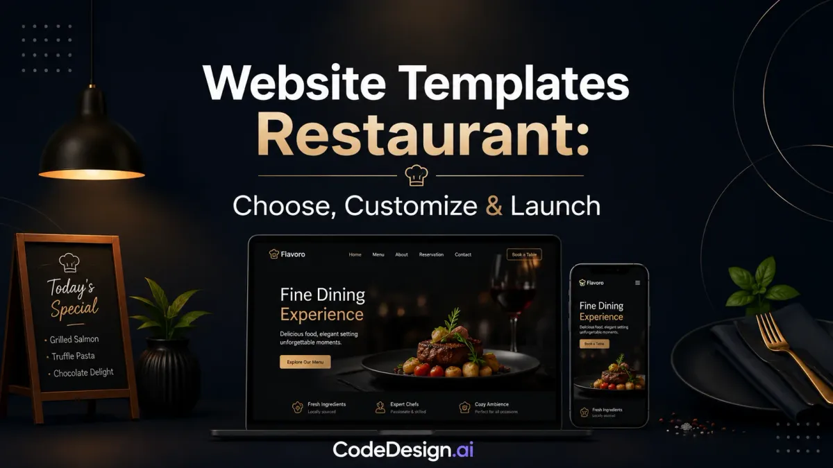
You can spot the problem fast. A restaurant owner picks a template because it looks polished on a laptop, then realizes the site doesn't make it easy to book a table, place an order, or even find the menu on a phone. That's why website templates restaurant decisions deserve the same attention as menu pricing or front-of-house flow. The template isn't just a design skin, it's the first layer of your booking and ordering engine.
The modern shift matters. Template libraries now bundle the core restaurant tasks, menu display, reservation calls to action, contact details, and location visibility, into ready-made layouts, and Canva's restaurant template guidance shows how far that workflow has moved by letting users build, publish, and connect a domain in one place. Broader design guidance points to the same essentials, clear location, easy menu access, branding, contact information, strong photography, reservation CTAs, and order-online CTAs, which tells you template design is no longer mainly about aesthetics.
If you're comparing options for a café, bistro, or catering business, the key question is simple. Will this template help someone take the next action quickly, or will it make them hunt for basics? For a useful companion on the business setup side, Afida's advice on opening a coffee shop is a practical read because it reinforces how much operational clarity matters before the first customer ever arrives.

Table of Contents
- Why Your Restaurant Template Choice Is a Business Decision
- Evaluating Restaurant Templates for Conversion Readiness
- Customizing Your Template Around a Single Conversion Goal
- Integrating Reservations and Online Ordering Systems
- Optimizing for Local Search and Mobile Performance
- Testing and Launching Your Restaurant Website
Why Your Restaurant Template Choice Is a Business Decision
A lot of owners start in the wrong place. They open three template previews, compare colors, and choose the one that feels closest to the dining room mood. Then the hard questions show up, like where the menu lives, how reservations work on mobile, and whether the contact details are visible without scrolling forever.
The template now does operational work
Restaurant templates used to behave like generic themes with a food photo swap. The better ones now package menu pages, booking links, mobile-friendly presentation, and contact visibility into layouts that support actual restaurant tasks. That shift is why niche-specific restaurant templates matter more than general website themes, because they already account for what diners try to do first.
Independent template roundups reinforce that this is a mature category, not a novelty. HubSpot curated 25 restaurant templates in one list, and Astra highlights 30+ niche templates in its starter library, which shows the market has specialized around dining workflows rather than just visual style Canva's restaurant template guide.
Practical rule: if a template doesn't make the next customer action obvious, it's not helping the business, no matter how polished it looks.
The best way to judge the fit is to think in conversion terms. A café needs quick access to hours, a menu, and directions. A dinner spot may care more about reservations. A caterer needs inquiry handling and event detail pages. That's why the same template can be right for one restaurant and wrong for another.
The economics also shape the decision. A restaurant template may be free, or it may sit inside a paid system with more operational depth, but the key issue is whether the template supports the services that matter most. That's the business case, not the visual one, and it's the same logic behind choosing the right platform when weighing build costs on CodeDesign's website cost guide.
Design is only useful when it supports the guest journey
A restaurant site should reduce friction. Visitors usually arrive with one of a few intents, find the menu, make a booking, place an order, or get contact details. When a template buries those actions under decorative sections, it creates work for the user and loses business in the process.
The strongest templates make the homepage do fewer things, but do them better. They surface the menu, reservation prompt, and location details early, then keep the rest of the site focused on trust and clarity. That's the right mental model for restaurant websites, not “fancy brochure,” but “fast path to a decision.”
Evaluating Restaurant Templates for Conversion Readiness
The quickest way to test a template is to use it like a customer would. Open it on a phone, look for the menu, find the phone number, and try to book or order without extra taps. If any of those steps feel buried, the template is already fighting your business.
What to check before you commit
Start with mobile-first responsive design. Tap-friendly buttons, readable text, and layouts that hold up on smaller screens matter more here than decorative motion or elaborate homepage art. Restaurant visitors are often on their phones while deciding where to eat, so the template has to work well in that context.
Next, check the menu format. An HTML-based menu is usually a better choice than a PDF because it can be crawled, scanned, and updated without making customers pinch and zoom. PDF menus often look tidy in a design mockup, but they create friction for mobile users and make search visibility weaker.
A template that hides the menu behind a download link is asking too much of the visitor.
Then review the conversion tools. Free templates often lack the ordering integration and table-booking plugins restaurants rely on, while paid options more often bundle those features. Template pricing can range from $0 to $300 depending on the feature set, WordPress restaurant themes are typically around $50 to $80, and Wix and Squarespace subscriptions commonly fall in the $15 to $45 monthly range Slider Revolution's restaurant template review.
Restaurant Template Evaluation Criteria
| Feature | Why It Matters | Priority |
|---|---|---|
| Mobile responsiveness | Most diners browse on phones and need a clean small-screen experience | High |
| HTML menu support | Improves crawlability, readability, and update speed | High |
| Reservation integration | Turns interest into a measurable booking action | High |
| Ordering integration | Lets visitors complete the next step without leaving the site | High |
| Visible contact details | Makes calls, directions, and quick questions easy | High |
| Fast customization | Helps owners launch and update content without delays | Medium |
| SSL and performance support | Improves trust and reduces technical friction | Medium |
The warning signs are easy to spot once you know them. Burying contact information, relying on image-only menus, or making the primary action hard to find all hurt performance. The same is true for templates that look good in desktop preview mode but fall apart on a phone.
For layout choices and conversion structure, the logic aligns closely with landing page best practices, even if the restaurant use case has its own quirks. Keep the evaluation anchored to behavior, not decoration.
Customizing Your Template Around a Single Conversion Goal
Most restaurant websites become messy after the template purchase. Someone adds a catering button, a newsletter block, a gift card banner, an events panel, and a chef story, then wonders why no one clicks the reservation prompt. The fix is to choose one primary conversion goal and let that goal shape the whole page.
Build the page around one action
If reservations matter most, the hero section should say that immediately. The navigation should support it, not distract from it, and the header should keep the booking action visible as visitors scroll. If ordering is the priority, the same logic applies, but the design should push the visitor toward the menu and checkout path instead.
The most reliable customizations are small and direct. Put the phone number, hours, and address in text format on every page or in the footer. Keep the menu scannable with prices and dietary notes. Make sure the main action sits in the header or sticky mobile nav, because that's where people look when they're ready to act.
Remove anything that competes with the main action
Many restaurant owners go wrong when they treat every section as equally important, and the page turns into a collection of announcements instead of a decision path. A better template setup removes secondary CTAs from the top of the experience and leaves room for one clear next step.
The menu itself should work like a service tool, not a graphic flyer. A crawlable HTML menu helps with search visibility and gives guests a faster way to compare dishes, ingredients, and pricing. A PDF might feel familiar, but it usually works against both usability and updates.
Practical rule: if a detail helps a guest decide, make it visible. If it only adds noise, move it lower or remove it.
A good customization workflow starts with goal selection, then moves through template choice, clarity, distraction removal, and testing. If you want a builder that can generate and edit the site, support drag-and-drop changes, and publish without a heavy technical handoff, CodeDesign.ai is one option in that workflow, especially when the site needs fast iteration.

For form setup and menu-friendly customization patterns, the mechanics line up well with HTML form building guidance, because restaurants need simple, low-friction input paths more than decorative interface tricks.
Integrating Reservations and Online Ordering Systems
A beautiful template can still fail the business if booking and ordering are bolted on badly. Visitors don't care whether the site looks elegant if the reservation widget breaks on mobile or the checkout path feels confusing. The integration layer is where a template becomes a functional restaurant tool.
Treat integration as part of the design
Reservation widgets should sit naturally inside the template, not fight it. Some templates support booking plugins natively, while others need custom code or careful embedding. The difference matters because a native fit usually causes fewer layout issues and less maintenance later.
A standard contact form also has a job beyond general inquiries. It can handle catering requests, private events, and group bookings if the fields are designed with those needs in mind. That makes the form part of the operational flow, not a spare page element.
Online ordering deserves the same attention. The ordering path should feel continuous from homepage to confirmation, with clear handoff points and no confusing jumps. If the widget creates layout problems on small screens or forces too many steps, diners drop off before checkout.
The cleanest test is simple. Go through the full booking or ordering flow on mobile and desktop, then confirm that every submission triggers a notification and lands where it should. That's also the place to check payment handling if your setup depends on it, especially on the payment solutions page where the operational side of checkout connects directly to customer action.
Common failures show up fast
Forms that don't send notifications are a basic but painful failure. Booking widgets that overlap headers or break spacing on smaller screens create trust issues. Ordering systems that feel detached from the template's layout make the site seem patched together.
A useful template should let the restaurant keep control of the experience. That means the booking or ordering element should look like part of the site, not a foreign object dropped into it. It also means the team must be able to update menu items, hours, and offers without reworking the whole setup every time something changes.
Optimizing for Local Search and Mobile Performance
Restaurant discovery is local by nature and mobile by habit. People search while they're out, on the way somewhere, or deciding between a few nearby options. A template that ignores that reality misses the main use case.
Make local intent easy for search engines to read
Search visibility starts with structured content. Add schema markup for cuisine, hours, and location so search engines can interpret the business correctly. Use the restaurant name, city, and cuisine type throughout written content, because that helps reinforce local relevance without stuffing keywords.
The rest of the site should support that same pattern. Keep business hours and address details in text, not just in images. Make sure the contact page and footer repeat the essentials so visitors and search systems can find them easily.
Search engines can't do much with vague copy and hidden details. They do better when the site states the basics clearly.
Speed matters more than most template galleries admit
Restaurant template guides often say “mobile-friendly” and “SEO-friendly” without explaining what that means in practice. The practical benchmark is mobile load times under about 3 seconds, with responsive layouts, tap-friendly buttons, and clean page structure Framer's restaurant design guidance. That kind of speed helps because phone users don't wait around for heavy pages.
The usual speed offenders are predictable. Oversized hero images, bulky gallery sliders, and too many third-party scripts slow the experience down. If a template looks impressive only after several seconds of loading, it's probably costing bookings.
The broader technical checklist should include accessibility, analytics, and booking or ordering validation before launch. A template that supports those checks gives you more than style. It gives you a workable restaurant site that can be found, read, and used quickly.

Testing and Launching Your Restaurant Website
The launch process should feel boring in a good way. If the site is ready, the final checks are mostly about removing failure points, not inventing features. A restaurant website should be treated like a live sales channel, not a static brochure.
Use a build sequence that forces discipline
The clean sequence is audit, wireframe, content, design, build, QA. Each stage forces a different kind of decision, and QA is where most restaurant owners are tempted to rush. That's the stage where you verify the booking and ordering flow, click every phone number, test the contact form, and check that the menu still reads well on a phone.
The same QA pass should confirm analytics tracking and review whether seasonal items or promotions can be changed without developer help. If the owner can't update hours or specials quickly, the template is already too rigid for restaurant operations.
Keep the site alive after launch
Launch isn't the finish line. Hours change, menus shift, seasonal dishes rotate, and promos expire. If the site doesn't stay current, guests assume the restaurant itself may be equally out of date.
Post-launch monitoring should include uptime checks, booking completion review, and regular content refreshes. The goal is to keep the site aligned with how the restaurant operates, which is why publishing workflows matter as much as design. The process for getting pages live is explained well in CodeDesign's publishing guide, especially for owners who need a fast path from edit to live site.
A template earns its place when it keeps performing after the launch week glow fades. If it still makes booking, ordering, and updating simple three months later, you chose well.
If you want a restaurant site that's built around bookings, ordering, local search, and fast updates, CodeDesign.ai gives you a way to generate, edit, host, and publish that site without losing control of the final output. Visit CodeDesign.ai to build a restaurant template that's shaped around real customer actions, not just a pretty homepage.