Graphic Design Movements: A Guide to Iconic Styles
You know the moment. A blank website template is open, the logo is in place, and now every choice feels louder than it should. Should the page feel elegant, strict, playful, or raw? Graphic design movements give you a practical way to answer that question, because each movement solved a real communication problem, and those solutions still show up in modern websites, brand systems, and AI-assisted layouts.
Table of Contents
- Why Old Design Movements Still Matter on a Modern Website
- A Timeline of Graphic Design Movements From 1890 to Today
- Defining Traits of the Four Movements Every Creator Should Know
- New Wave and the Movements Most Lists Skip Over
- Applying Movement Principles to Modern Websites and Templates
- The Global and Non-Western Side of Design History
- Building Your Next Site With a Movement Mindset
Why Old Design Movements Still Matter on a Modern Website
You can think of old movements as stored answers to recurring design problems. Too much ornament? A movement reacted. No hierarchy? A movement responded. A layout that feels scattered? Another movement gave you a system. That is why a solo founder staring at a homepage mockup can still learn more from Bauhaus or Swiss Style than from a pile of random templates.
The problem each movement solves
Bauhaus helps when a site needs clarity, speed, and fewer distractions. Swiss Style helps when the page needs order, readable type, and a layout that scales across blog posts, landing pages, and product pages. Postmodernism helps when a brand wants to break expectations without losing control. Those are not museum categories, they are working tools for making choices about type, spacing, and hierarchy.
A lot of beginners get stuck because they treat style as decoration instead of structure. The stronger move is to ask, “What job does this page need to do?” If the answer is trust, legibility, and fast scanning, a movement with a rational grid makes sense. If the answer is personality and surprise, a movement that allows expressive breaks makes more sense. For a practical starting point on layout basics, website design for beginners is a useful companion to this way of thinking.
Practical rule: choose the movement that matches the decision your page has to support, then borrow only the parts that help that decision.
That mindset also matters for credibility. Visitors rarely say, “This site uses a coherent visual system.” They feel it. Consistent type, tight spacing, and a deliberate grid make a brand look thought through, which is especially important for solo operators who need a site to do the trust-building work of a larger team. Old movements give you a language for that trust.
A Timeline of Graphic Design Movements From 1890 to Today

Old movements function as stored answers to recurring design problems. Each era faced a specific pressure, then built a visual method that later designers could reuse in new contexts. That is why the timeline still matters for web design today. The page grid, the use of sans-serif type, the split between ornament and structure, and the collage-like look that appears in some AI-era visuals all belong to the same longer conversation.
From ornament to structure
Late 19th-century Art Nouveau brought flowing lines, floral shapes, and decorative unity to books, posters, and commercial graphics. It answered a world that was moving into mass production by offering something handcrafted and expressive. Designers were no longer only arranging information, they were also trying to give printed objects a sense of identity and warmth.
Then De Stijl pushed in the opposite direction, reducing form toward grids, flat planes, and strict order. That shift mattered because designers were beginning to treat the page as a system rather than a canvas. For a website, that same logic shows up whenever a layout needs clear alignment, calm spacing, and a visual rhythm that helps visitors read without effort.
Modernism becomes a working method
Bauhaus, founded in Germany in 1919 and repeatedly identified as a foundational movement for modern graphic design, emphasized simplicity, utility, clean lines, and geometric forms. The school treated type and layout as part of an industrial system, not just art. That idea, documented in a critical guide to graphic design history, made layout feel repeatable and disciplined rather than ornamental (Bauhaus history guide).
That shift maps cleanly to modern websites. A homepage that needs a clear call to action benefits from the same kind of restraint, where every element has a purpose and nothing competes with the main message. For more examples of how expressive layouts can still stay organized, CodeDesign.ai artist website examples shows how strong structure and visual character can work together.
Later, Swiss Style pushed legibility and modular structure even further, using grid construction and sans-serif typography to regularize dense communication. That logic still shows up in editorial websites and content-heavy pages because readers need fast scanning, not visual noise. When a page has many sections, the grid becomes a kind of scaffolding, the thing that keeps the whole composition standing upright.
Expression returns, then gets recombined
Pop Art and Punk brought culture, attitude, and friction back into the conversation. Postmodernism rejected the idea that one system had to control every page, and New Wave then mixed earlier approaches instead of replacing them. The useful lesson is that contrast can be intentional, not careless. A designer might pair a rigid grid with an unexpected image crop, or use a highly ordered page structure while allowing one section to break rhythm for emphasis.
The current taste for collage, hand-made texture, and asymmetry is not a brand-new invention. It is a recombination of older visual solutions, adjusted to digital tools and faster production cycles.
The late 20th century also saw digital influence accelerate the pace of change. Movement history is now about workflow, interface constraints, and the tools people use to produce and revise visuals. That is why modern templates often borrow from several movements at once, and why a site can mix formal structure with experimental details without losing coherence.
Defining Traits of the Four Movements Every Creator Should Know
A movement list can become a pile of labels if it treats every style as equal. The four that matter most for day-to-day web work are Art Nouveau, Bauhaus, Swiss Style, and Postmodernism. Each one answers the same design problem in a different way, how a page can balance beauty, clarity, and personality without losing the reader.
Art Nouveau as ornament with purpose
Art Nouveau is easy to recognize because it favors flowing lines, organic motifs, and a handcrafted romantic feel. Alphonse Mucha posters show the idea clearly, with floral framing and stylized figures wrapped around the message. The lesson is specific. Ornament can support content instead of burying it.
On a website, that often means using curves, botanical accents, or decorative borders in one controlled area, rather than spreading detail across every section. The decoration should guide attention, like a frame around a painting. For a broader visual reference, browse original 1930s posters to see how decorative composition can direct the eye without flattening the message.
Bauhaus and the discipline of function
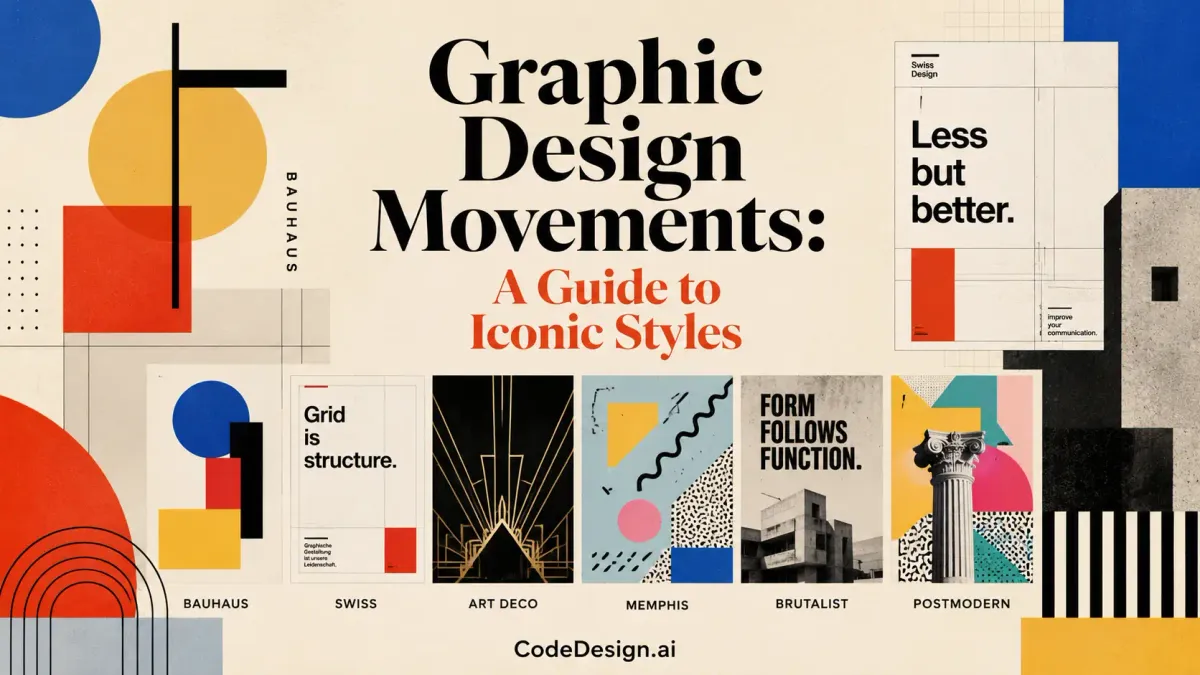
Bauhaus reduces a composition to its working parts. Its core mechanics are form follows function, geometric shapes, and minimal ornamentation. The school, founded in Germany in 1919, treated type and layout as part of an industrial system, not just as decoration.
That thinking maps cleanly to a modern website. A hero section needs one clear promise, one primary action, and no competing noise. If a page tries to do too much at once, Bauhaus offers the correction. A useful visual reference for this approach appears in artist website examples, especially where the layout stays simple and the work receives the attention.
A grid-based layout can feel plain at first, then suddenly make everything easier to read. That is the Bauhaus lesson in practice. Strip away what is only there to decorate, and the content becomes stronger because the structure is doing its job.
Swiss Style and readable hierarchy
Swiss Style is built on modular grid construction, sans-serif typography, and flush-left, ragged-right alignment. Britannica describes postwar designers using horizontal and vertical grid systems to align page elements and reduce subjective expression in favor of legibility (Swiss Style overview). For readers, that means the page behaves like a well-organized filing system. Each part has a place, and the eye does not have to work hard to find it.
That makes the movement especially useful for blogs, documentation, pricing pages, and any site that needs structure across many screen sizes. A grid does not make a page dull. It makes decisions predictable, which is what readers need when they are scanning for information.
Postmodernism as permission to break rules
Postmodernism pushes back against the idea that every design choice has to serve one clean system. It often uses irony, contrast, mixed references, and visual disruption. On the web, that can become one oversized quote, one unexpected type pairing, or one section that breaks the grid for emphasis.
The trick is restraint. If every element is loud, nothing stands out. The movement works best when it creates a single moment of tension inside an otherwise readable layout, the same way a sharp chord in a song catches attention because the rest of the tune has already set expectations.
A designer building a site with strong personality can use this as a check. Keep the structure steady, then allow one deliberate disruption where the message needs force. The result feels expressive without turning the whole page into noise.
| Movement | Era | Defining Traits | Modern Web Application |
|---|---|---|---|
| Art Nouveau | Late 19th to early 20th century | Flowing lines, organic forms, decorative unity | Hero accents, framed imagery, romantic brand sections |
| Bauhaus | Early 20th century | Form follows function, geometry, minimal ornament | Clean landing pages, one-message heroes, component systems |
| Swiss Style | Postwar modernism | Grids, sans-serif type, flush-left alignment | Blogs, editorial layouts, documentation, scalable UI |
| Postmodernism | Late 20th century | Rule breaking, contrast, irony, expressive shifts | Bold brand moments, mixed type, intentional asymmetry |
If you want to compare how these ideas show up in real design contexts, use CodeDesign.ai templates as a practical test bed. The layout decisions feel easier to judge when you can compare a rigid composition, a restrained one, and a more experimental one side by side.
New Wave and the Movements Most Lists Skip Over
Most explainers stop at Postmodernism, then miss the movement that connected modernism to today's layered digital look. New Wave graphics from the late 1970s to late 1980s combined earlier movements instead of replacing them. AIGA calls them “the most influential designs you've probably ignored,” which is a fair description because they sit in the overlap between Swiss order, Bauhaus geometry, punk energy, psychedelia, and Constructivist color (AIGA on New Wave graphics).
Why New Wave matters now
That mix explains a lot of what people call “fresh” today. Overlapping type, hand-cut collage, off-kilter alignment, and visible texture all feel current, but they are also part of an older synthesis. New Wave did not reject the past. It sampled it. That makes it a useful model for modern brands that want personality without losing readability.
A lot of students assume expressive design means abandoning structure. New Wave shows the opposite. Designers kept a grid, then bent it. They kept hierarchy, then made it feel alive. That balance is useful for web pages where you need a brand section to feel human without breaking the whole site.
Design gets interesting when a system stays visible and a designer pushes against it on purpose.
A bridge, not a dead end
This is why New Wave still matters for creators building with AI tools and templates. The current visual appetite leans toward imperfect, layered, and tactile surfaces, but those looks work best when they sit on a stable base. New Wave gives you a way to mix the two. It says you can keep the structure and still let the composition breathe, tilt, or collide in one section. That is a more realistic model of contemporary visual culture than a neat style timeline ever gives you.
Applying Movement Principles to Modern Websites and Templates
A movement becomes useful only when it changes what you do on the page. That is the shift from history to practice. A website asks for decisions about grid, type, spacing, motion, and the first place the eye should land. Old movements still matter because each one solves a different design problem, and those solutions still map cleanly to modern site building.
What to borrow and what to leave behind
Swiss Style is the clearest starting point for an SEO-friendly blog or service site. Use the grid as the skeleton, keep paragraphs easy to scan, and let hierarchy do the organizing work. Bauhaus is a strong model for navigation and hero sections because it strips away extras until one message stays in focus. Art Nouveau works better as a controlled accent, such as a hero image frame, an illustration edge, or a decorative divider that appears once and then steps back. Postmodernism can justify a single break in the system, like an oversized testimonial block or a color shift that signals a change in tone.
A movement is easier to understand when you can test it on a real page. A template library such as CodeDesign.ai templates gives you a fast way to compare a restrained Swiss layout against a more decorative or expressive version. That kind of side-by-side editing helps students see the difference between structure, ornament, and disruption without guessing.
A practical checklist for the build
- Start with the grid: choose a layout that keeps content aligned before you touch color or decoration.
- Set type first: pair fonts that match the movement's mood, then test them in headings, body text, and buttons.
- Limit the accent language: one decorative element can carry Art Nouveau energy without making the whole site ornate.
- Keep one expressive break: if you want a Postmodern or New Wave moment, place it where it supports the story, not everywhere.
Why AI helps here
AI-assisted builders are useful when they generate alternate layouts from the same brief. That makes it easier to compare a Bauhaus-like hero with a more expressive New Wave version. It also helps when you need to test color systems, spacing, or typography without rebuilding the page from scratch. If you are choosing software, browse 2026 design tools for beginners to see how different platforms frame those layout decisions.
The strongest web pages usually feel edited, not randomly assembled. Movement thinking gives you that editing instinct. It helps you ask what is necessary before you ask what looks trendy.
The Global and Non-Western Side of Design History
A classroom timeline that begins in Paris, Zurich, or Weimar can make graphic design history feel like a single European story with a few American add-ons. That version misses how ideas moved through publishing houses, ad agencies, schools, trade printers, and film studios, then changed shape as they crossed borders. Britannica on graphic design in the 20th century shows European designers drawing from Cubism, Constructivism, De Stijl, Futurism, Suprematism, and Surrealism, then postwar Swiss Design turning modernist layout into a widely used model for clarity. The story is one of circulation, not a sealed room.
Movements move because systems move
When Bauhaus ideas traveled, they moved through education, print culture, and later commercial design systems. Swiss grids spread for the same reason, because publishers and brands needed repeatable structure across languages, page sizes, and media formats. Outside Europe and the U.S., designers in Latin America, Japan, and South Asia also shaped posters, packaging, publishing, and album art in ways that fed back into global taste. The visual exchange was never one-way.
That matters on the web now because the same production pressure can create new habits again. AI-generated imagery, tactile collage, naive illustration, and punk-grunge textures often answer a polished digital sameness that many brands want to leave behind. A designer studying a portfolio site builder free guide, such as how to choose a portfolio website builder free, is really making the same kind of judgment, what visual problem does this layout solve, and what kind of audience response does it create?
A movement is not just a style label. It is a response to a production environment.
That shift in thinking keeps design history from turning into a museum tour. It works more like a map of pressure points. When tools change, distribution changes, and audiences tire of a look, the next movement often appears as a practical answer before it becomes a named style. That is the clearest way to read design history, and the most useful way to apply it to the web today.
Building Your Next Site With a Movement Mindset
The easiest way to use movement history is to treat it like a decision framework. Start by naming the brand voice. Then choose one movement that fits that voice, borrow two or three traits, and leave the rest behind. A site rarely needs full historical imitation. It needs a coherent system that feels intentional.
A simple build order
First, lock the grid and type scale. That gives the page its skeleton. After that, add the brand's personality through one or two visual moves, maybe a Bauhaus-like layout discipline, a Swiss-style article template, or a single Art Nouveau accent in the hero. Once the structure is stable, you can add motion, texture, and asymmetry without losing control.
The same logic works inside a builder. A template gives you a starting point, the visual editor lets you refine spacing and text, and prompt-based regeneration can help you test a new direction without starting over. That is the kind of workflow solo entrepreneurs need when they want to ship today and still keep room for later refinement. If you want a practical starting point, CodeDesign.ai AI website builder supports that kind of iteration with templates, prompts, and visual editing in one place.
What to check before you publish
- Does the page have one clear visual system?
- Does the type choice match the movement you want to signal?
- Did you add decoration only where it improves the message?
- Can a visitor scan the page quickly on mobile?

That checklist keeps you from mixing styles by accident. It also gives you a way to brief an AI builder with more precision, because you can describe not just the look, but the structure behind the look. When you understand the movement, you can edit faster and publish with more confidence.
If you want to turn these movement principles into a live site, build your next page with CodeDesign.ai. You can start from a template, refine the layout visually, and use AI-assisted editing to test different style directions without rebuilding from scratch. For a solo business or small team, that means you can move from concept to published site with a clearer design language and a lot less friction.